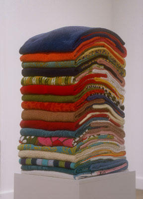
Had a short visit this morning at the Pennsylvania Academy of the Fine Arts, that fabulous and flamboyant Furness (and Hewitt) Italianate edifiice on Broad and Cherry, complements of the Barnes...I have been, frankly, worn out with pontificating, with recent posts on friend's blogs, so I will simply share with you some of what I saw. It was really fun being back in a museum; it's been a while. No, technically the Barnes is not a museum.
The Ellen Harvey installation is really worth checking out, by Nov. 27th. A series of huge back-lit mirrored walls, with detailed, etched drawings of the grand entrance of the building, along with some subtle changes...it's quite beautiful in its neo-Gothicism, and has the feeling of one of those Modernist takes on Baroque chandeliers, that one occasionally sees in 1970's glam/commercial spaces incorporating faux-luxury, e.g. department stores, except it also plays with the idea of the "romantic ruin." But the installation also incorporates video...and Harvey altered the walls too, which are quite nice.
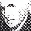
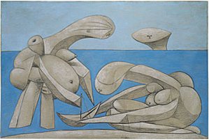
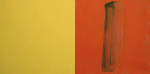
The other nice surprise was a small Vik Muniz exhibit, who is quite close to being a genius, I think. His re-takes on some of my favorite 20th century photographs, a series by Stieglitz called Equivalents, are wonderful. (I think they are snapshots of patterns on marble, with the flash showing up as a sun...) Very tricky. Above is a take on Peale, with puddled ink. And what do Pollock and chocolate have in common? Go see.
One last note...if you go, check out the special 200-year annniversary show as well, all culled from private collections...between both old and new PAFA buildings - lots of gems. If you get that far, and feel like commenting, I'd be very interested in your thoughts about this question I was considering this morning: is there any reason to believe there is a direct relationship between the GREAT Arthur Dove in the old gallery; the Philip Guston in the new gallery's street level, and the Carroll Dunham on the second floor mezzanine? I have a hunch there is, but with no other evidence except visual, and what other pieces I know of each of these artists. What do YOU think?
P.S. and one of the most amazing Brice Marden paintings I know is in the exhibit as well, Bear. The closest I come to drooling. Bow down and worship, you daubers of paint.
Read more...
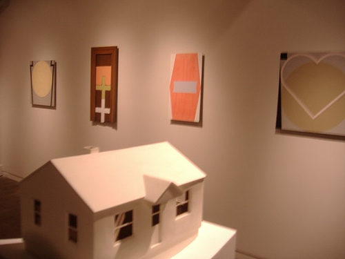
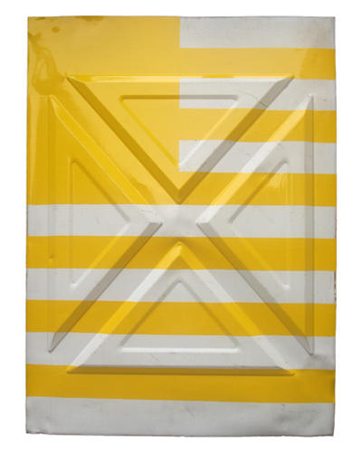
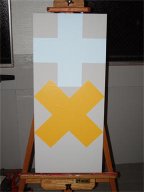
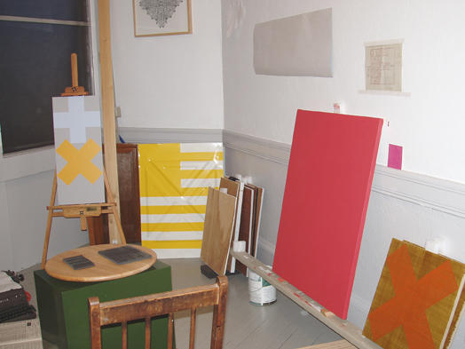
 Gonna get this one out there while I have a chance; may be leaving work early today. Anyway, I promised some pictures from my Meat Ball exhibit, so here you are (below). I'll be in Media and Oley in the beautiful Keystone state over the next week; this may be my last post of the year. I'll hopefully be doing a lot of reflection, thinking and writing over the holiday break; perhaps some of it will end up here. Thanks for participating in making my blog more rich and fun. It's more fun when you know people are watching; listening. I wish you all an old-school American, Currier & Ives holiday season. It is a winter holiday, after all. No matter what people in San Diego, Miami or Houston may say...the Northeast has got this holiday WRAPPED UP. Word.
 (above, left to right on wall: Heart/Boat; Keystone Study 1...Leah Bailis's house piece on left)
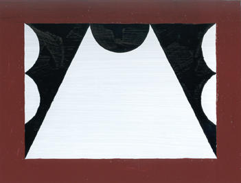
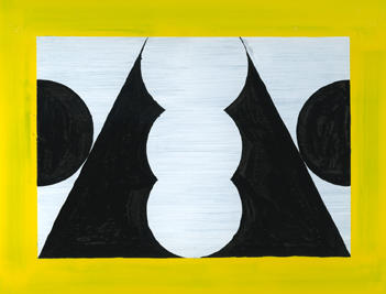
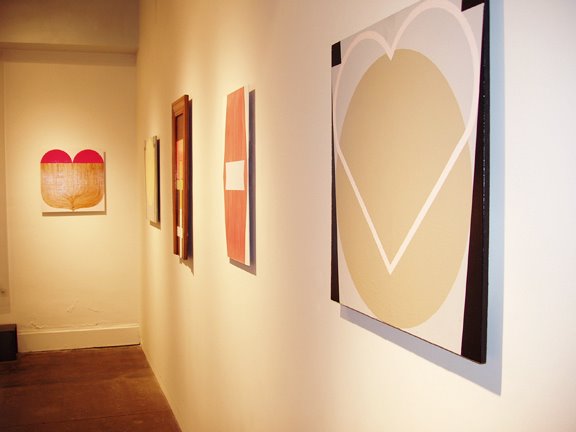 (above, from left to right: Heart/Boat; Keystone Study 1; Double Cross; Stacked Keystones; Keystone Study 2 - all mixed media on panel)


.jpg)