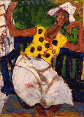
Art Thoughts, Week 36 -- Vuillard & Interiors


Red Interior, Edouard Vuillard, French (1868—1940) 1902, oil on tan paper mounted to panel, BF366.

When Dr. Barnes bought this painting by Vuillard in 1912, Vuillard was forty-four years old. He had been spending the majority of his painting life indoors – at least as evidenced by many of his pictures. Even the exterior presence was normally viewed from inside, occasionally sneaking in only by permission of doors, windows and porches. Vuillard had also spent a great deal of his life in the house of his mother, a cottage industry seamstress. In Vuillard’s childhood, as in all of our childhoods, the psychological interiors and physical interiors tangle and overlap; they often emerge later on as muddled mirror images of each other. Considering the comparatively drawn-out period in which Vuillard matured into independence, he probably had a heightened sensitivity towards and intimacy with interior spaces. He enveloped himself (along with his paintings) in the warmth, intricacies, patterns and lights of French bourgeois existence, making many of his paintings feel like blurry, flocked dioramas. He even managed to convey a bit of the exterior’s openness into his interiors – his paintings rarely feel stifling.

James Castle was an American, born 1900, who drew and sculpted impetuously for decades on his family’s Idaho farm, spurred on mostly, it seems, by his inability to hear and speak. This rendered him largely unfit for the normal rigors of a rural life. But he coped through his drawings, which are simultaneously dim and dreamlike; lively and virtuosic. Most significantly, he was locked into a permanent interior by the fate of nature. Because of this, many of Castle’s explicitly exterior drawings feel like they are ordered and close interiors. And unlike the conscious, preferential choices made by Vuillard, who was drawn to an interior life and expression up to and through his adult life, Castle was required to make the most of what he was given.

An interesting comparison may be drawn, however. When I was first acquainted with the Vuillard in the Barnes collection, I didn’t at first notice the figure seated by the table. In fact, she really only came into form for me the fourth or fifth time that I really concentrated on the painting. She is a definite fixture, draped in the same brushwork which Vuillard used to convey both the lacey tablecloth; the chandelier; her needlework. Likewise, in many of Castle’s drawings, figures are drawn with the exacting, blocky layout and line as the buildings, rooms and barnyards he knew so well. Again, they are like fixtures in the space, portrayed as simply elements in a composition. Of course, this is an important, basic realization in any study of art – to draw a person is to draw, firstly, the same blocks, chunks and shadows as any other thing which occupies space. Many artists go on though and struggle to imbue their figures with that mysterious and elusive spark which makes them that much more alive – or more accurately, which appeals to our perceptions of aliveness, and attempts to convince us of its verity. And in many ways, we alone know the true intimacies, complications and machinations of our interiors. Though spill as we will (and do), we can never fully share the depth and breadth of our core selves. If they do rise to the surface, the most poignant translations are rarely prosaic; at times they are poetic, and often they are visual. And when we each have that “aha!” moment upon making a deep personal connection with another’s art (and seemingly, their soul), we might well wonder if we are looking into a diorama or a mirror.


(above, James Castle, The Big Attic Interior, date unknown). Thanks to Greg Kucera Gallery website.

Read more...

A brief clarification to Obama on my hope:

This refrain has been running around in my head, ever since the presidential campaign, and the ubiquitousness of Hope, so I'm going to let it out now.


"My hope is built on nothing less/

Than Jesus’ blood and righteousness."

-From 1863 hymn by Mote and Bradbury.


Coming up: next Art Thoughts, on Vuillard.

Read more...

Art Thoughts, Week 35 -- Denis & Models


Mother and Child, Maurice Denis, French (1870—1943) c. 1895, oil on canvas, BF 335.

In one way or another, from the subtle to the blatant, all artworks operate under the influence of a model. That is, a pattern or precedent which informs a new work in its own foray into space. Even an object as unprecedented and radical as Duchamp’s ready-made urinal, has as its model traditional sculpture – though it differs greatly in execution and concept, it differs much less in its basic formality. Instead of marble: porcelain.

Maurice Denis’ Mother and Child falls into line behind a long tradition of paintings of the Madonna and Child (i.e. the virgin Mary and the Christ child), a model both powerful and pervasive in Western art. And, though not necessarily intended by Denis, any arrangement of a mother and child in such a composition invariably refers, and is somehow related to, other Madonna and Child paintings. However, once a model is used and acknowledged, the most persistently successful artist proceeds to further re-mold and alter the model in significant ways. Denis, for his part, turns us to the power of depiction.

In all Madonna and Child paintings, a relationship is implicit. But within this assumption, all degrees of relationships may be found. Many late medieval and early Renaissance depictions of the Madonna and Child emphasize the alienness of the Christ child – assuming him to be more spiritually detached – as opposed to Mary’s more obvious humanness. And there is of course physical interaction, and along with occasional differences in scale between Christ and Mary, it is often evident that these two figures are in a tenuous place – they are not of necessity intimate; and there is an insinuated spiritual divide. A relationship is definitely active too, in Mother and Child – and, as in most early Modern depictions of familial relationships, in contrast to those earlier traditions, their revelations are more realistic and honest. We can draw some conclusions about this relationship based on the relative depictions of mother and child. The mother, save for her bas-relief face, is depicted fairly flatly. She becomes a backdrop (secondary to the muddy puce and maroon bars in the background) to the more consistently roundly modeled and vivacious infant. Besides her face, the mother’s hands are the only other modeled part of her body. The black shape of her torso and dress edges create a flat, board-like layer, through which the hands and face emerge – much like a painted board at a carnival, where one pushes through their face and sometimes hands, to become a strongman; clown or animal. The mother’s hands and face therefore act as “entry points” into the infant’s world and that is, essentially, how infants encounter their mothers: through sight and touch; especially the mother’s physiognomy. Therefore, though their similar modeling suggests a lively commonality, the brushwork seems to weight the balance of the relationship towards the infant. There is some evidence this might be a portrait of Denis’s wife and child. If this is the case, then a natural realization of one’s – and one’s spouse’s – place in relation to the reality of a new child, could surely have entered into Denis’s decisions of how to depict his wife and new child, and especially how to make those depictions differ. In all unequal relationships, there is bound to be a shift in the balance of importance, and for mother and child – any parent and child, really – that is certainly the case. In many Madonna and Child paintings, it is harshly evident that the Christ child will soon overshadow and surpass his mother in importance. And in this case at least, the Denis painting follows its stylistic model.

Read more...

Art Thoughts, Week 34 -- Bonnard & Writing


Young Woman Writing, Pierre Bonnard (French, 1867—1947), 1908, oil on canvas, BF 367.

Letter writing, a daily discipline for several generations, is today largely dead. Done in by email, instant messaging and other more immediate methods of communicating, it is a mode of crafting a connected intimacy that has not found a satisfactory replacement. In Young Woman Writing, Bonnard captured a woman in the midst of her various correspondences. And being the painter, often, of carefully considered interiors (much like his friend and fellow Nabis, Vuillard) Bonnard mimicked this domestic transfer of intimacies that letter-writing is, in his own favored form of communicating, painting. Writing a letter, in fact, is essentially an interior to exterior action. That is, like all writing, it emerges from the culled and organized synapses of an interior human space, and then through a recording medium, to the intended recipient – it is inside to outside; life to life.

Another French painting of a generation or two earlier, The Death of Marat by Jacques-Louis David (pronounced dah-VEED) may serve as a useful opposite of Young Woman Writing. Marat was an incendiary journalist for the cause of the 18th century revolutionary Jacobins, who was assassinated by a loyalist to the throne, to quiet the rousing clangs of his pen. David, an artist and fellow revolutionary, painted this as a tribute to Marat. In it, the stabbed writer is sprawled over the left end of his bathtub, in which he sat as treatment for a skin condition, expired with pen still in hand. It is a moving, but mythic image; a memorial’s presence in paint. It is also a painting which illustrates the exterior world collapsing back upon the interior world, from whence the revolutionizing writing emanated. When viewed alongside the David, Bonnard’s quiet interior in which light is seeping in from the outside, seems a mirror image of the artificially-lit David, the dark side of the pen’s power. And while the letters floating out into the bathtub-like table in the Bonnard likely hold everyday news and sentiments, the pen which Marat holds is still smoldering from the vitriol which it disseminated.

The two paintings also illustrate very different forms of life. In the David, life as encompassed by this man, this pen, this presence has stopped: David has carved the name like an epitaph – the air is still – a force has been extinguished. The Bonnard, though filled with the quiet of an afternoon’s duties, vibrates with life on its luminous edges – the shimmering, wiggling brushwork on the lilac and cream curtains; the lean of tensed, animal-like furniture – all point to an absorbed tautness. And while Marat’s death-clamp holds tightly the letter he was composing, emblematic of a stream blocked, the letter writer in the Bonnard continues quietly writing, sending them out onto the scarlet table like toy sailboats, wending their ways to the larger ocean; small but meaning-wrought messengers. David has painted a memorial to a life of words which ultimately collapsed upon itself. Too violent to stand forever without harming its producer, it returned from the outside, back inside; death to death. Bonnard, on the other hand, painted a scene in which the outside world (the recipient) of the letters is almost inconsequential – and at the most, implied. Between the both of them, however, it’s apparent that regardless of outcome, the complications of human life and the inevitable recording of it, must and will continue.
(below, The Death of Marat, by Jacques-Louis David, 1793)


Read more...

Art Thoughts, Week 33 -- Courbet & Pornography


Nude, Gustave Courbet (French, 1819—1877) 1864, oil on canvas, BF 810.

Mystery permeates the space between a painting and its viewer – it has always been that way. Of course, the importance of an individual’s response to a work of art has increased in the last few centuries, in the wane of more communal, pre-modern responses to art. But volumes have contemplated this numinous space – revealing the fact that what humans know little about, they’ve expended inordinate amounts of energy in investigating. Likewise, ever since the sexes were separated by a single rib bone, they’ve been incredibly fascinated in knowing more about the Other, by almost any means possible – pryingly and insistently; psychologically and physically. Betwixt these two realities of human impulse we find the painting Nude, by Gustave Courbet. A young woman, wearing little besides a knowing smirk, is reclining on her back on the ground near some woods, putting on (or is it removing?) a white stocking, revealing her thighs and buttocks to the viewer. A dalliance; fore or aft? We do not know for sure – but this is not an innocent Degas or Bonnard baigneuse scene. Courbet, later in his life, began creating erotic paintings – at least one on commission – perhaps signifying his famously intense penchant for anti-establishment action. This is one of the milder ones (the most blatant being The Origin of the World which Duchamp will later reference in a more impersonal and humorously nihilist way). It’s not immediately evident, but Courbet too had a sly, humorous bent in making this painting, not to mention cutting insight into basic human nature. Simply put, by viewing we implicate ourselves. The prime signifier in the picture is a large, implied X which lays smack-dab in the middle. It’s created by the girl’s lower leg and left arm on one side, and her left thigh and right foot on the other. The arms of this X enter the landscape through the upper right corner tree line; the shadow on the bottom right, and her red shoe pointing to the lower left-hand corner. An initial question of an X might be what is the locus? It is not, as one may imagine, the girl’s genitalia – it is rather her bowels, though obscured by her left thigh. (The bowels, incidentally, were considered by the Greeks to be the seat of human emotion.)

An X works both as a signifier (clue) and a blockage (stop) – it proverbially “marks the spot”, and also denotes “this far, but no farther”. Thus, because it simultaneously promises and rejects, this X is a major titillation, moving the picture towards what is euphemistically called “soft porn”. In pornography, there is usually – and sometimes implied – a culpable party, and here it is the viewers (i.e., after the artist, who painted and ran, leaving us with the question of responsibility). Pornography promises gratification – but here it is denied, while Courbet sniggers. Like her left thigh which obscures her genitals, so the large X prevents us from entering any further into the painting; from succumbing to the narrative. We are implicated but emasculated (for the implied viewer is male) without satisfaction; stopped in our tracks by the inapproachability of the figure, and the flaming sword of an X. We’ve tried putting our key into the lock, and it’s broken off in our hand – and now our entry’s been denied. Using our innate curiosity, Courbet has first lured us in, then denied us all meaningful and fulfilling gratification – metaphorically emasculating our desire, making the picture simultaneously saddening and maddening. In one thrust, it is the double-edged mystery of a painting and of sexuality. And ironically, if thought through carefully, it also reveals the futility of seeking further satisfaction through pornography. If we keep trying our keys in dubious locks, we may lose our ability to enter meaningfully altogether.

Read more...

Art Thoughts, Week 32 -- Gritchenko & Compaction


Mountain with Two Figures, Alexis Gritchenko (Ukrainian, 1883—1977) 1921, oil on panel, BF 2066.
From my parent’s bathroom window, I would get a great view of the hill the house was built at the foot of, rising up to meet the woods at the frame’s top. The other large element in view was an elephantine oil tank, painted a glossy and highly-textured black. An early memory from staring out the window is seeing, as it were, the layers of the landscape – grassy hill; stone fence; trees; sky – reflected dully on the side of the black tank. I loved seeing the seasonal changes – light spring green to yellow-flecked tan; olives and oranges; umber and ruddy brown from the line of oaks and hickories; slate grey to brilliant blue from the sky, all arranged like a strange layer cake. In hindsight, extrapolating back from my current preferences, I think the most appealing thing was this sandwiched snapshot of the current layers of the seasons, all on the “canvas” of the oil tank. It was nature, compacted: a sensation familiar to anyone who’s made a terrarium. This experience, repeated over the years, informed my love of bound and abstracted reflections of the observed and natural world. In Gritchenko’s small painting Mountain with Two Figures, layering and compaction are important features. The ground, beach, lake and build-up of mountainous strata, though they do pivot, lend a strong layered, horizontal feel to the painting. Horizontals are almost inextricably linked to landscape in the human psyche. Even those indigenous landscapes which have strong verticals (such as highland Peru, or coastal Japan) are inevitably grounded in the reality of horizontals and the accompanying perpendicularity of gravity. We relate to the horizontals of landscape for various reasons: gravity as mentioned; time, and culture…but we learn about them best through layering (repetition of horizontals) and we learn about layering through vistas. What I saw in the tank was a limited vista; what Gritchenko shows us is wider, but still compacted.

Compaction is a form of abstraction, and the mountain and lake are certainly abstracted. But both compaction and abstraction function in a highly paradoxical way when it comes to landscape: that is, they give us a deep sense of a place, without an excess of information. In other words, they may condense and compact the onslaught of visual data that is landscape, and in the end come away with a better, more well-rounded sensual experience of the scene. (This is assuming the abstraction is well-done). In this picture, Gritchenko has pared down the visual information to a minimum, but we undoubtedly receive a better feel for this scene than if he’d taken a photograph. Why? Because an artist has at their disposal a myriad of tactics: composition, color, value, texture, pattern; and the more elusive mood and light. All of these are infinitely tweakable; none of them must be relayed literally, but all are firecrackers, capable of powerful visual sea changes. (It must be said that this is an artist’s personal tweaking; each one would go about it differently. Therefore, it’s a highly subjective sense, but highly accurate). If successful though, this particular inherency of painting is capable of conveying a vastly deeper sense of a scene than a photographic record ever could. So think of this process as a simultaneously visual, physical and psychological compaction. Gritchenko chose to frame this particular scene the way he did, to great and appealing effect; I had fewer choices with my oil tank. But in both cases, nature was constantly on the move; her panoply of elements in flux. The best we can do in most cases is try to keep up, and stake our claim when we are able – compaction is one way we do so.

Read more...

Art Thoughts, Week 31 -- Utrillo & Perspective


Sacre Coeur, Montmartre, Maurice Utrillo (1883—1955) unknown date, oil on paperboard, BF 815.

Perspective is everything, right? Any subject, person, landscape or belief might undergo a sea change if only seen from a different perspective. The word itself could be rephrased (roughly) as “particular view”. That is, one person’s view, as is the case with this painting. There are two main ways to change perspective: firstly, by altering our mindset (psychologically); and secondly, by changing our location (spatially). And art can deal with either of these; in fact, one of the most enduringly powerful qualities of important artwork is that it causes us to either see from another’s perspective, or to significantly change our own – and not unusually, these two are connected, and cause each other to occur. Additionally, this process is often unwitting and gradual.

Utrillo’s “particular view” can be picked up on just by looking at any of his sixteen works in the Barnes Foundation collection. He had a certain way that he’d set up his easel (he was a street painter), facing this street at a certain askew angle; turned towards this church in a certain manner: he had tendencies towards certain setups, and repeated them. Mostly, buildings, plazas and streets are faced head-on, with a certain amount of semi-vacuous space in front of them (between the subject and us, the viewers). In this, at least as far as the Barnes Utrillos are concerned, he is unwavering. That is, except for this painting: Sacre Coeur, Montmartre. Montmartre is a section of Paris, popular and thus populated with artists, but Utrillo himself was born there; he most likely knew the area intimately. Many of his scenes are of Montmartre, and as mentioned before, they are generally focused squarely on a building or group of buildings. His figures are rare and cursory; his trees are ephemeral and calligraphic – it is the hard edifices he is most passionate about. In this way, he seems to be continuously reaffirming in his own mind, through his practice of depicting things which are inanimate and generally unmoving, that this place is uniquely his.

But back to the picture at hand: Sacre Coeur, Montmartre. While discussing this painting with a co-worker, it occurred to us that it was somewhat of an aberration in Utrillo’s otherwise rigid styling. Namely, it had a strong, frontal element: a wonderfully graphic and lyrical picket fence, dancing across the relatively shallow foreground, where normally a gaping or triangulated plaza languishes. Instead of allowing the background building alone to animate the space, the vernacular fence has taken over, its folksy mazurka drowning out the Sacre Coeur Basilica’s majestic madrigal. It seems Utrillo has, however briefly, shifted his focus to the more humble and diminutive of buildings in this corner of Montmartre. In fact, the church is all but obscured by trees. But why – was it boredom, or a flash of inspiration? Was it the lure of a particular scene or the urge for a fresh perspective? Whatever it was, his perspective indeed changed.

Not all is completely different, however: the domes of Sacre Coeur, though on the back burner visually have as much presence as they would if Utrillo had made them the focal point. So, Utrillo has shifted his perspective, but he has not remade it. More than likely, he thereafter resorted to his typical pictorial duo of strong background subject or strong, foreshortened frontal shape, and semi-vacuous piazza. Something this time, though, caught his attention, and caused him to focus on a reversal of his practice – almost. He didn’t completely abandon his interest in powerful, central subject matter...but for a time, he seems to have painted in its backyard, rather than its doorstep.

Read more...

Art Thoughts, Week 30 -- Cranach & Advertising


Portrait of Frederick the Wise, Duke of Saxony, Lucas Cranach the Elder (German, 1472—1553) c. 1525, oil on panel, BF 867.

What is a portrait, anyway? At its most obvious, it’s a picture; a portrayal of something or someone (usually a one) which normally gives a face prominence: a likeness, if you will. Formally, generically; that’s what a portrait is. But perhaps more pointedly, what is a portrait for…or what does it do? For starters, they are painted for posterity; popularity; ego and profit. When Lucas Cranach the Elder (or someone in his reputedly large workshop) painted this portrait of Frederick the Wise, a popular contemporary German ruler, what reasons lay beneath it? A portrayal, it should be said, is vastly more than a simple picture, or a record of a particular slice of time in a person’s face or psyche. It is more often than not an attempt to put the portrayed in a good light. Not until the early modern era in painting did realism, per se, gain a stronghold on how artists portrayed things and people. The art of portraiture would have leaned rather heavily towards idealism. And an artist had to be careful; to put too fine a point on facial aberrations, deformities and the like, would cause the rendering to easily tip over into caricature; a result worse than overt idealism. One doesn’t realize how odd one looks until captured and frozen. There had to be a delicate balance between honest portrayal on one hand, and selective idealism on the other. To rephrase Teddy Roosevelt, artists had to walk softly and carry a large brush.

The greatest benefactor of a portrait highlighting a sitter’s best and most refined qualities would be, of course, the sitter. For someone like Frederick the Wise, it could be tantamount to propaganda. Just look at this portrait for a while: see the three-quarter view, the most flattering of views for most faces regardless of features; the healthily plump face and chest, and fine but understated fur, denoting humility in wealth and temperance in vices; the delicate eyes and well-formed mouth which belie his status, but show his wisdom in both thought and action; see the hopefulness of a clear and boundless sky, suggested by the rich turquoise background. All of this is discreetly and skillfully done by Cranach to show off the best of Frederick the Wise to his peers and constituents.

But is the duke the only one benefitting from this judicious and even beautiful portrayal? Surely not – with a deft stroke such as this painting, the “circle of Cranach,” as emulators en masse of famous artists are sometimes called, gained a heightened reputation as well, from both skill and by association. Artists would glom immediately onto a portrait request from a prominent person, since it meant, in all actuality, that more prominent portraits would follow, and perhaps sales for the artist’s other genre pieces, if the initial contract was fulfilled satisfactorily; with appeal and verve. (An official court painter position might have even been a possibility, as it was for Cranach.) In addition, if the personage was already a popular leader, there could be requests for copies or prints of the original, by other patrons and fanatics of both master and sitter. Another example of this is Chardin, who painted numerous copies of his most popular domestic interiors, in order to increase sales. And in his casual assumption of reproduction equaling art Andy Warhol was groundbreaking, but not necessarily revolutionary. All in all, it meant a profitable and happy return for all parties involved, if the project was successful. Therefore, this portrait is not just propaganda, as mentioned before, but also mid-sixteenth century advertising.

Read more...

Closing Reception Date Announced!

NEWSFLASH!

The show I'm part of, On Loss and Memory at the StrataSphere in Old Kensington, Philadelphia, is having its CLOSING RECEPTION on September the 27th, from 3 pm to 5 pm. I'll be there, probably for the whole time, so stop by and say hello; check out the art and have something to drink. There's also an opportunity for visitors to add their memories to a collection project at the gallery, as part of the show.

For more information, visit www.thestratasphere.com

Read more...

Art Thoughts, Week 29 -- Modigliani & Shape


Boy in Sailor Suit, Amadeo Modigliani (Italian, 1884—1920) 1917, oil on canvas, BF 369.

Modigliani’s portraits seem custom-made, in a way, for the Barnes Foundation collection: they tend to be symmetrical, playing off Barnes’ own erratic symmetry. Additionally, they excel in all ways within Barnes’ four “plastic elements” – light, line, color and space – the components which, being present and in balance were, according to Dr. Barnes, the hallmark of a successful and fine artwork. Here’s the rub though – for the longest time, I was convinced that shape was also one of the plastic elements…somehow it seemed as if it must be. What are the lines in a Matisse without the primacy of shape? Where do the colors go or stop in a Rousseau, Soutine or Rouault without shape? But, shape is not a part of the elements. I will not back down that easily though; artists like Ellsworth Kelly, Robert Mangold, Brice Marden and Elizabeth Murray mean too much to me for shape to capitulate.

And shape is primal in Modigliani’s work. Without strong shapes his paintings would disintegrate into a mass of skillful scumbling. But more than simply using shapes, Modigliani utilized a network of repeated lines to emphasize pattern and the power of opposites. How do I mean this? In Boy with Sailor Suit, there is a dominant shape pattern, and that is the arch, or vault, both closed and open. Over and over the point is reiterated: the boy’s collar and eyebrows; the background shapes; the chair back and posts; the negative shape between his knees, and so on. All of these are curved and vaulted like a church apse, and are the dominant shape-makers in the painting. Opposing these arched elements is the other important group of shape-making lines: the anti-vaults. They create a mirrored arrangement, mimicking the vaults – the rosy facial highlights under the boy’s eyes; the curvature of his nose; the cuffs of his jacket; and the hair by his part. And the most important of the shapes created by the vault/anti-vault relationship are of course, the eyes.

In Modigliani’s portraits, all roads eventually lead to the eyes. They may not even be that striking– in fact, in many of his portraits, the eyes are hollow, or are painted in with a white or colored glaze, rendering them masklike. However, our tendency to be drawn to eyes – the mirrors, after all, of our own viewing – coupled with Modigliani’s setup of them, cause the eyes to be the focal shape in his portraits. And this is certainly the case in Boy with Sailor Suit. Not only are his eyes riveting and clear, they also epitomize the vault/anti-vault relationship so dominant in the piece. In effect, they create the perfect harmony of the two shape-making lines into the almond shape, balancing out the two forces in the painting’s composition. Indeed, the eyes anchor and stabilize the entire piece, like a bridge and its reflection creating a harmonious visual calm over a body of water. And not only do the eyes convey stability and balance, they also emit an energy that flows into the rest of the painting. This is not always the case in Modiglianis, but here it is. The delicate eyebrows, the pink ears and the blush below the eyes radiate from them like a force-field; like a diagram of pulsing magnetic waves. So, in a way, instead of simply being the goal of the painting’s composition, the eyes seem to emanate the energy which animates the rest of the picture, continually recreating the dynamics which originally attracted Modigliani: from the eyes in, and back again, ad infinitum.

Read more...

Art Thoughts, Week 28 -- Tintoretto & Value


Jacopo Tintoretto, Two Apostles, (Italian, Venetian 1519—1594), late 16th century, oil on canvas, BF 807.

My first interaction with the name Tintoretto was when, very unexpectedly, a painting by him was rediscovered in a monastery in the small eastern Pennsylvania town of Womelsdorf. It had been donated by a wealthy patron, hung in what became a neglected area, and forgotten until decades later, when the Reading Public Museum director was paying a visit, and recognized the painting as being the Venetian’s style. After this caused a local stir, I went to see the painting at the museum, where it was being displayed on long-term loan, but remember little about it; not even what the subject was. But I do have a memory of its being dark.

I get that impression of darkness whenever I look at a Tintoretto – whether one of the three at the Barnes Foundation, one of which is the Two Apostles, or the aforementioned one in Reading. But here’s the curious thing: it’s such a warm darkness, that it has no element of fear, portent, confusion or depression, as some painted darkness has. It is a supportive dark, in that it works symbiotically with the lights, rather than against them. In my basic painting course at college, we learned a rudimentary technique to work towards this. To make a black, rather than using a black straight from the tube, which can be heavy-handed and flat, we were taught to mix burnt sienna (a dark, chestnut brown) and ultramarine (a rich navy blue, which when transparent, sings like a sapphire). The resulting hue was deeper and more expressive than a straight black. Tintoretto (ironically, by the way, a nickname meaning “little dyer” or tinter, after his father’s vocation) was far beyond this little technique. The interplay between his values, dark and light, is a symphonic coup. And that is not a flippant metaphor; when first looking at the Two Apostles, I recalled a quote (with long-lost provenance) about music: rather than the notes themselves being all-important, it’s the spaces between the notes which make all the difference. One group would make little sense without the other. This smacks of a cosmic truism, but in Tintoretto, Rembrandt, or even Cezanne for that matter, it’s very practical, at least in the beginning: in their particular, personal “playing” of the scene or subject matter. In other words, much as each interpreter of a piece of music will ever so slightly personalize it by running it through their emotional and emphatic filters, so will each painter “separate” their lights in different ways and to different effects, showing even the most hackneyed of subject matter in a newly revealing way.

What continues to astonish me about so-called Old Masters such as Tintoretto, Rubens or Titian, is with what contemporary economy and bravura they went about in this constant interpretation of light. This shows accumulated skill at work, yes, but it shows even more than that. It shows an intensely open and receptive spirit to what was in front of them; their subject matter; their aim; their passion for capturing and conveying life with paint. The painter is never better than the painting; and dark is never better than light, or vice versa, and over the millennia it has all balanced out. To be virtuosic with something requires one to at turns to be submitted to it, and coax it to submit. And then, like Jacob did from his tent at Peniel, we might emerge with a badly twisted hip, but triumphantly displaying a new name.

Read more...

Website update: new show


above, Voice (small) and Voice (still).


Hello everyone (please don't miss my essay of the week below)...

This was all very sudden, and divinely arranged it seemed, but two of my paintings (the very ones I was holding on to, hoping that they could be exhibited together) will be part of a show called On Loss and Memory at The Stratasphere, an arts space on Germantown Avenue in Old Kensington. The show opens on August 23rd; a closing reception is planned for the end of September/early October; date TBD. More information can be found at my website www.gierschickwork.com or at www.thestratasphere.com

Read more...

Art Thoughts, Week 27 -- Berd & Nature


Nature Study, Morris Berd, (American, born 1914), 1947, oil on canvas, BF 2084.

Honestly, the word “nature” has lost much of its former power. It is almost never adorned anymore with its Emersonian capital, its prominence displayed like a medal. Too often now, because of our society’s general disconnect with true wildness, our images of what constitutes nature falls into one of two categories: one, either a happy, idealized place inhabited by friendly woodland creatures; or two, where we humans are always an other; ever the stranger and never the denizen; a place we visit, but always return from. This is all patently false, says Wendell Berry in his book, Citizenship Papers. We humans, he insists, have forgotten how to see ourselves as integral to, and as an intrinsic part of, “nature.” Thus we do the world a disservice, and perpetuate a twenty-first century brand of disillusionment and practical disengagement. This mindset has produced all manner of pollution, abuse and general ignorance about our natural world.

The Morris Berd painting Nature Study binds up these issues into a personal, parallel question: is it in our nature (i.e. our essential character) as humans to be concerned with nature (i.e. the rest of the physical world)? We do practically all we can, it seems, to disengage from nature, then yearn for token respites within it in the form of vacations and weekend jaunts. In this picture, Berd is both asking this question, and offering a possible answer. The picture shows three beatific figures ensconced in a stylized forest, lit by a blood-red moon. The figures seem at peace, and involved in activity with the trees. One is grasping a tree trunk, as if to observe or contemplate it more closely; a second is also observing a branch, but more admiringly. And a third figure, moon-struck and small, is in awe of both the forest and the more monumental figures beside him. The painting’s composition is a haphazard grid of overlapping trunks and branches, which creates a thicket of quadrangles and trapezoids filled with an array of colors: the polychromatic diversity of forest foliage. This pattern both envelopes and involves the figures, revealing that they are not visitors, per se, but colleagues in the dynamic relationship which all living things are involved in: the scene would be incomplete without them.

This natural setting not only gives the figures import, but also posits a second question. Is care for this place in the nature of these figures, as intimately involved with this place as they are? The careful manner of the hands; the affection and awe seen in the gazes; the panoply of background hues; all point towards the affirmative. But Berd might caution that, as art often is, this painting is more prophetic than revelatory. Meaning, it pictures what could or will be, not necessarily what already is. And even if it does picture what is current, it is not normative, which points to another form of prophecy: to show what should be. And with 20/20 hindsight, we know that harmony with the natural world was entering a season of serious ebb in late, 1940’s America. Science began masquerading as a panacea with demigod status, and stole the capitalized esteem of nature, becoming Science. We are now on the bitten tail-end of much of this, but the sting has not fully cured us of our blind faith in science. Nevertheless, Nature Study holds its ground, showing us what could – and should – be: humans turning away from simply a “harmony with” nature, which still implies a detachment, to a deeper “harmonization” – a relationship dynamic; life-changing and genuine. We are nature.

Read more...

Art Thoughts, Week 26 -- De Chirico & Tragedy


The Arrival, Giorgio De Chirico (Italian, 1888—1978), 1912—1913, oil on canvas, BF 377.

As is common in Surrealist paintings, the scenery in The Arrival feels like a theatrical set. And here, the mood suggests a tragedy. There is a central, open area flanked by buildings, and behind, a flat curtain-like sky. The scenery is Mediterranean Edward Gorey; one could imagine a Verdi opera being staged here. Indeed, the painting has at its center a morose, truncated triangle – art’s power composition emasculated – of caramel-colored vacuity. That’s another aspect of theatrical sets: they are a sort of vacuum, in which activity will spark and flow; a backdrop for activity, rather than active itself. But the significant aberration in the center of this triangular, perspectival vacuum is the sculptured figure of a man with his back to us; the sole actor on this stage.

Two common components of a tragedy are melancholy and ennui. And melancholy, among other things, is an indistinct sense of being stuck in the center of something over which one is powerless; in the middle of two seeming absolutes: the past and future. The past: it cannot be changed, and for all intents and purposes, we are not part of it. The future, to the melancholic or nihilistic mind, cannot be overly influenced, and it might even unduly influence us. Therefore our role there is just as – if not more so – dubious than in the past. Thus, a melancholic person is a foundering person; unsure (or violently over-confident) of place or action, much like a tragic character. In both its oddly illustrative style and dreamy content, this painting also brings to mind the hapless Jimmy Corrigan: The Smartest Kid on Earth, as drawn by graphic novelist Chris Ware. Jimmy plays out his tragic life scene after scene in a gorgeous and dystopian middle-America; never fully understanding his lot.

If indecision is part of ennui, then a further point of meaningful conflict in a tragedy is wistfulness. In fact, wistfulness is often a regret of that indecisiveness; a sense of what could have been, but never was. These two elements are joined in the idea of movement (or the lack thereof). And in The Arrival, movement plays a significant role. A dominant direction to the right is established by the diminishing archways in the left-hand building; by the dynamo of moving brick-red, pushed from left to right by the gesturing, finger-like shadow of the monument – even the wind is going in that direction, as evidenced by the flags stiffened by it. The ship, however, is the one thing that seems to be moving in the opposite direction of the majority of the painting – evidenced by the smoke coming from the laboring ship engines – and contextually, this might make all the difference. This is movement against movement; a cold gust of change on this somnambulistic morning.

Again, we might ask, if the ship is what’s arriving, for whom and for what is it doing so? The scene is abandoned, save for this carved man, with his fatigued and stooped pose. Could it possibly be then seeing the mood evident in this sculpture’s posture, and its self-absorbed focus on the sea, that this monument might be an accurate psychological study of the man whom it’s portraying? Was he a melancholic watcher of the sea; a sufferer of ennui; stuck in time; indecisive and stooped? Perhaps…but this much we do know: he was memorialized, therefore was an influential, heroic, beloved…or tragic figure. Great people are often plagued by doubt and ennui. Could it be, perhaps, that just now, too late, this man’s ship has finally come in?

Read more...

Art Thoughts, Week 25 -- Pascin & Craft


Southern Scene, Jules Pascin, (American and Bulgarian, active in France, 1885—1930), 1915, oil on canvas, BF 194.

Most of us, at one time or another, were taught to draw by breaking what we were seeing down into individual shapes – triangles, squares, circles, cylinders, pyramids, rectangles and so on. This way, we were told, anything could be drawn; we could parse anything intellectually, visually rebuild it, then smooth off the edges: literally 2D sculpture as drawing. But this is not the only way of drawing, by any means. Instead, for example, one could use an unbroken line which caresses and undulates around an object, becoming a spatial, quivering depiction. Or, a drawing could be done completely in shaded patches, overlapping in different directions like so many screens or webs that eventually pile up into a specific shape or space.

Pascin, at least in many of his exterior scenes, used a decidedly drawing-based style of painting, what I’d call line-and-wash, reminiscent of Kandinsky’s painting style. But overall, the particular shape which Pascin preferred using to construct or craft his compositions was the almond, or mandorla, shape. It can be found in the arching trunks of shade trees; the spindly legs of the horse’s and people’s limbs; and the foreshortened wagon wheels. It’s significant here that the almond shape is reminiscent of another iconic shape: the simple leaf. And in some ways, the manner in which Pascin has crafted his picture is akin to a pile of multi-colored leaves; all laying on top of, next to or overlapping one another; influencing and casting color and light between each other. And like leaves, which in a sudden gust of wind could blow away and completely rearrange, so it seems could the repeated elements in this painting.

And, as most artists eventually realize, that is about as concrete as a space – and light within that space – will ever get. Each moment brings change; everything from the most infinitesimal to the grippingly enormous, and they are all interconnected. Those who choose the exquisite torture of trying to depict these changes are constantly on the chase, like a dog after its own tail. (Thus the appeal of making up one’s own environment, with its more controlled set of variables – though this is just as elusive…how many of us have actually been successful in recreating the exact picture we began with in our mind?) There are, of course, significant numbers of these moments that do get successfully wrangled down; otherwise we’d have no artworks to speak of. But still, the space and forms are tenuous in Southern Scene – the feel is similar to a photograph in which shapes are blurred because there was movement during the exposure. Things in this painting fade in and out; there is air and room between elements, largely defined by color changes – much how a Fauvian Matisse feels. The leaf pile thus is able to breathe; to live.

This might be indicative of where and when this painting was made – likely out of doors, and on a sunny, breezy day. The crucial thing to realize though is that Pascin made deliberate choices about how he was going to craft his depiction, and because of those choices – the almonds; the dappled light; the breezy shapes – the painting feels wonderfully fresh. We know intellectually that this is a painting of a scene, not the scene itself. But still, we are somehow startled that it does not suddenly, despite being a resplendent butterfly pinned to a card, flutter its delicate wings and fly off.

Read more...

Summer in the Studio

Not much commentary folks, but here's a few pictures of what I've been working on at the studio this summer so far...

This painting is just about finished; the lighting is really poor, but it's on a light, "strawberry mousse" pink. (There are some filled holes in the panel which have not yet been painted in.) I'm working on starting another panel using these shapes.


And this painting was finished several weeks ago; the title is Pod.


With this one, not quite sure where it's going, but I like the color balance so far.


Additionally, I've really been itching to do some more drawings, so I restarted my protracted series on flattened Chinese takeout boxes (the first one is titled Liberty [ink on gessoed cardboard, drawn with bamboo pen], and the second Witnesses [pencil on gessoed cardboard]).


Read more...

Art Thoughts, Week 24 -- Hals and Mortality

(Dear readers; this essay was to appear Friday afternoon; unfortunately the internet was down all that day, so you're getting it late. This week will supply another installment however.)


Dutch Burgher, Frans Hals, Dutch (c. 1580—1666), 1643, oil on canvas, BF 262.

Eyes are difficult to paint accurately; take it from someone who has tried, and often failed. The eyes (and even more so the eye socket) have so many thin strands of varied strata; such numerous tone and color changes – not to mention being known as “windows to the soul” – that they are likely the hardest thing on a human to paint. Nevertheless, Hals has painted a pair of extremely engaging eyes; dark eyes that are at turn inviting, comforting, imploring.

The eyes are also where the viewer’s eyes are first drawn to in a portrait. Any divergence from this tendency indicates a Herculean effort on the portrait painter’s part – it’s just too natural. Our own primary mode of gathering information is highly magnetized towards portrayals of another’s same portals. Depending on the met gaze’s intensity, focus, aloofness or even intimidation, we may quickly turn away, but the eye is still an enormous draw in art, especially in portraits.

And this is a portrait – but of whom exactly has been lost. Quite possibly, Hals was paid by this Dutch burgher (Dutch citizen) to have his portrait done. Even though we’ve lost his name, there are many more things (and most of them more important) to be learned about him. After the eyes, other features become noticeable: the gently rakish angle of his hat sitting on a slightly tilted head, and how that angle plays with his emerging arm below; the coarse, painterly way Hals has depicted his beard hairs and hands like two little patches of Lucian Freud; the delicate lay of his gauzy collar. All this is interesting, and could command a separate essay. But the most obvious, and what exists as a parallel element to the intensity of his eyes, is his gold pocket watch. These two seem to be sidling up into a joint message. What of the imploring in his eyes and face may be found in the watch? What of the open and obviously-readable watch is related to his eyes?

There is a tradition in the painting of portraits called momento mori, where an object or element in the painting shares the message of sure mortality; of what Franklin called the only sure thing besides taxation. Eventually, the burgher might be saying to us, we all will die, you included; in fact, I’ve gone on before and want you to think seriously about this fact, reforming your life if necessary. Accordingly, in Pennsylvania German culture, the idea takes form in a more emboldening phrase: “O edel Herz, bedenk dein End” (O noble heart, consider your end).

Momento mori usually takes shape in one of several iconic objects: a candle; skull; wilting flower; clock and so on. Here the choice is interesting – a gold watch, such as only the wealthy could have afforded. With the intricacy and skill involved in hand-making such a diminutive timepiece, it’s clear that this burgher was a man of means. This risks clouding our reception of his message. Is he warning us of the deluding snare that riches may become, or is this blatant ostentatiousness clothed in a false morality? In other words, is he really concerned, or just showing off? Perhaps we should give his eyes the benefit of the doubt, and not be tempted to ascribe the gold watch too much persuasive clout. Let’s postulate the burgher had overcome the sirens of wealth in his lifetime, and is now reaching out through the fog with clarity; inviting us to live Socrate’s “considered life”.


Read more...

Art Thoughts, Week 23 -- Settanni & Joy


Negro Figure, Luigi Settanni, American, (1908—1984), c. 1940, oil on canvas, BF 2037.

Sitting on a veranda as I write, surrounded by the ebb and flow of cicada chatter, I remember the distinct pleasure of a break from hot labor on a porch swing. The subdued lilting of that seated pause was a typical summertime feature for me while growing up (and still is when visiting my family’s house.)

“Topsy”, as the Negro Figure is more colorfully known, clearly realizes the pleasure of porch swings as well. Her sprawling, lanky pose in the hefty, navy-blue swing in this Settanni painting makes this clear. There is also an obvious expression of joy and relaxation, not only in her gesture, but also in her face…though it has a bit of the pasted-on doll face to it, sketchily rendered by Settanni as it is. But Settanni was never terribly concerned with facial messages; he was much more interested in a two-part “expressive relationship” if you will – and perhaps this was the native-born Italian in him: (1) the expressiveness of the pictured figure’s bodily movement, and (2) the implied but necessary movement of the artist/depicter in kind, in reaction to what was being painted. This was crucial to his identification with the subject, and indeed helps our, the viewers’ identification as well.

This African-American woman is very expressive in her movement. There is something of the caryatid about her. But she is a domestic caryatid as opposed to Modigliani’s decorative caryatid, which is more concerned with itself than with what it’s supporting. But what is Topsy supporting? She seems to be holding up a writhing, amoebic form of emerald and grass, Atlas-like, but with her happy, ragdoll arms. Now, some may find the following assertion offensive, but it only has a racial cast because of Settanni’s choice to depict an African-American woman in 1940: given the time period and possible location this was painted (southern Florida), along with her work-style clothing, it’s possible Topsy was a domestic laborer, accustomed to hard, sometimes tedious, work. Thinking of her in this way though is useful: it brings us back to the swing as a welcoming pause; part of the simple summer antidote to a hot, workaday existence. By lifting her hands, she is both holding up the drudgeries of the day with her joy, and harking back to that old African-American refrain of “laughing to keep from crying” – continued praise and even levity among adversity – which is actually common to all oppressed peoples still holding on to a shredded hope. Thus, even in her likely dull day, Topsy is able to lift her hands with a joie de vivre which is admirable – and infectious. (The fact that Settanni was able to notice this and desire to depict it is a reminder that the eponymous French phrase has been used to describe his own painting style – and that he was intimately connected to the Barnes Foundation and supported by Dr. Barnes himself for decades.)

As always (and especially in this case) to say these things is hopefully to elicit from the work that which is already there, rather than conjure up non-existent gewgaws, which is so easy (and tempting) for an art writer to do. There is always that danger. However, we can know instinctually that there is a skilled joy evident in this painting; Settanni has conveyed this well. This is the joying in contrast – the cool breeze treasured all the more for dispelling the blast of heat before it. This much at least I must say, having experienced it, is incontrovertible.

Read more...

Art Thoughts, Week 22 -- Avery & Mystery


Nursemaid, Milton Avery, (American, 1893—1965), 1934, oil on canvas, BF 961.

The story goes that Dr. Barnes, upon seeing this painting leaning against a wall in a New York gallery storeroom, was immediately taken with it, and bought it on the spot. I don’t believe he ever owned another Avery; and it is the only one in the collection. And, as is typical in the Barnes Foundation’s small stable of artists represented by a single piece, the signature painting is often atypical of their work. This painting is somewhat an atypical Avery, in that it has a decidedly dark emotion.

It is, as Dr. Barnes noticed straight away, a very arresting picture. Three figures stand, one of them seemingly talking, on a beach which curves around behind them in a hairpin, culminating in a peninsular tuft of trees; there is a cursorily-drawn, buffeted little boat on the navy and ultramarine waters. Moreover, there is a curious darkness which seems to hang over the work; even the palette-knifed off-white of the nursemaid’s great-coat seems shadowy. This darkness also permeates the sky, giving a sense of “impending doom” (which also happens to be my wife’s euphemism for autumn), much like the inky electric storm that develops around the Sta-Puff marshmallow ghost in the movie Ghostbusters II. That is, there seems to be a distinct foreboding; an atmosphere just beginning to ripen towards an intensifying and mysterious conclusion.

But what about these figures who populate (or find themselves) in this darkening landscape? There are three: a sturdy, dark woman wearing a shamrock green swimsuit, talking to a monumental, white-garbed nursemaid, whose charge is a tiny slip of a child, leaning silently by the nursemaid. The figure in green and the pink child seem like visitors; they are not entirely comfortable in the landscape. The nursemaid however seems more integral to the dark emotion of the scene: she is part of the scenery. And one look at her face convinces you of this, and almost prevents you thereafter from looking at anything else in the painting in the same way. It is a face simultaneously piercing and dully masklike; ghostly ephemeral, yet very concrete. This face given by Avery to the nursemaid even inspires a bit of horror in me – it is reminiscent of those ambiguously grinning personifications of the moon phases found sometimes on old-style calendars. Here is the blacked-out new moon staring back at us, confronting us – supposed to be invisible, but somehow still gazing unnervingly; inscrutably.

The moon has for centuries – and by myriad cultures – been endowed with more mystery, deifications and mythology than almost every other heavenly body. It has been revered as both mother and seducer; a maddening force (think of the word “luna-cy”) and a beautiful, reassuring presence. A nursemaid as a mysterious new moon; her coat glowing like a lit pearl, but her face obscured like a fading, mocking mask? Is she protector or harmer? – it’s unsure. We are told in biblical texts that Satan masquerades as an “angel of light” deceiving and devouring the straying believer. Is this nursemaid a guardian angel – as Avery seems to have portrayed her on the surface – or is she a spirit disguised and bringing harm, just now reflected in the ensuing darkness swimming around her presence? Or; is she simply a “mama bear”, whose ire’s been piqued by a nosy beach painter, who himself is unconsciously staring at this odd trio on a normal, storm-threatening afternoon?

Read more...

Art Thoughts, Week 21 -- Corot & Melancholy


(Since I'm so behind anyway, here's another mini-essay for the Independence Day vacation):
Melancholic Italian Woman (Rome), Jean Baptiste Camille Corot, (French 1796—1875), 1826—1827, oil on canvas, BF 964.


Normally, I’d never start my thoughts on a painting or other work of art with a subject suggested by the artist themselves. It would come off as patronizing, and perhaps like short-changing myself and the reader before even handing over my product. But the inclusion of “melancholic” in the title of this piece, the more I thought it over and considered the painting, seemed so necessary and intrinsic, that to ignore it would seem to not only miss the whole point of why Corot painted it in the first place, but also how he laid down his decisions in paint, all along the way.

I tend to prefer – and think to be more accurate – the ancient definition of “melancholia” which acknowledged not only emotional and psychological components of the condition (the modern definition stops here) but physical and physiological manifestations as well. And as Dr. William Glasser makes amply clear in his brilliant psychological manifesto, Choice Theory, all we can do for our whole lives is behave (in the sense of pure action, not morals) and furthermore, all behavior is by nature “total behavior” – the physical response cannot be divorced from the feeling or emotional seed, and vice-versa. And of course, it makes sense, right? How else would Corot have picked up on this Italian woman’s emotional state, except through its physical manifestation? And Corot chose, more specifically as an artist, to portray his response in expressive color.

Corot’s coloring, in my limited experience with his work here at the Foundation and even more limitedly elsewhere, tends to have two distinguishing characteristics: it is usually both dark and complex. That is, his colors are hard to “read”. (In contrast, Matisse’s colors, which use much white and “purer” colors, are easier to pull apart into individual hues). But Corot’s colors are more layered – the adjectives don’t come as readily to describe them. And in this painting in particular, each major color has some of each of the others mixed in. For example, the ruddy chestnut brown of her skirt has some of the rusty lacquer-red of the furniture mixed in; the dark camel where she’s seated has some of the warm, sage grey of the wall mixed in…and so on. So, much like the mixed, conflicted emotions of melancholy, the colors seem, though absolutely accurate, conflicted as well.

Composition also accentuates the melancholy seen on the woman’s face and body. She is essentially painted into a corner. Complex emotions, of which melancholy is the most insidious, tend to back the sufferer into a helpless place, where all feels terribly final, and because of its encompassing nature, inevitable. Thus resigned inaction is a usual part of melancholia (note her sadly folded hands).

Could Corot have misread the woman? Was she perhaps simply tired and resting? In a way, it’s immaterial. Many of us have known spikes of melancholy – a few hours or a day – where all felt futile and pheromones ebbed. And more importantly, whether or not this woman was melancholic by nature, the subject at hand genuinely was, and that is what Corot painted – with more than a handful of seasoned empathy and compassion.


Read more...

Art Thoughts, Week 20 -- Pippin & Salvation


Woman of Samaria, Horace Pippin, (American, 1888—1946), 1940, oil on canvas, BF 986.

Horace Pippin is sometimes called a naïve painter. Naïve painting has many similarities and affinities to outsider, now mostly called visionary, painting, as well as simply self-taught artists. Naïveté in the painting world usually pertains to formal concerns (composition; depiction; color choice) rather than conceptual or otherwise. And certainly in no way can this painting by Pippin in the Barnes Foundation, Woman of Samaria, be considered naïve in any other way than formal – and even that is debatable.

The first impression upon looking at this painting is the incredible sky – an almost apocalyptic pink, emblazoned with grey clouds, sizzles in the background. The foreground is dominated by tarry blacks and deep forest greens; it is an almost inscrutable space, in the manner of Albert Pinkham Ryder. And in the middle of this edgy landscape sits Christ at the well in Samaria, a region near ancient Palestine, conversing calmly with a penitent woman come to draw water. The composition is fairly typical of a genre painting – in fact, Pippin may have drawn this image from a biblical illustration, print or other publication as self-taught artists often do – but the color is anything but typical. Another odd thing: one somehow expects Christ to be beckoning towards the woman, in an invitational manner, or emphasizing towards the well, as in the biblical story. But no; he is motioning towards the darkened woods that they are on the edge of – a foreboding place – and the woman is straining towards him, seemingly hanging on every word. The well, symbolic of offered salvation, floats in a - literally and figuratively -gray area between the distant fiery sky, and the nearer at hand dark forest.

Might this indicate that Jesus is offering the woman escape from an atmosphere of heightening danger? Is this, along with the conflagratory sky, indicating the imperative of accepting salvation – no time to consider; they are at our heels! It almost seems that way.

Another possibility, though, presents itself once one remembers that naïve and visionary art both often deal with internal drive rather than exterior impetus: or at least, the aesthetic drive usually goes that direction. That is, the artist’s reasons for deciding to create something is often not driven by outside influences, such as nature or light or a beautiful face; it is more often rather suggested by some spiritual vision, or persistent internal idea. (In this way, these artists have more affinity with conceptual art than they do with traditional realism.) So, could the bellicose pink sunset, and Jesus’ imperative gesture towards the dangers of the forest, belie not actual danger in the real, but a spiritual and psychological immediacy in the woman’s heart? Could her soul, rather than simply her body, be on the line in this painting; could the burning in the sky indicate the burning in her heart on encountering the incarnate God? Indeed, the apostles of Emmaus in the book of Acts remarked breathlessly to themselves, after realizing the Lord had been there unbeknownst to them, “Were not our hearts burning within us while he talked with us?” (And Pippin was no stranger to the dangers implicit in wartime.) In this way, Pippin’s use of almost toxic, cosmic colors speaks of a spiritual imperative; an immediacy of salvation; a time of decision at hand. And we thus arrive at another prime motive in naïve and visionary art: message. And what more classically Western spiritual message than the imperative of the gospel, as iterated through the woman of Samaria? Pippin has painted his message well.

Read more...

Art Thoughts, Week 19 -- Soutine & Chaos


The Pastry Chef (Baker Boy), Chaim Soutine, (Russian, active in France, 1893—1943), c. 1919, oil on canvas, BF 442.

In the Disney movie Beauty and the Beast, the main character Belle is aided by various anthropomorphic household objects: a clock, candelabra, and others, all highly animated, helpful and effusive. They would have found a compatriot in the chair in this painting of a young pastry chef. He is a jumpy, assertive fellow; less interested in holding the sitter, than trying to gain attention from the viewers for himself; poking out around the arm of the sitter like an insistent puppy. In fact, many other parts of this picture try to assert themselves by pulling away autonomously from the expected composition: the chef’s right ear is straining to remove itself from the head; the blood-red towel in the chef’s fists is struggling to extract itself; the cream baker’s jacket is about to twist off. Even the paint layers themselves compete against each other for attention and supremacy, creating an incredibly seething matrix, even for someone like Soutine. The whole is a truly cacophonic bazaar of shouting shapes and writhing colors; all elements conspiring to get our attention, and their own way. Yet somehow Soutine – perhaps despite himself – was able to press enough stability upon this chaos to keep it recognizable, without moving fully into Mitchell or De Kooning territory.

But whence the chaos: perhaps we have it turned around? Was the tableau less the suppressed than Soutine himself? There is some evidence for this from Soutine’s life: he had troubled and destructive episodes fueled by depression, poor health and forced exile. But despite this, the evidence in this painting seems to point to suppression by the painter of not simply himself, but more pointedly his wild perceptions of scenes that doggedly pursued him; his animalistic desire to swing paint with abandon conflicting with his need for a semblance of accuracy in depiction. Obviously his technique here is belying his current psychological state and aesthetic needs. Otherwise, his other paintings wouldn’t differ much – which they do; otherwise this painting would be de rigueur – which it’s not.

One aspect of the painting’s surface which seems to support this is the series of thicker, restraining bars of paint which Soutine has laid over the more roiling soup of undercoating, pentimenti and contrasting glazes and washes. In the center of the boy’s jacket especially, more substantial bars of navy and avocado hold in the pool of violet and sea-foam underneath. Another point of suppression can be seen in the chef’s face. The one side, with the swollen ear, is vastly different than the other, more sedate side. This is more of a difference than shading, angle or composition can explain. Together, they exhibit a Jekyll and Hyde-type vacillation of mood, which is analogous, certainly, with the conflicted paint surfaces.

A final interesting note to keep in mind is that, unlike portraits by Paula Rego or Alice Neel, it’s not the gaze in Soutine’s portraits which rivet us; it’s not necessarily by any fault of the sitter that we are arrested by the picture. It’s the conflicted and affronting paint surface and application which jars and holds us, even these nearly 100 years hence. Soutine wasn’t primarily suppressing the psyches of the sitters he painted; he was busy suppressing the wild animal of abstraction convulsing inside him.

Read more...

Art Thoughts, Week 18 -- Degas & Intent


Jockeys and Horses, Edgar Degas (French, 1834—1917), c. 1890—1895, oil on panel, BF 572.

Was Degas really finished? That’s one question which came to me while pondering Jockeys and Horses in the Barnes collection. This doubt is mostly precipitated by the plethora of more taut, almost polished compositions Degas is well known for; those glowing portraits which influenced younger artists, such as Toulouse-Lautrec and William Glackens. In fact, the execution of this painting is more akin with Degas’ pastel paintings: immediate; sensitive; obviously layered and a predominantly dry application.

The other reason for asking the question is the undisguised bravura with which Degas laid down this hazy cream sky; brushing against, and in some spots covering over the jockeys’ faces and the horses’ heads; and the similarly bold layer of mossy green emanating from the land, grabbing at the horses’ flanks and hooves. The application is so bald-faced; did Degas intend this? Or, did he just become too distracted, as he once said; beginning far too many things he hadn’t time to finish?

Degas was, simply put, by the time this painting came to be, a master; both highly individualistic and influential. So, I would like to think that he fully intended to push a little at his own envelope, which he self-proclaimed to be “realism”. This painting was done when abstraction was just a twinkle in Art’s eyes, but it is, in retrospective, more thoroughly abstract than realistic. (My faithful readers will know I consider all art to be intrinsically abstract by default, even realism, but that’s another conversation). An important point to make, regardless, is that Degas, in this sassy lathering-up of sky and kicking-up of ground, seems to have acted instinctively rather than intellectually to natural stimuli. That is, instead of a Northern Renaissance artist’s need to obtain a full cogitation on sky as a platitude – carefully parsing and then reconstructing it – Degas is brushing before he thinks; or more aptly, brushing with out needing to think – i.e. instinctually. His extensive training and intensive “field experience” had equipped him to act confidently in bold gestures of competence such as this one.
So, the question of Degas’ intent remains. But what also remains is the much more mysterious, beautiful and evanescent result of whatever was going on in Degas’ head: at that particular French racetrack, that particular misty autumn morning.

Read more...

Art Thoughts, Week 17 -- Cassatt & Intimacy


Woman with Nude Boy at Her Left, Mary Cassatt (American, active in France, 1844—1926), c. 1905—1908, watercolor on paper, BF 323.


A watercolor study is a bit like a gut reaction. In a slightly scandalous continuum, they are more than a sketch, and less than an oil painting. The combination of responsive paper and willing paint creates an environment of spontaneity, and a sometimes impetuous result. Yet, as unpredictable as it can be, watercolor is also akin to the phrase sometimes heard at grade-school testing time: go with your first answer; it’s probably the one closest to being right. In other words, the immediacy of our initial synapses are often more reliable before they become increasingly weighted down with context.

Mary Cassatt’s Woman with Nude Boy at Her Left has an instantly affecting and painterly immediacy to it. The Barnes collection has two Cassatt watercolors of almost identical subjects, yet this one is the truer of the two – and the less worked, as it turns out.

There is obvious warmth between mother and child (the familiar gaze and touch seem to suggest that relationship, regardless of the innocuous title). The leaning boy is drawn in by the large, rose-colored V of the mother’s robe neckline. He is further enveloped in an opposing warm V of her skirted legs, nestling him carefully. And too, she is gently holding him there with her right arm. Thus there is a subtle mix of two elements: an encouraging-into-intimacy, and a holding-inside-of-intimacy. Her legs provide the nest of that intimacy, and her arm the adoring restraint of love. This is a decidedly pacific and nurturing take on intimacy. That is, a welcoming space is provided, and then an extremely gentle hand of guidance and restraint is used, saying, in effect, I want you here; and you need to be here. This intimacy model is opposed to the one which would turn the tables, restraining someone in a grip of intimacy, and then attempting to nurture. This of course, is necessary in discipline, and may be found in some lovemaking. Here, however, there is no overt discipline and the painting itself is not Oedipal in the least. There is only a warm, cursory instant between mother and child.

Cassatt’s painting method accentuates this intimate feel. Many thin brush lines of dark lilac and salmon puddle around the figures’ limbs, and caress them into form; the positive shapes becoming almost a negative space, materially speaking. That is, there is less paint on the figures than there is around them. This creates a sort of paint nest for the growth of bodily form inside it, conveying a delicate and spontaneous feel to the paint surface; the forms feel almost carved out of the paper with paint. And those two qualities – delicacy and spontaneity – are certainly as equally important to mothering as they are to painting with watercolors.

Read more...

Art Thoughts, Week 16 -- Hartley & Tension


Flower Piece, Marsden Hartley (American, 1877—1943), 1916, oil on commercial wallboard, BF 2072.

Energy is a funny thing. How something so seemingly static and…well, flat like a painting could put one on edge – psychologically or even physiologically – is amazing. And yet, Flower Piece does this; it imparts an energetic tension, through implied motion, and what in physics is known as potential energy.

A crucial element in this Hartley painting fostering this energetic tension is that it, in the grand tradition of Modernist art, subtly plays against our elementary school art lessons. That is, most of us were taught in the equally grand Renaissance tradition that all representative pictures should (once we’re old enough to understand and utilize it) have correct perspective and vanishing points. Here though, there is no such stability. At first, the paint application, texture and color scheme is exceedingly calm, almost somnambular, lulling us into thinking that all is well and domestic. However, once we start paying attention, we see there is no one perspective or vanishing point; no, there are numerous ones, all piled up like a thicket of pick-up sticks. Any rash movement might topple and crash this tense monument.

The other element which is equally as crafty as the painting method and color is the style: a kind of “folk-graphic” composition of tea-table, doily and goblet with flower, which fools us into thinking sleepy thoughts of afternoons at our grandmother’s. But no! The table is off to a sly tilt to the left; the doily is angled neatly to the right, and then the goblet again to the left; the flower and leaves are set upon each other like a spinning pin wheel, lending a bit more vertigo. This is all serenely teetering, like a video still of a plate spinner’s act.

As seen, contrast can play an important part in creating energetic tension in an artwork. The careful, methodical introduction of an elemental theme throughout a work’s whole can subsequently make for tension by the introduction of a contrasting, opposite force. Here in Flower Piece the teetering-tower feel is introduced into an otherwise calming environment. (This sense is heightened by this painting's being hung several feet above eye level, in the Foundation gallery.) But this is good for us as viewers. It keeps us from consigning this to the “still-life-painting” file in our brain, and moving on yawningly to the next piece. It may set our body ever so slightly on edge, and we begin wondering why, and are thusly influenced by the work. Tension in one area tends to make us want to move in another direction.

All this seems appropriate to Hartley, whom as his life progressed became increasingly interested in the spiritual elements inherent in art and the possibilities therein. To have created a work of art which moves one towards something larger than one’s self is essentially spiritual. Our body may not yet have moved, but something deep inside has begun to.

Read more...
Related Posts with Thumbnails