Thoughts on Power and Brancusi's Endless Column

 http://www.earlham.edu/~vanbma/20th%20century/images/Brancusi%20Endless%20Column%201937-38.jpg

How many epiphanies have descended in bathrooms? A late Constatin Brancusi piece and a childhood habit collided there recently. For years as a child, I would contemplate on my bedroom's  manufactured ceiling tiles with the random punctuation; the kitchen floor with the vaguely repetitious pattern -- and wait to find faces; animals; grotesque caricatures with hats and strange proboscises. And while sitting in our home's bathroom, I still do the same thing: it's a short interlude of childhood, this looking for those same faces or patterns. The floor in our current bathroom does not foster much face-finding, but the hexagonal porcelain tile facilitates all manner of abstract geometric patterning and formation -- which corresponds to my current painting work, and keeps me thinking.

In the back of my mind, I've long questioned (gingerly and respectfully) Brancusi's Endless Column -- it seemed like such an offhanded gesture among so many of his strokes of brilliance. I questioned its power, its efficacy even: for goodness sake, the column is obviously not endless. And irony is fine, but it seems too shallow even for the beginning of irony. From what did this tower draw its undeniable gravitas -- even for a skeptic such as myself? I admit, until recently, I did not know.

Looking for patterns in the worn tile, stroking my innate attraction to Rorschach-type images and Jungian symbolism, suddenly one emerged -- one which I'd noticed before, but had never associated with Brancusi's Romanian column. Simultaneously, I realized the form's uncanny similarity to a taut, stretched accordion or concertina, bursting with the possibility of immense noise -- the infinitely tense pause of a captured breath in a fully-extended lung, forever silent on the cusp of a sound. Thus, like a rush, I finally understood the power -- the potential -- of Brancusi's piece: it benefits from the incredible power of the delayed moment; the possible blare; the state which causes the flinch in front of a wave of expected sound, thought to be imminent. To capture and express this emotional state was a brilliant (and perhaps unconscious) move. There is more coercive power in the possibility or anticipation of enormity, than there is in the final expression of it. Once captured energy is released (the squeezed accordion; the bawling child; the piercing whistle or sneeze; the aria's final note) there is a context which needs to be reacted against, and the actual capacity or power of the energy has been expressed. More energy must then be exerted to come to a similar state of powerful suspension. An unknown power is stronger than a known one, in theory; largely because of our imaginations. We (humans/observers) can imagine an almost infinite amount of power (related to our innate need for a divinity...but I digress). Withheld, that power is in essence infinite. Once expressed though, the actuality is known, and more likely than not, finite.

And thus, though Brancusi has finely expressed infinity (or perceived infinity) through the column, he has simultaneously expressed finiteness through the seemingly cheap irony of a column named Endless, with an undeniable material end. There's no getting around this, he says, in his prototypical peasant wisdom, fencing the line between profundity and simplicity...and mocking my epiphany. Not only is there no getting around the finiteness of this gesture, the form references common funerary markers of southern Romania (where the monument is to be found): a finite status if there ever was one -- as well as one laced with concepts of infinity (for those who ascribe to a future not fully defined by the present). Seen in this way, the formal constantly lapsing into the symbolic, the intertwining statuses of finiteness and infinity become even more integral. The form seems to reference in an even more basic way the axi mundi, the ancient and worldwide symbol found in multitudinous guises, of the universe's central pillar or bellybutton: a protean symbol of both origins and destinations, thus mixing past, present and future; the prime progenitive symbol of the world. The moniker of Endless becomes less ironic and more appropriate through this realization. Seen stylistically, as a form where angles interact in a consistent manner, between intersecting and diverting, it begins weaving a spiral and thus creates another primal form, uncovered in the 20th century and likely unknown to Brancusi: the double helix of DNA.

Months ago, I was inspired to write about the double helix as the universe's or nature's genetic center, after seeing two butterflies in a mating dance in flight, which drew that very shape in evanescent movement, up and up into the air, in a spiraling form. Are we seeing in Endless Column, Brancusi's contribution to this seemingly universal and shape-shifting, deeply seated and culturally diverse power symbol? I think so, and if so, it is indeed an "endless" column in that its pictorial, anecdotal and anthropological antecedents are legion, and eternal -- as far as I can see. Another proof that a work's title goes far beyond the work itself.

Read more...

INROADS: Curator's Statement

         Yvonne Valenza, Jumble, from the exhibit INROADS                        


An ongoing project of mine (I'm heading it up, anyway) is an art exhibit space in my place of worship, Oxford Circle Mennonite Church, called Second Space Arts. The current exhibit (up until the 28th of November) is entitled INROADS, the work of Tegan Brozyna and Yvonne Valenza. Their work in this exhibit deals with both the ins and outs (inward and outward) aspects of journey...and how our individual journeys impact others, as well as our environment. What follows is the curatorial statement I wrote for the show:


Curator’s Statement
Inroads: Brozyna and Valenza

Life’s a journey: we’ve all heard this so many times, it’s nearly a cliché. But like most clichés, it has its origin in dignified truth. In a Western (European/American, generally) cultural sense, this journey is implied as linear – one occurrence after another, lined up like fence-posts or hatch-marks – creating a line which does not return. In the Eastern (Asian/African; again generally) cultural concept, a journey often assumes, rather than linear, a circular progression: occurrences repeat; one’s actions influence how you are acted upon. This is related to the concept of karma: good results in good; bad often results in bad.

Looking at topography (the “lay of the land”) or cartography (maps) should then resonate with our guts – our instincts, so to speak – and visually remind us that extremes are often incorrect: the truth is often somewhere nearer the middle. The meandering lines found in Tegan Brozyna’s paintings and works on paper are a fine synthesis of the linear and the circular versions of journey. In a real sense, rather than life being a journey, life is journeying: the passive becomes active. In Brozyna’s works, we visually walk with her over hill and dale; through the streets and avenues of America, all the while enjoying the view afforded by Brozyna’s joyful re-working of the landscape, and its realignment into a more ambiguous space. Painted on “bird’s-eye view” maps, the lines we actually traipse on morph into a more horizon-based experience: our progression is pleasant, but somewhat mysterious, because of this ambiguity. As the French post-Impressionist painter Paul Gauguin asks in his famous painting title, Where Do We Come From? What Are We? Where Are We Going?

Ambiguity and mystery are part and parcel of all journeys – including that of our psychological interiors. Ever since the early-twentieth century heydays of the ground-breaking psychological theorists Freud and Jung, a cultural fascination with the self’s personality, direction and meaning has been popularized. But of course, regardless of what our time within consists of; all our inner journeys impact all our outer life directions. And this is the line where Yvonne Valenza’s works on paper find their footing. In fact her illustrations and prints confront us with the question of how our direct actions may directly influence others’ lives (and journeys)…a little Western-style karma anyone? The work deftly retains both a sharp (poignant) sense of the interior, as well as one of social and cultural action and questions.

Whereas Brozyna is making work as an invitation to the viewer to join (and enjoy) the journey, Valenza’s work acts most usually as an investigation of journey: how do our individual journeys – both inner and outer – affect our surroundings and fellow pilgrims? 

Timothy Gierschick
Curator


Coming soon...part 3 of Wherefore Painting?


Read more...

Wherefore painting? (part 2)

(Part 2 of an ongoing essay)


 (Matthew Sepielli, Black Book, 2010).


A further question which arises then is why, if the book trope functions to give Sepielli’s works both a physical and psychological skeleton, as well as make it a driver of experience, does not the nearly-as universal trope of a four-sided, rectangular painting surface seem to function as strongly? The history and psychological power of the flat painting surface is even deeper historically and potentially more primeval than even the scribed and bound book. One possible approach to this question is to consider the educational and didactic shift that happened because of (or was occasioned by) the printing press. Before the book’s more universal availability and affordability, production was highly laborious, and the finished products were rare and expensive, therefore only available to the elite (i.e. church; ruling class; etc.) The average citizen could not read. Previous to this, didactics were based on pictures: one of the primary reasons churches were adorned with all the beautiful and lavish painting was for educational means – to instruct the laity in scriptural stories, beliefs and credos. Then came the printing press: Gutenberg’s innovation made the book more affordable, more lightweight and more ubiquitous. From this point on, the heretofore prime didactic tool – the painting (or more correctly picture) – was gradually replaced by the book; at least for the masses. In the six centuries since, the concept and logic of a book (put forward here earlier) became linked directly to not only our sense of narrative and progression, but also education, knowledge and propaganda. Therefore the trope of a book is rooted in the subconscious, in its power to sway, direct and limit one’s absorption of anything related to or reminiscent of that particular group of logic. And of course, Sepielli’s paintings are our pertinent example of that dynamic.

In Black Book, Sepielli takes this idea a step further, and appeals to that by-now ingrained logic more directly. In Black Book, we have a characteristically Sepiellian surface: nearly tar-bound with a protean, rubbery consistency, this painting reads fairly simply, until one reaches (incidentally, by “reading” left to right, Western-style) a shape suggestive of a backwards capital letter B. Now, Sepielli has been utilizing text in various ways in much of his recent work, on both book and non-book pieces, but not normally in quite so direct a way as this; which recalls one of Ed Ruscha’s iconic letter paintings. No longer is it something to be “read” and “interpreted”; here it is more symbolic (as all letters are) and decipherable. B relates to perhaps the title, Black Book, or the original Greek beta, second in command to the alpha – a commentary on a book’s subservience to the author; a painting’s subservience to the artist? The sense of cipher, symbol and icon is heightened by its being filled in (no “gesture” to speak of, such as script has, which would imply human hand, and less autonomy) and its highly-variable and expressive application of palette. It is literally a shape which suggests a letter, rather than vice versa. 


(Ed Ruscha, F-house, 1987)


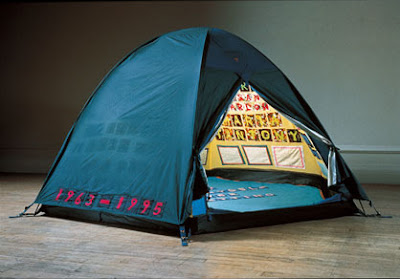
There is one other feature of Black Book which distinguishes it from the other book paintings: it is permanently opened – sealed to this particular spread. This creates an instant ambiguity: we are (book-wise) in the center, yet simultaneously at the end determined by Sepielli. The iconic B then, is afforded even more power, because it becomes a pointer (as it does even by virtue of its shape) to the previous narrative (the alpha) – leaving us to guess at the rest of the narrative, or alphabet, if you will. It is therefore ironically even more of a mystery than the closed books are: having been afforded the sense of “readability” by an ostensibly open book, the conversation and narrative are more titillating than a book of which we are given only the cover/surface. There we are given a surface with the informing logic of a book (trope); here we are made to attempt to read it – that is, approach it as a book rather than a painting – to ultimately little avail. Does Black Book intimate the infamous bachelor’s “little black book”, akin to a Tracey Emin embroidered confessional tent – and leave us wanting and wondering? We cannot be positive; and thus this is a work in control of itself; drawing strength from its limiting (and limits); both revealing and withholding. 


(Tracey Emin, Everyone I Have Ever Slept With, 1963--1995, 1994).


Read more...

Wherefore painting? (part 1)


(Some thoughts garnered from a few hours at Matthew Sepielli's new show at Tiger Strikes Asteroid...)


 What is central to a painting? What is at its core; both physically and philosophically, and most fundamentally, how are these related – or are they?

The reason Matthew Sepielli’s paintings are a good case study for these sticky – and dangerously unanswerable – questions, is that they are overwhelmingly corporeal; meaty and unavoidable. These are objects for which titling seems nearly unnecessary – their presence alone speaks with a certain enough voice to eliminate any overt need for textual specificity. And yet, Sepielli does title them; attaching small rudders to these already careering vehicles. Some of these paintings are indistinct color studies; each color morphing into another, Kosoff-like; line being a near non- entity. In others, the matrix itself is delineated literally, with connect-the-dot-style mapping nets, elbowing and hinging their way across the soupy surface: and in this case, color is sublimated. This seems to offer the beginnings of a thesis: no one formal concern is paramount; indeed as is intimated in Sepielli's press release, the organic exploration informs directly which element or elements the piece moves within and towards – and what materials are intuitively grabbed  and incorporated. Is it then the experiment itself which forms the core of these works? Perhaps…but to posit a more succinct theory, I believe the choice and features of the painted-on form/surface most closely directs the path of the paintings, in a roughly-centralized manner. That is, rather than line in this one, color in that, and surface in yet another, the actual depth, perimeter, dimension and sheer thing-ness of the painted-on form/surface (or object, as the case may be) most universally drives Sepielli’s paintings’ direction and eventual conclusion. 

The series (and this term is used as loosely as I believe Sepielli might use it) of books as surfaces/objects focus in even more closely on this core driver of Sepielli’s work. As with the other paintings, the compositions on the books are centrally organized, but depending on the piece and the choice of incorporated collage that is appliqued to the surface, the perimeter is occasionally pierced slightly by those added elements (or literally pierced, as in State Fair). (The frequency of this does not work against the surface as prime-driver argument; rather it is fairly consistently utilized; enough to consider its absence as the “exception which makes the rule”).  A book, in the beginning as that alone, is an understood and fully-logicized entity, physically: it is read as being complete in its form. In this way, even before becoming subsequently a surface, it exerts a strong influence even on the final parameters of the piece. In other words, the logic of the book, even before paint is applied, reaches ahead of the artist and places certain defining limits and stops on the process. This is a highly organic comingling of mind and matter; past, present and future; meta- and micro-reality – becoming not unlike one of Karl Jung’s famous anthropomorphic Archetypes.

But why these particular limits from the very concept of a book – and why does this feature prominently in these particular works? Put simply, the strongest component of a book’s overall logic is its narrative (meant in the largest sense possible); that is, we logicize and assume, through long and absorbed experience, that a book has a distinct beginning and distinct end, with a center of some length between. And not only is this a theoretical and psychological dimension, it is wrought physically in a form, for us to know tactilely. Therefore this narrative logic is multi-leveled, and that much more pervasive and persistent, placing a particularly strong defining logic on anything added to it, even if that addition, for all intents and purposes, is primarily physical in nature. Thus, Sepielli’s paintings rely heavily on, firstly, the force of surface and form; and secondly, the book “series” even more so because of the forth-going, extrapolating narrative logic. 

 (All images, Matthew Sepiellli, 2010. Titles, top to bottom: Pig Meat; State Fair; In a Fine Net)


(Part 2, next week...)

Read more...

In3s: two paintings

Here are two of the three paintings that will be in In3s at Artspace Liberti, Fishtown, opening this Friday evening the 3rd:


Pique, latex, enamel, collage, found object on panel, 2010.


Parade Rain, latex, enamel, collage on panel, 2010.

The opening reception runs from 7 - 10 PM. See you there?

Read more...

TSA Essay: Thomas Vance: Plan

For those who didn't make it for the opening, or had trouble finding the essay I wrote for Thomas Vance's new exhibit at Tiger Strikes Asteroid, Plan, here it is.


    Thomas Vance, 2010

Craft is a bridge. This image alone imparts a finely-tuned sense of the cause-and-effect of tools on a concept. Craft itself is a tool to make sense of the area between impulse and idea, where a finished work will eventually result. It also lends a sense of trickery to the workaday. And, how is the viewer engaged? This too carries a sense of craft; of willing wiliness. Craft will tend to be antisocial; anti-modern; anti-change. It is defined by gathered knowledge; private skill; proven technique; quality repetitions.  Because of this, craft can adroitly chisel out a beautiful rut for itself. The trick becomes old.
Thomas Vance’s exhibit of new work, Plan is, strictly speaking, a trompe l’oeil: both expertly constructed and finished, those same constructs and finishes fool our eyes, suggesting otherwise to us: the delicate hatching on an upright board suggests bark; the painted flow chart-like patterns suggest wood’s graininess; the puffy, turquoise jewels suggest trimmed shrubbery. But unlike trompe l’oeil, Vance’s surfaces are never fully a substitute: the trickery (craftiness) is never a less-than; replacement or simulacrum. They exist, rather, on their own – his piquant trees are stubbornly autonomous, morphed into a hushed, almost introverted timelessness. Faux-grained chests, originally made to mimic the richly-veneered case-pieces of the wealthy, may once have served as a consolation prize for a lower-class dowry, but they quickly became their own, powerful definition of beauty in artifice.
Not only that: Vance, the chief sorcerer in this mystic, aesthetic re-appropriation, has tricked foam, dimensional lumber, paper, clay and pigment into thinking they are a garden, or a lacquered floor. Much like the Japanese tradition he’s inspired by, Niwaki, one element of nature (shrubs) are tricked into thinking they are another (clouds). Interested in both sides of this equation, Vance utilizes not only his painted trees and interiors, but also painted wood that might have been sawn from those trees, and clad those floors – both painted on materials made from the actual thing. This brings to mind the phrase “inside-out” – implying a sense of being backwards, confused or reversed. The trickery, however, is only skin deep; the answer only a finger’s breadth away. And coupled with the reverse of that phrase, “outside-in”, we are reminded of Vance’s keen fascination with connections between the garden (traditionally an outside space) and architecture (traditionally an inside space), and the crafty places in which they meet, mingle and overlap. Plan is a deliberate experiment in that arena; craft lends directly into our visual ambiguity.
Nature is not crafty. Nature is direct, forthright and brusque. We may see craftiness in nature, but it is normally anthropomorphistic: we see a resembling reflection. Craft is a (nearly) thoroughly human distinction. Yet, we operate in nature; the places and materials we utilize and create in our craft are inevitably of, in or from nature. Houses must have a skin which touches air; gardens must be given light, otherwise our very definitions begin crumbling. Vance’s faux gardens and interiors then, are important neutral places between humanity’s craft and nature’s resoluteness; a mental or psychological resting place; a bench between impulse and idea. His work is a reflecting pool, in which the trees above us are juxtaposed and framed with our own bodies, on the very same – very physical – surface.

Read more...

Reflections on Painting and Cultivation


 (above, Warren Rohrer, of Yellow 9, oil on canvas [diptych], 1994).
 Painting and Cultivation
The artist Paul Klee, so it’s told, had three great loves, one of which he became internationally famous for: art, music and cooking. The latter two, most certainly sustained both him and the first great love, in many intermeshed ways. Music and its lyrical, rhythmical, logical, as well as visual qualities, is readily evident in much of Klee’s work: the meters, the brassy lilt and line; the bars and note-like figures; the titles alluding to music of the spheres and the instrument – all feeding off the second love. But what of the cooking? In my readings on Klee, it’s mostly self-referential, this love of cooking – and perhaps it really was “number three” in a hierarchical sense. But my inclination is to think of these three things, these three loves, as being hierarchical only to the outsider, the critic and the clarifier. To Klee himself (speaking as a fellow artist) I’m sure they were more egalitarian, and cross-complementary than even the most attentive of us may know.
I’ve noticed this “layering” of talents in many artists I’ve known personally, or have read about: one talent or love stands out, but there is usually at least one other which is more latent; more personal and perhaps self-indulgent – but no less important. Two disparate examples include E. E. cummings (a passionate illustrator to help pay the bills), and secondly a close friend of mine who, brilliant painter “by day”, has also been an accomplished musician for years, to the point of being recorded. Continuing with this model, my passions are art, writing and gardening (or cultivation, as I will direct it here). Much crafting, so to speak, is carefully and ingeniously re-defining repetition within a particular model, or set of limitations. Cooking, music, writing, art, and gardening – all work within that definition of “craft”, writ large. Taking gardening as the working example, cultivation is a clarifying direction. Cultivation implies not only providing an appropriate condition for growth (as in the sense of weeding and tilling soil), but as every gardener will tell you, much repetition. It must be done over, and over, and over. And here is where love becomes operative. One must have at least a modicum (and ideally, more!) for the chosen repeated love, or otherwise it fails its own definition. Cultivation also implies a continuity of tradition, or form, but more on that later.
 (above, Warren Rohrer, Four Fields)
 This distinction suggested itself to me upon seeing anew a canvas by a painter named Warren Rohrer, entitled Christiana Boogie-Woogie. Appropriately parsed and contextualized, this title alone states much on this subject. Christiana, Pennsylvania, near where Rohrer’s roots lay deep, is a predominantly rural, agricultural area, with repetition of the landscape sort abounding. Rohrer himself was from a devotedly religious, farming family, all tropes including copious amounts of both cultivation and repetition. The Boogie-Woogie portion of the title, the art-savvy, brings to mind the influence of Piet Mondrian’s seminal, visual-dance-step of a painting, Broadway Boogie-Woogie – an obvious (inclusion-wise, if not immediately visually-wise) influence on Rohrer’s practice and thinking – and tradition. By this title alone, again, Rohrer bridges two usually disparate worlds: an agrarian, sectarian world, with that of an urbanized, dynamic and a joyfully-structured high-modernism. That bridge, as I realized recently, could be considered as nearly synonymous with cultivation. And being an inveterate gardener and artist, familiar with cultivation of both the horticultural and artistic varieties, it seems a helpful connector. But where, formalistically, might the connection continue? Rather than starting formally inside the painting (as is normally my wont), let’s begin with gardening (or horticulture). Whether one espouses a Western (linear; spacious) or Eastern (triangular; compact) aesthetic in one’s horticultural practice, order is necessary (as opposed to flower gardening, which is often a different animal altogether). It is necessary because of cultivation: an element of careful balance between control and freedom is essential. One must realize that a complete ordering of a natural environment is impossible, and naively utopian (or dystopian, depending on your viewpoint). This then brings us to the “form” portion of “formal”. Part of traditional gardening, unlike modern industrial farming, is great variety. When cultivating a diverse garden, then, “small” forms (specific cultivars; individualized, custom techniques) lie within the larger forms (soil augmentation; bed preparation, etc.) Both are integral to that cultivated balance. And one picks up from where, so to speak, your tradition left it – sometimes to the point of refreshing it with alternative cultural traditions. Geniuses such as J. I. Rodale, or Jackson Pollock, take those traditions and squeeze them, scour them, and set them on new (or as is often the case, new-old) paths, where they’ve strayed. Not all of us have this panache, but nonetheless, painter and gardener alike, work within, and push the edges of, a tradition of cultivation. Find an image of a late 1970’s Warren Rohrer painting, and observe the brush work. They are nearly of the same mindset as a plowman on his tractor, pulling the monster tool behind; glazing over in the pleasurable mundanity of the task: the familiar place; the newness layered on to the utter sameness. Is the danger also, as well as the redemption, evident in this? Each row is new, yet near to the previous year’s path. This harks to another seriously influential component of modern painting (especially of late Modernists such as Rohrer): the often minute changes between canvases, or works. That subtle change – tweaking – is the revelatory gap between one spark of discovery and subsequent experimentation, and another. And even though I hoe along with a multiple-thousand year tradition, I still teach myself – and the practice teaches me – because neither painting nor horticultural cultivation are static, but rather are continuums, subject to change, however glacial a pace it may be in some eras. Though we may stand and work in the same places, our experience is always glazed with that crucial, titillating layer of discovery. 


Read more...

TSA Essay: Jukkala and Rosenthal

Wow, it's been over a month, folks...so here's a little taste of some recent writing I've been doing. This is an essay I was asked to do, for the June show at Tiger Strikes Asteroid: Clint Jukkala and Mia Rosenthal.

(below, Mia Rosenthal, General Mills 8-pack


There are places to which none of us can ever go…or return. The past; others’ heads; the womb; the place to where loved ones have crossed over. Likewise, we all have talismans which impart a certain sense; a sliver of the unreachable place. For Mia Rosenthal, her straightforwardly sweet simulacrums of sent and received postcards impart a second, more spiritually acute layer to an already powerful metaphor for those places we cannot go, or cannot be, or are not – and those people who inhabit them, or are passing through before us. On the uncomfortable cusp of welcoming a new life, Rosenthal found comfort in celebrating a recently-departed life, painstakingly reinterpreting the talisman of shared postcards – those small purchased icons of travel and exoticism; the skimmed-off leftovers of a life’s memory.
For every sensory sliver from place to place, a vector is needed, and Rosenthal also sensed this correctly by making a postmortem catalog of part of her aunt’s stamp accumulation – bringing some coherence to what had been a haphazard habit in waking life. An even smaller icon of the connections between unlikely places, stamps like postcards, being quickly outmoded as they are, also impart a sense of nostalgia and whimsy to what could be an otherwise dour examination of life’s ends and passings.
An even more familiar rectangle, along with postcards and stamps, is the doorway. Likewise a domestic and familiar limnal presence, doorways are an even more fragile and immediate skin between spaces. Stamps and postcards bring home some of the exotic and unreachable to us; doorways allow us to be more active in movement through. In a way, they could be seen as the negative to the postcard’s positive: the closed card a symbol of the desire for the open door. Clint Jukkala previously worked more with the positive – shakily digital renderings of top-heavy bouquet forms; or slowly branching, slow-motion fireworks. Recently though, Jukkala’s bouquets have dissipated and migrated to the edges, and suggest portals, or doorways; the promising rainbows enveloping and bordering, rather than blossoming or branching bouquet or fountain forms.
Rosenthal’s approach is talisman, but clear; Jukkala’s more at-hand icons on the other hand, is ironically, more ambiguous: are we entering or exiting those doorways; portals? But not unlike many of the color and square studies by Josef Albers, the spaces and ways through are infinitely commutable. The essence really is the movement through – the process – rather than the direction. No matter what space or place our life is finding form within, a human yearns for a little of another – and we will continue to find talismans for that yearning. Jukkala and Rosenthal have found related, but aesthetically divergent, ways into that yen.

Check out their portfolios: Clint Jukkala and Mia Rosenthal

Read more...

Brief: Max Cole at Larry Becker

(P. A. Renoir, Before the Bath, oil on canvas, c. 1875, BF9)


Two very different artists (or are they?) connected themselves in my mind recently: Max Cole, and Renoir. I knew little about Cole until I saw the advertisement for the exhibit, now up through May at Larry Becker Contemporary Art in Philadelphia. Max Cole is an older generation Minimalist painter, who uses traditionalist materials – oil, canvas, etc: even Renoir himself would recognize that if seeing her work from the beyond. She is, a la Agnes Martin, a rural Midwestern transplant to a New York oriented world, but who retains the Midwesterner’s sense of extremes: horizontal and vertical; smooth and rough; dark and light; ground and sky. One is almost even tempted to create a mini-school for them: AgroMinimalism. Or Fieldworks. At any rate, the affinity is noted, and helpful.
Renoir needs no introduction, but since the connection mentioned was painting-specific, that at least should be given: Before the Bath, BF9 in the Barnes Foundation collection. It is a classic Modernist bath scene, and a fine Renoir among Renoirs (and that is no small statement regarding the Barnes Foundation, which holds more Renoirs than any other institution, save for the Victoria and Albert in England). She is fixing her hair, with a sweetly demure smile, and is sitting before a bed with a mattress covered in ticking. Now, before I go further, there are two words which emerged while I was cultivating this connection: depiction, and intention. A bit dry, perhaps, but they are the double linchpins, so to speak, that hitch these two painters (and paintings) to each other. Hitching also creates friction, which as we know can begin lighting a fire in one’s mind. The ticking which Renoir depicted is brushed off fairly easily – a few broad strokes of a deep ultramarine; some thinner lines of an analogous color, with some white in there modulating towards volume, and there you have it: a supporting member of the cast. Renoir has intended this as no more than that; it is undoubtedly in service to the bathing girl; indeed, even the bed itself. And yet where would that corner of the painting be without the depiction of the ticking? Renoir’s intention enacted this depiction.
 
 (Max Cole, Sandspit, acrylic on linen, 2009) Larry Becker Contemporary Art
The ongoing decades of Modernism rolled on, and painting’s role made several sea changes, until we arrived to the late 1960’s, where Cole’s and Martin’s method and interests have their origins, and indeed from where Cole’s current work still draws parallels. Intention takes a dive into Renoir, needing more, and sensing that it’s in there somewhere; still holding some oysters beneath the surface. What she has found, and then runs with, is a question of fundamentals. And fundamental is an appropriate way to approach Cole’s 2009 painting, Sandspit. It is a carefully, lovingly constructed matrix of thick and thin; dark and light. The aberrations of human touch is not rejected or suppressed (as neither was Renoir’s, as a matter of course) but rather incorporated and nurtured. Does the manner or mode of making these marks (depiction) analogous to Renoir’s ticking, have some grander (or deeper) possibilities for intention? No answer will be provided here, but like Martin, Cole frequently names – embodies, more like it – her works with natural and occasionally spiritually-infused titles: Starfield; Sandspit. Thus we always seem to be pushed (gently) towards another characteristic of AgroMinimalism: the loving analysis of those extremes mentioned earlier, through classification; dissection; grid-making and categorization. But on the balance, like most conclusions of science, an irreducible core of mystery remains solid, and the allusions always are suggested, never tyrannical: there is always wiggle room.
And wiggle room might just be a good descriptive phrase for painting’s continuing move through post-modernism and beyond – where Renoir, unquestioningly, stated “ticking!” Cole has loosened up the reins, and given us some Midwestern populist latitude. Po-pomo-western, anyone?


(detail, Sandspit, acrylic on linen, 2009)
Larry Becker Contemporary Art, Philadelphia


Read more...

A Wink and a Nod...


Three not entirely unrelated notes from this past week and a half:
Note 1: a Wink
I’ve been reading a book (much of my reading takes place on the bus these days) entitled Engaging the Powers: Discernment and Resistance in a World of Domination, by Walter Wink. I won’t go into detail about the content right now, but suffice it to say it’s been shifting my worldview slightly…as well as my thoughts about the differences between “nonresistance” and “nonviolence”. For anyone interested in activist theology, neo-Anabaptist leanings, and a call to rid ourselves (as Christians) of the destructive myth of redemptive violence, I would highly recommend it. I certainly don’t agree with everything Wink is saying, but as the best writers do and the best writing does, Wink keeps the questions and discussions open. It is masterfully done, and highly thought-provoking.

Note 2: and a Nod
An artist whose work has been highly influential to my own over the last few months is Corey Antis. His work was featured in Tiger Strikes Asteroid’s January show, and its qualities have been resonating with me ever since. In fact, one Saturday as I gallery sat, I distilled some of what I thought was highly effective about Antis’ work, and re-defined it for myself as a form of several “New Year (work) resolutions” (it all centers on consistency and standards, essentially):
·         Paintings all collared and edged in same white paint.
·         Three at a time; colors between.
·         More steps and more creativity with tape usage.
·         More uniform sizes, and standard collar depth.
·         Edges of found surfaces, also edged in white.
·         Don’t be afraid of texture!
·         Be more disciplined with periodic making of panels.
I’ll talk more about this once I upload some pictures of my recent work.

Note 3: Class
Some of my more dedicated readers may remember my postings from this past fall and winter on the class I led at the Barnes Foundation, Investigating the Spiritual in Art. I am working on a syllabus/concept for a new class for this coming fall. The (rough) working title is Humans and the Modern Landscape. Briefly, it will deal with the two overriding concerns (as I see them) in the Barnes collection: the ensembles, which are wall arrangements which are both internally constructed and didactic, and also connect with the collection as a whole, philosophically, psychologically and formally (and I’d add, unsurprisingly, spiritually); and the two dominant formats of modern paintings (the bulk of our collection), namely, portraits or depictions of humans, and landscapes or depictions of environment or the natural world. The class sessions will be constructed of contrasts: urban/rural; civilized/savage; European/American, etc.
The Spiritual in Art class was loosely arranged around a wonderful book, An Art of our Own: The Spiritual in Twentieth-Century Art, by Roger Lipsey. The search is on for a book which could function in the same way, for this new class concept. 
Any ideas?

Read more...

March of the Romantic -- Jaya Howey at Marginal Utility


The In Acts Out: Jaya Howey at Marginal Utility.
Mr. Howey, I’m confident, does create a “humorous contrast” between the highly-considered surfaces, and the flippant, banal titles of his paintings – but there was no way I could really know. Marginal Utility decided to hang the paintings – runic slabs of  mostly wet-clay, warm-gray, over various brightly-colored underlayers – without any text or explanation, save a cryptic newsprint scrap such as Marginal Utility is fond of. Only the ebb and flow of Howey’s thicket of marks were there to guide the viewer – and I’m entirely fine with this. Though it may turn off the casual visitor, or the “post-painting” painting neophyte, those who are already very interested in both the materiality of painting and the nascent ideas of painting, will feel themselves drawn in regardless. (A risky hang tends to divide the art-adults from the art-children, anyhow).
As I discussed afterward with a friend along for the visit, my frame of references includes many artists whom I, upon meeting new work, will almost unconsciously associate and categorize them with. It’s a mental sorting which helps with both looking and articulating. Upon viewing Howey for the first time (and it must be said, that I only know this Howey body of work well; his practice is widely divergent in style) within a minute I was thinking of Warren Rohrer. Rohrer is one of the local painting scene’s best hidden secrets (unfortunately); he was at the height of his powers during the eighties, dying in 1995. He utilized a similar push-and-pull exercise as Howey with the materials of paint, and with the possibilities of surface as a repository of ideas and belief. Brightly-colored, heavily influenced by drawing, calligraphy and the agricultural landscape (a kind of Updikian painter), Rohrer’s work is decidedly painting; there is little credence given to the possibility of post-painting – he is still feeding fundamentally off the abstract expressionist’s tap. Whereas Rohrer created an internal language of marks within each piece – only incidentally connected to the whole, his personality really being the consistent touchstone – Howey’s works are strongly reliant on the whole. The sparseness of stimuli almost requires this, so it does not collapse under its own weightlessness.  Indeed, as the press release states, Howey’s pictorial surfaces are pushed just shy of “compositional stability”. But again, whereas in Rohrer this is accomplished by an overwhelming flood of color, strata and mark-upon-mark, we’re given the most economical of means by Howey – but to the same end essentially: co-identification. Howey wants us to find a way in as much as Rohrer, but because each of them is drawing off quite different tributaries, their flow is divergent. But the same wide river of painting is nonetheless fed.
This paucity of “compositional stability” is what really appeals to me the most – that is of course, after the pleasingly moist-clay gray oil; the subtleties of brightness under the murk, and the beauty of the scratching – put simply, the gorgeous formality of it all. In fact, compositional stability increases, as the implication of painting being legion tells us, the more one takes in (or is taken in by) the entire show. Rather than being given a collection of short stories (there’s Updike again; how modernist!) we are seeing the chapters of a novel. In German, “novel” is Roman (pronounced roe-monn) – and the role of neo-romanticism is evident. The romance in Howey’s paintings though, is not of the hero, the hapless sidekick or the wooed woman – it is rather the story of painting itself. Each scratch into the paint, creating the buzz of moist burrs, tries to accomplish what all romantics are after – a direct line from the body to the heart…not a cord to be twanged at whim, but to function as a real tap for real emotion. In the current environment of high irony as craftsmanship, and winking, humorless humor, this is a tall order. But I believe this neo-romanticism will continue to march in, even if on matchstick legs such as Howey’s. Bravo to him for realizing it, and bravo to Marginal Utility for verifying it by making us rely on the old-fashioned gaze for information. How romantic is that?


(top, Jaya Howey; from www.marginalutility.com)
(below, Warren Rohrer, from www.locksgallery.com)


Read more...

Art Thoughts, Week 46: David & Conflict


Crucifixion Scene with the Virgin, St. John and the Magdalene, Gerard David, Netherlandish (1460—1523), oil on panel, BF123.

Even when writing about paintings, auto-pilot can attempt to take over. Whether through routine, boredom, distraction or stereotypes, occasionally the same words, the same thoughts, the same associations float to the top. For this particular painting, Crucifixion by David (pronounced Dah-veed), that particular temptation to be rote came from genre. This is firstly a religious painting, and secondly a crucifixion: a genre so ubiquitous as to elicit a whole corral of pre-programmed expectations. Ironically, my sculpture professor used to say the hardest thing to depict seriously in art is the cross: it’s just been done too many times, and too often poorly. But even though this happens, one must keep looking, and keep writing. 

The important question which finally emerges is what is there about this painting’s unique voice which helps it rise above the babble? By what aspect does this piece distinguish itself? Though an academician, and subject to the whims of his patrons, David was nonetheless his own person, and most importantly his own painter. Otherwise (to grow momentarily snarky) how would one know if it was a Van der Weyden, Tintoretto or Gaugin crucifixion that we were looking at? You get the point: aesthetic signature is important; primary, even.

But what else – any particular emotional undercurrent which pulls or pushes the painting in one direction or another? There is such within this painting, animating it…and there is a companion set of color choices by David (supported by convention) which set up both a support and a denial of that emotional portrayal. In other words, the painting’s components take sides. Another professor of mine, this time in literature, stated that all fiction, at its core, has a driving force of conflict behind it. It is a raw touchstone for humanness. And really, what more conflicted scene could one imagine for a 15th century Christian? They, along with the figures here, are stuck between a promise and a reality. That is, the promise of resurrection and renewal, and the harsh reality of an expiring fleshly form.

To illustrate the basic conflict, look at two of the figures. The emotional conflict is primarily represented in the central figure, Mary the mother of Jesus. (Mary Magdalene, the third in the group, is sometimes shown at the foot of the cross, but the scriptural reference supports this being the Virgin, since John is comforting her). Not only is her entire gesture and weight attempting to hold Jesus down, but also the darkest colors in the painting are found in her cloak, causing the greatest balance of weight – compositionally and emotionally – to be on her side. And this makes sense: it is before the resurrection, when reality holds sway. Her emotional response of wrapping around the cross and Jesus’ feet and holding on for dear life, accentuates the necessity of Christ’s eventual ascent – here signified iconically by his outstretched arms, seeming like not so much a crucifixion as an attempt to fly up into the air, right then and there.

John the disciple, the figure on the left, is opposed to Mary emotionally and by color. He rushes in (by evidence of his flying, flaming cloak) and comforts Mary with the promise aspect of the equation –while likely being unconvinced of its verity. With his shocking crimson coat, he represents the passion with which he takes up the duty of looking after Jesus’ mother Mary…despite the doubt; he shows why he is the “disciple whom Jesus loved”: he is devoted despite overt emotion.

Mary Magdalene represents, I believe, the place where most viewers will (and should) find themselves (knowing, after all, how the story ends): at the place of sorrowful readiness. She has a vessel which most likely holds the embalming spices for the burial. That is, she is neither pinioning the promise like Mary, nor bemoaning the reality like John…she is rather, prepared to move on and step into the future, regardless of what the details may determine. She remains, after everything, that belittled – but far from little – giant of faith.

Read more...

Folk + Abstraction: Core Aims


For a long time, I’ve been fascinated with the overlap between folk art and abstraction, and so here comes a New York exhibit I’d love to visit: Approaching Abstraction, at the American Folk Art Museum. There are many stereotypes about what folk art is, or where it comes from, but at the same time, the definition really encompasses an impressively wide spectrum: everything from Pennsylvania German, my personal favorite, to Mexican "outsider"collage, and all stops in-between.
The question I’m most interested in however, is: why abstraction? The answer can often come too easily. By nature of the work being by the “folk” or the common person, this often is meant as “untrained”. And academically speaking, this is often true – but not always. And here I think a key statement can be made: abstraction in folk art, being a step farther past the normal stylization, must have another impetus. I believe that “step farther” could be called core aim. I mean this in the sense which caused medieval artists to be almost wholly unconcerned about scientific perspective (vanishing point, etc.), only to have Renaissance artists pick up the very same principle and crown it king not long after: core aim. That is, what was the prevailing sentiment among artists of that particular time, culture or persuasion? What did they care enough about, to be picky about? And for folk artists, ignoring verisimilitude is not simply a necessity (i.e. something they couldn’t do), it’s that it didn’t really matter that much to them – it wasn’t their core aim
Now, as opposed to Abstract Expressionism, or even Color Field painting, abstraction was not so much a cause or a maxim, but simply a by-product. Thus the great inspiration of folk art to subsequent Modernists (the most famous example being African artifacts to Picasso, Matisse, Rouault, etc.) The Modernists and later artists picked up on the aesthetics of abstraction; saw its potential as a rallying cry and possibly an egalitarian tool, and they crowned it king, after overthrowing perspective. And that by-product of folk art, abstraction, seemingly emerged from certain limitations on the folk artist: training being one, but others being material limitations; narrow cultural beliefs, forms or distinctions, and of course time. Folk art in many cases was purely a sideline as far as commerce went; very little money was likely made. It was decorative; memorial/commemorative; life-affirming.
In my own work, I feel like those two core aims – that of a rallying call and egalitarian tool of the “high” abstraction and the formerly mentioned aims of folk art – come together. I am excited to see if this new exhibit sheds any more light on what that might mean for not only my work as it moves forward, but for artistic expressions writ large. 

Read more...
Related Posts with Thumbnails