Thoughts on Gone Formalism

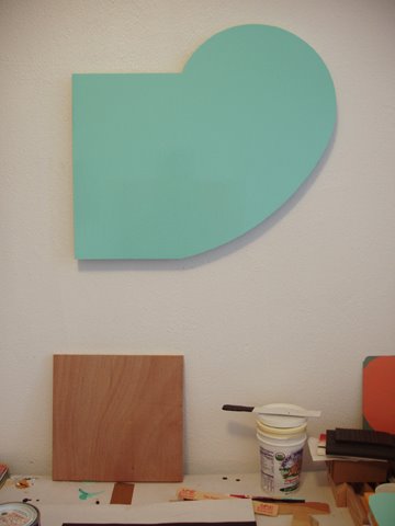
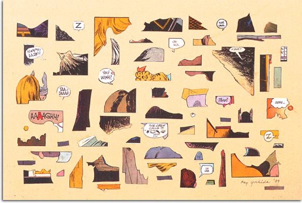
(above, 2005 installation shot of Mark Grotjahn at Blum & Poe)


I went to see Gone Formalism at University of Penn’s ICA two Sundays ago, before it was, well…gone. The exhibit was nicely arranged, but I was unsure about the curatorial premise at first – largely because (in an egotistical way) I couldn’t figure it out. That is, if one criterion for “good” curating is that the premise is penetrable by a reasonably educated viewer. It eventually began making some sense to me in my own grappling with the word and concept of formalism. (Reading the exhibit essay afterwards, the curator seemed a little loosy-goosy on the premise as well.)

Regardless, I continued to ruminate on formalism while walking through the show. The word formal has always signified to me an overriding concern with the basic elements of art making: color, line, space, composition, material, etc., as opposed to more idea-based, conceptual concerns. All of the work was in some way concerned with those issues of the visual experience. Though both were in play, the bent of Gone Formalism was largely conceptual rather than literal. And when I say conceptual, I mean both within the pieces themselves as well as among them – in the joints that held this body of work together.

For example, Jessica Jackson Hutchins’ White Mountain – a leaning, icy ski-slope of a sculpture – is really a façade covering its true source, which cannot be seen until moving to the opposite side. Doing so, we find the structure is built of a material that is the epitome of ephemeral – papier-mâché of newspaper. There is a shock here of the elemental, when set into contrast with its intrinsic opposite, the farce. And yet the foolery is grand; the formal aspects pump life into the concept and its irony. (This foolery is turned on itself in another piece, The Philosopher’s Stone; again of papier-mâché, but in this case with embedded, real pyrite – fool’s gold). The whole thing has a curiously tipsy whimsy, which only increases its appeal – somewhat akin to the glee imparted by a model railroad’s paper mountains. The formal source (paper) is evident in this piece, as well as the formal product (fake mountain), but having been melded in this way, they become conceptually valid and inseparable. Perhaps I have stumbled upon an accidental definition of art itself: source + product = art. Or maybe not.

http://www.derekeller.com/jessicahutchins_work.html

Elemental almost equated formal in this show. I also found that concept and form were in cahoots…sometimes towards somewhat sketchy aims. Nonetheless, the formalities of Gone Formalism were continually exposing, revealing and examining the core elements of artistic construction – in both a conceptual and a literal (tangible/material) sense. Elemental became a clarification of formalism.

A further example of this was the so-called Butterfly drawings and paintings by Mark Grotjahn. They are beautifully executed with tightly-packed lines, often black, white or red, radiating multi-directionally from a central line or lines to the edges of the surface, creating the sense of a Suprematist angel. Their actual genesis is exposed: the vertical flat-line(s) from which each of them begins to take shape, or flight – where the form transmogrifies. How appropriate then, that they are called butterflies. We see the product, and the conceptual creature that has emerged from this chrysalis line of the works’ formalities has made this relationship, if not clear, clearer.
www.blumandpoe.com/artists/markgrotjahn/2005/index.htm


In Gitte Schafer’s work, this formal relationship between source and product takes an interesting twist. Her pieces, constructed of found objects such as floor lampposts, baskets and plastic dishes and arranged in copses on the gallery floor, are curiously totem-like. Interestingly enough, the source and product seem to be one and the same here, in a strangely self-generated way. It seems this work only needed a pair of mortal hands to allow them to escape. This thought reminded me of the story said of Michelangelo, who was supposed to have seen the future sculpture trapped in the marble chunk, only needing to “let it out”. In Schafer’s pieces, indeed in the entire installation, the work itself is the formality. The formalism is pure, seemingly revealed rather than created.
http://www.perryrubenstein.com/home.html (click on Schafer's link on main page).


The formalism in Liz Larner’s work, especially her mixed media cubist sculptures, is not only found in the elements of the piece itself – shape and color – or even the previous artist’s work, whose color schemes she lifts and reapplies to her pieces: it’s a strange and fascinating hybrid of both. The formal elements exist in all three spheres: the past, the present, and the future of their connection – which, of course, is always becoming present. That is, the pieces are floating in an odd formalistic space that is between source and product; concept and realization. This sense is heightened by Larner’s adoption of a molecular style – simultaneously grounded and tenuous – which speaks of elemental typologies. www.303gallery.com/artists/larner

Formalism, then, in this exhibit, was indeed “gone”, in the sense that it was far beyond that term’s traditional parameters. Indeed, much of the work was in a foggy, alluring space of questioning, exuding the tension of potential energy instead of the jaunty kinetic. The formal aspects of the curating were somewhat dry, but luckily the formal envelope-pushing of the work largely saved the premise from itself.

www.icaphila.org/exhibitions/past/formalism.php

Read more...

Ay, Marron!


(above, picture of Kew Garden's cafe marron plant, cloned from the last remaining plant in the wild, in Mauritius.)

I just had to share this sweet and fascinating story from NPR's All Things Considered, with which I was enthralled the other day. It's all about a once thought-to-be extinct wild coffee plant native to an island of Mauritius. The story bridges different generations, continents and scientific expectations. The best way to experience the story is to listen to the audio, on the NPR website:

http://www.npr.org/templates/story/story.php?storyId=5307047

Read more...

January, 2006


January is a painting I finished recently, done on a cut plywood panel, inspired by my mood in January and how the month felt to me. (It also has reminded me of how much I owe to Ellsworth Kelly.)

I've talked before of how I'm fascinated with things which are "on the edge", or transitional, so the month of January and the god Janus who inspired the month's name are an obvious connection. Also, there is a union of two things or feelings which have, at the same time, very little and a lot to do with each other. Anyway, the painting is One-Shot gloss enamel on plywood panel.

Below is a shot of it with various studio objects, giving it more of a spatial context.

3/27/06: (And no, Rubens, I haven't changed my mind about this being a sort of self-portrait...or more specifically an emotional self-portrait of that particular time.)


Read more...

Studio pictures coming...


...I promise folks. I've been at the studio a lot recently (comparitively) over the last month, and have been working on some exciting paintings. Part of the motivation has been that someone is interested in buying my work, especially larger pieces...this has been a blessing, as I've wanted to "go big", but had various excuses to not do so until now.

Anyway...pictures coming!

Read more...

Spring in America, Part 2


This season is one of the times when I most wish I still lived in a rural area...to be able to watch the slow unfolding of green is an amazing thing. One can find this in the city as well, but it doesn't have the same impact as it does when it is en masse; the luscious inevitability of it; the unstoppable burst of season change...as indefatigable and constant as a sidewalk giving way to a tree root: persistence made powerful.

That said, I've always admired things that are limnal; that are on the edge...that have elements of both sides, but are still their own. For that reason, I have long admired people like Thomas Jefferson, Wendell Berry and others, who so wonderfully bridge the common cliche of the "country person" and the "city person". And not necessarily in a sense of simply spending some time in the city, and some time in the country, or even being a wealthy person buying a country estate. Jefferson, for example, was intensely interested in farming and horticulture, as well as more bookish concerns such as philosophy and politics. He was not just a city person living off the fat of the country; he was intimately involved in rural concerns - at the least, in a somewhat American-style feudalism.

Wendell Berry is someone born and bred and dyed-in-the-wool country; but he too has a bent which normally lends itself to a "citified" definition: he is a poet; writer; essayist, as well as a tireless farmer and proponent of agricultural, environmental and political reform and protest.

These two gentlemen I hold in the highest esteem. When I encounter someone who is both interested in the fine arts and is a hunter, for example; or someone who is a rough-handed farmer who writes poetry; or someone else who is an amateur theologian and socio-economist, but plants peas throughout his backyard: these are the people whom I admire the most of all when I meet them. I once met a man from central Pa. who is both a surgeon and a beef farmer. These people who aren't afraid to hitch their brain to a plow, and get dirt as well as ink or paint on their hands: these are on my pedestal. In the same way, I secretly revile people who play up the element of the "yahoo" or the country bumpkin, for their own political or social motives...this is the twisted, malevolent side of what I've mentioned above.

Well, what does this have to do with spring, you ask? This is the season when I consider what it is that I'm doing; who I am and where I'm going, and I hold myself up to my ideals. Gaugin entitled one of his masterpieces (I can't remember the exact title) Where have we come from; where are we going? (link to the painting, compliments of Rob Matthews...thanks Rob: http://www.harley.com/art/abstract-art/gauguin.html)

My ideal is to be an individual such as these two men...unafraid of books and plants, skyscrapers and cornfields alike; unequivocally unafraid of, and unashamed in, any place, be it city or country, and able to question and challenge regardless.

Read more...

Spring in America, Part 1


Spring is skulking towards us...right around the corner...thereitgoesdidyouseeit!? Maybe it was just a floating white plastic bag, or a cardinal taking flight. I've been hearing the "cheer" of cardinals this past week...it seems to be a song they don't sing during the winter...only as weather turns warmer.

This is the true season of Janus...the double-visaged Roman god of doorways and change...the limnal god. We assigned him, somewhat artificially, to our month of cerebral/abstract change, January, but his workshop really is at the corner of Winter and Spring; Summer and Fall. Instead of his signposts being dates and abstract delineations of time, they are the visceral, inexorable grindings of autumn's decay, and spring's seething sighs of burgeoning green. I've been spying small clouds of pink cherry blossoms among the lingering browns and steel grays of winter in the park.

The brain too, though, to give it credit, seems to have the stamp of Janus upon it, this season...the Spring seems to be a time of blossoming intellect, curiosity and exploration. New possibilities are everywhere; in the old and in the new. Spring seems to be the proper time to consider that unique American school of thought and philosophy, the Transcendentalists: Thoreau, Emerson, Alcott, et al. You may not recognize the last thinker, but he is the father of Louisa May Alcott of Little Women fame, and the originator of the source for the Trancendentalist paper's name, the DIAL: "Dial on time your own eternity."

Trancendentalism has always fascinated me, for various reasons: the freshness and originality of its American intellectualism; their bent towards the Soul and Nature, and the almost anarchic opinions and actions that they produced. Part of the Spring of the Intellect of which they were part, was the rapid burgeoning of publishing and lectures: Thoreau, Emerson, Oliver Wendell Holmes, and many others conducted lectures to packed houses; citizens, eager to hear new thoughts and interesting anecdotes discussed, would crowd lecture halls, librarys and lyceums.

It was fascinating and refreshing, then, to find out from the New York Times, that the genre of the lecture seems to be experiencing a rebirth of sorts. Read about it here:

http://www.nytimes.com/2006/03/17/books/17lect.html?_r=1&oref=slogin

At their peak, lectures would draw about 400,000 people weekly. It seems that, in Springfield, MA, in 1856, that a lecture by Henry Ward Beecher drew so many people that special train service had to be provided for the throngs of eager participants from outlying areas.

We officially greet the season of Spring tomorrow, on the vernal equinox, March 20th. But greet Spring in your own way, in a transcendentalist American way: attend a lecture, and ask questions of the speaker at the end; buy a book on a subject you know little about; borrow a guide book to flowers or birds, trees or clouds, and start paying attention; practice some non-violent protest against injustice and Bigness; plant some pea seeds, water and wait patiently.

Celebrate Spring in America; celebrate the Spring of the Intellect; the season of growth, openness, newness, rejuvenation and resurrection.

Read more...

...in with the new.

(above, work on paper by Ray Yoshida - information unavailable)


...in with the new.

A new show of collage artists at Fleisher-Ollman Gallery, 1616 Walnut Street, Rock Paper Scissors: American Collage Now, seems to investigate the age-old questions of chaos and order. Some possible answers are explored, through both lovingly “conventional” and bracingly unconventional means. The show includes some of the usual suspects, as well as contemporary Fleisher-Ollman fare.

Left to its own devices, the enormous amount of flotsam and jetsam that floats through our lives and accumulates over the years can become oppressive. We feel this after a few weeks of not sorting mail on the kitchen table. The piles can seem psychologically troubling – yet instinctively there are scraps of paper, curious ephemera and plastic gewgaws which catch our fancy, and for various reasons, hang on to us.

For centuries artists have found this stream of peripheral scraps to be fertile material for the imagination; an imagination that re-appropriates, reworks and redefines, creating new language from old words. Collage cashes in on this fascination, using a poetic assembly to entrance and beguile us, to hold our attention. It appeals to the miniaturist in all of us.

This show features an assemblage by one well-known practitioner of the aesthetic, Joseph Cornell. This particular box construction his usual charm, vague nostalgia and often-inscrutable, yet almost accidental profundity of object relationships. Gold rings wait quietly for the call to ascend moonward along the white length of the box – there is a light, airy expectation to this environment. And this is often the curious, naive strength of Cornell’s work: the feeling that a narrative is unfinished; that the action is just suspended, until we turn away, and all the tiny objects – balls, feathers, paper fans – will whirl back into the continuation of their story. The box has much to do with this of course. It’s a frame, window, diorama – a peephole into another world – an encapsulated world with material parameters.

Furthermore, this helps explain the strength in general of collage – the tautness of choice over randomness, the power of delineation over scattering, the freedom of limits: the easing of order out of chaos. Or at least reordered chaos. In an interview recently, actor Matt Dillon expressed this idea rather nicely when he talked about actors who like working with strict directors because “ they want to feel safe so they can take chances.” With the contemporary concept of freedom, this smacks initially of paradox. Not so. Without parameters, freedom becomes a meaningless concept; without edges, art becomes simplistic simulacrum.

An artist, who has made much of the Max Ernst style of collage – yet in a more tongue-in-cheek, less macabre way, is Felipe Jesus Consalvos. There are similar tactics to Cornell here – a framing, and a story-like feel. Yet in these exists a political undertone. Victorian lovelies cavort and promenade with George-Washington headed figures and Napoleon-torsoed creatures. It seems Tim Burton and Thomas Nast have birthed a bastard child, a Hannah Hoch collage absurdist that writes weird plays-on-paper. Cheekily seeming much like government, we can see things are happening, but we’re not sure what’s going on. Pasted-on phrases attempt to help us, but they seem more red herring than slogan. Felipe Jesus Consalvos has created a physically reordered world that’s become psychologically chaotic. Order is riding the edge of entropy.

Ray Yoshida, on the other hand, manages to wring both an order and a fresh breath out of collage’s sometimes-dingy reputation. His beautiful assemblages of cut-and-paste sections of comic-pages manage to feel at the same time like a box of delicately iced chocolates; a delightful space-age cuneiform; and a page from Buck Rogers’ guide to architectural elements. In addition, Yoshida adds little expressive speech balloons here and there, imparting a murmur of narrative – a color TV on low volume in the next room. Gallery owner John Ollman informed me that Yoshida is ill, and will most likely not be creating more work. This is sad, but any oeuvre that has major work as is in this exhibition, is a collection both well conceived and subtle. This type of collage is so unlike “traditional” collage that one almost hesitates in calling it such. But there is still the reordering – albeit on a more serene and severe structural level – and a definite sense of the old becoming new, the leftovers raised to silver platter status. This is a collage of sublimity.

There is so much more worth saying about the rest of the work in this delightful show, but hopefully this will suffice to whet your appetite for what is one of the more rich – and fun – exhibits I’ve seen for a while.

www.fleisher-ollmangallery.com


Read more...

Notes...and pot calling the kettle black.

Three things you all may find interesting; four which will make you say WHAAA!??? (my apologies to the prophet Amos):

1. Interesting stream on Edward Winkleman's blog on religion's relationship to art...go ahead, jump on in. I read the comments, and don't sense any sincere faith representatives so far:
http://edwardwinkleman.blogspot.com/2006/03/religion-as-subject-open-thread.html

2. Dennis Oppenheim coming to U Penn's campus! I love the bell shape:
http://slought.org/content/11322/

3. Early Ellsworth Kelly going up as we speak at the PMA. I'll be writing a response to this exhibit, hopefully:
http://www.philamuseum.org/exhibitions/special/110.html

Oh, okay; 4. Did you hear Mr. Bush, in a clip from a speech given yesterday, promoting his personal agenda of line item veto? He had the audacity to suggest that his idea would encourage "fiscal responsibility"? WHAAA??? That cat wouldn't know fiscal responsibility if it crushed his tail!

My apologies for the apoplectic dive into politics.

Read more...

Stacked Keystones


(latex on panel, 2005)

Read more...

H/Y/C corrections...

This from Linda Yun, regarding some important corrections to my mention of materials in Ho/Yun/Chaney Revisited:

"I wanted to point out just two points on behalf of Melissa and myself in that for her work with the newspapers, the blocks of color are actually not screen-printed but cut-and-pasted. For myself, the wall piece was made up of joint compound with latex paint, directly applied to the gallery wall. After it is set, the joint compound is sanded away to reveal the composition on the wall. These are just small distinctions, but we felt we should pass this information along to you. Although the other ‘paintings’ in the show were made with make-up, the wall piece did not contain any (although the sparkly quality to the dry gypsum is very similar to the surface achieved on the other works!). The glitter quality to the ‘paintings’ are actually from this glitter material you can add to latex paint."

Thanks Linda.

Read more...

Ho/Yun/Chaney revisit

It’s not what you have; it’s how you use it.

That might be a good way to begin a conversation about a trio of one-person shows – recently closed – at the Vox Populi Gallery on Cherry Street. Even though these three shows are technically unrelated and exist in separate spaces, there is a definite spirit that wafts between the sentiments of each. Experience, and how it is masked, revealed, uncovered and obscured is one common denominator – the experiences of both the artist and the viewer.

The most obvious use of obscuration is in Melissa Ho’s lovely grid of altered above-the-fold New York Times. On each of the text boxes she’s screen-printed blocks in analogous sky-blues. However, one might call it a subduing of the text, rather than obliteration; or perhaps appropriately enough, a “clouding,” rather than obfuscation, since some textual scraps can still be made out. It has been made avoidable, nonetheless, and we more easily focus on the color pictures, realizing some contrast between them and the calming effect of the blues. This subduing, in fact, makes the pictures pop. And through the grid, which suggests a sort of vague chronology, we can begin to ask about our experiences in a more pictorial, flashbacky sense – this past year; how has it affected us? Have we considered it objectively yet, or are we still choking on the leftover crumbs of past events? Ho’s new work is also a subdued version of her past uses of this technique – when I first saw her work, she was utilizing both multi-colored text blocking, and rectangles of floral photographs (see above image).


Rather than deliberately obscuring, Linda Yun makes use of some materials on her panel paintings - such as makeup and body glitter - which are normally used to create a mask, disguise, or focus attention. Simultaneously, she uncovers part of the gallery wall, slowly sanding off some of the – albeit benign – mask, in a taped-off rectangle, of changes through the space’s life. This delicate skin is captured in a dusty film on the floor. One’s senses, when standing in front of Yun’s works, experience an effect similar to approaching a made-up face – it is a deliberate but romantic deception. One only notices something is awry upon drawing closer. The infinite whites, lightly tinged with lilac and periwinkle edgings, suddenly become a tragically finite layer of snowy, glittering farce. And there is its wonder…we come to realize that beauty is neither skin-deep nor core. In its best sense it’s both (above image, a 2003 piece by Yun).


Experience and the related perception become more realistic and literal in Chaney’s work, but he uses no less subduing than the other two artists. Here it is more obviously an action – a multiple-choice quiz of what to include, and what to discard. And in that way, it makes sense that much of the work, if not photographs, is essentially photographic. Graceful shapes of telephone poles, parts of buildings and signs, and soaring power lines create compositions that are interactions of trapezoids, both within the particular pieces, and floating between the tiny dip- and triptychs of Polaroids. Silhouettes are the name of the subduing game in the drawings, and it accentuates their theatricality – the animated borders create empty stages, waiting for an austere, atmospheric kabuki, or an off-kilter karate movie. The color enters demurely. And in all their careful choices, they still carry the carefree possibilities of a hot California afternoon (above, Polaroid by Chaney).

(all images from the Vox Populi website, www.voxpopuligallery.org )


Read more...
Related Posts with Thumbnails