Art Thoughts, Week 46: David & Conflict


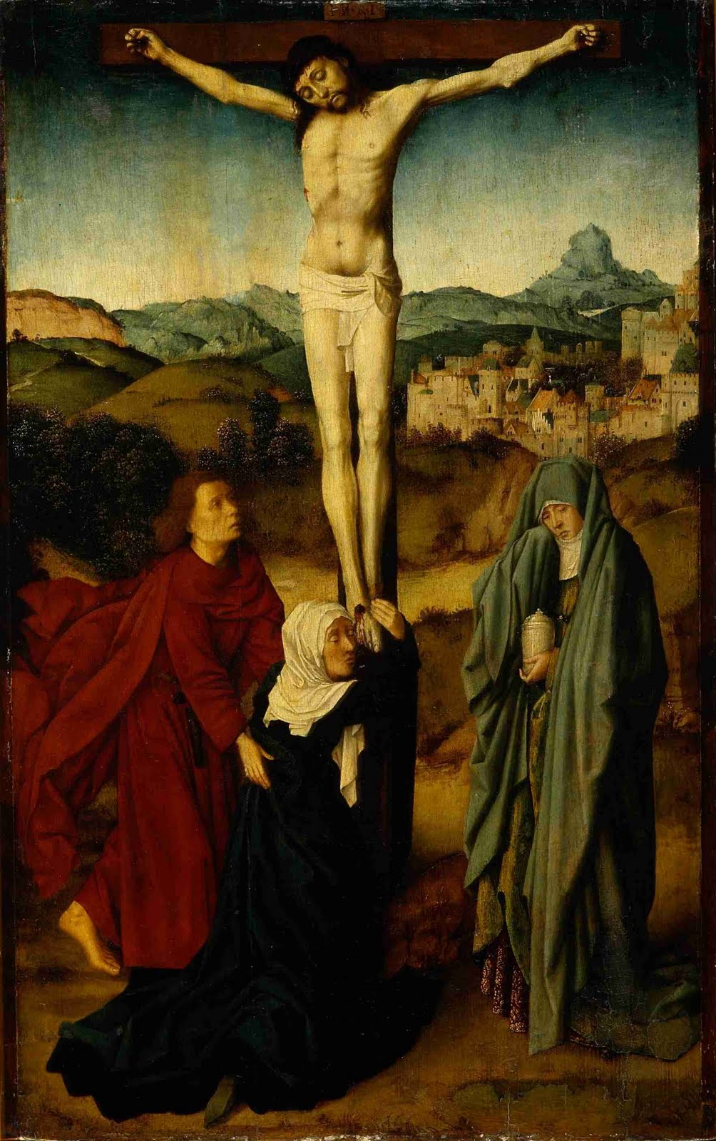
Crucifixion Scene with the Virgin, St. John and the Magdalene, Gerard David, Netherlandish (1460—1523), oil on panel, BF123.

Even when writing about paintings, auto-pilot can attempt to take over. Whether through routine, boredom, distraction or stereotypes, occasionally the same words, the same thoughts, the same associations float to the top. For this particular painting, Crucifixion by David (pronounced Dah-veed), that particular temptation to be rote came from genre. This is firstly a religious painting, and secondly a crucifixion: a genre so ubiquitous as to elicit a whole corral of pre-programmed expectations. Ironically, my sculpture professor used to say the hardest thing to depict seriously in art is the cross: it’s just been done too many times, and too often poorly. But even though this happens, one must keep looking, and keep writing. 

The important question which finally emerges is what is there about this painting’s unique voice which helps it rise above the babble? By what aspect does this piece distinguish itself? Though an academician, and subject to the whims of his patrons, David was nonetheless his own person, and most importantly his own painter. Otherwise (to grow momentarily snarky) how would one know if it was a Van der Weyden, Tintoretto or Gaugin crucifixion that we were looking at? You get the point: aesthetic signature is important; primary, even.

But what else – any particular emotional undercurrent which pulls or pushes the painting in one direction or another? There is such within this painting, animating it…and there is a companion set of color choices by David (supported by convention) which set up both a support and a denial of that emotional portrayal. In other words, the painting’s components take sides. Another professor of mine, this time in literature, stated that all fiction, at its core, has a driving force of conflict behind it. It is a raw touchstone for humanness. And really, what more conflicted scene could one imagine for a 15th century Christian? They, along with the figures here, are stuck between a promise and a reality. That is, the promise of resurrection and renewal, and the harsh reality of an expiring fleshly form.

To illustrate the basic conflict, look at two of the figures. The emotional conflict is primarily represented in the central figure, Mary the mother of Jesus. (Mary Magdalene, the third in the group, is sometimes shown at the foot of the cross, but the scriptural reference supports this being the Virgin, since John is comforting her). Not only is her entire gesture and weight attempting to hold Jesus down, but also the darkest colors in the painting are found in her cloak, causing the greatest balance of weight – compositionally and emotionally – to be on her side. And this makes sense: it is before the resurrection, when reality holds sway. Her emotional response of wrapping around the cross and Jesus’ feet and holding on for dear life, accentuates the necessity of Christ’s eventual ascent – here signified iconically by his outstretched arms, seeming like not so much a crucifixion as an attempt to fly up into the air, right then and there.

John the disciple, the figure on the left, is opposed to Mary emotionally and by color. He rushes in (by evidence of his flying, flaming cloak) and comforts Mary with the promise aspect of the equation –while likely being unconvinced of its verity. With his shocking crimson coat, he represents the passion with which he takes up the duty of looking after Jesus’ mother Mary…despite the doubt; he shows why he is the “disciple whom Jesus loved”: he is devoted despite overt emotion.

Mary Magdalene represents, I believe, the place where most viewers will (and should) find themselves (knowing, after all, how the story ends): at the place of sorrowful readiness. She has a vessel which most likely holds the embalming spices for the burial. That is, she is neither pinioning the promise like Mary, nor bemoaning the reality like John…she is rather, prepared to move on and step into the future, regardless of what the details may determine. She remains, after everything, that belittled – but far from little – giant of faith.

Read more...

Folk + Abstraction: Core Aims


For a long time, I’ve been fascinated with the overlap between folk art and abstraction, and so here comes a New York exhibit I’d love to visit: Approaching Abstraction, at the American Folk Art Museum. There are many stereotypes about what folk art is, or where it comes from, but at the same time, the definition really encompasses an impressively wide spectrum: everything from Pennsylvania German, my personal favorite, to Mexican "outsider"collage, and all stops in-between.
The question I’m most interested in however, is: why abstraction? The answer can often come too easily. By nature of the work being by the “folk” or the common person, this often is meant as “untrained”. And academically speaking, this is often true – but not always. And here I think a key statement can be made: abstraction in folk art, being a step farther past the normal stylization, must have another impetus. I believe that “step farther” could be called core aim. I mean this in the sense which caused medieval artists to be almost wholly unconcerned about scientific perspective (vanishing point, etc.), only to have Renaissance artists pick up the very same principle and crown it king not long after: core aim. That is, what was the prevailing sentiment among artists of that particular time, culture or persuasion? What did they care enough about, to be picky about? And for folk artists, ignoring verisimilitude is not simply a necessity (i.e. something they couldn’t do), it’s that it didn’t really matter that much to them – it wasn’t their core aim
Now, as opposed to Abstract Expressionism, or even Color Field painting, abstraction was not so much a cause or a maxim, but simply a by-product. Thus the great inspiration of folk art to subsequent Modernists (the most famous example being African artifacts to Picasso, Matisse, Rouault, etc.) The Modernists and later artists picked up on the aesthetics of abstraction; saw its potential as a rallying cry and possibly an egalitarian tool, and they crowned it king, after overthrowing perspective. And that by-product of folk art, abstraction, seemingly emerged from certain limitations on the folk artist: training being one, but others being material limitations; narrow cultural beliefs, forms or distinctions, and of course time. Folk art in many cases was purely a sideline as far as commerce went; very little money was likely made. It was decorative; memorial/commemorative; life-affirming.
In my own work, I feel like those two core aims – that of a rallying call and egalitarian tool of the “high” abstraction and the formerly mentioned aims of folk art – come together. I am excited to see if this new exhibit sheds any more light on what that might mean for not only my work as it moves forward, but for artistic expressions writ large. 

Read more...

Amphibious Painter's Tape


On many of my paintings, as you can make out if you look carefully, I use techniques and tools such as templates; stencils; compasses; scribing, etc. Another technique and material I use frequently is taping-off edges, borders, grids and lines. Much of this penchant comes from my interest in finding a balance between the effort towards "perfection", and the human errors (or "happy accidents") that result from pushing the painterly envelope. I'm also interested in traditional Pennsylvania German, and other folk-expression's techniques for decorative painting, but I'll let that topic for another post...


For years, I used a brown paper-based tape, with a low-tack adhesive on half the tape...this created, in my non-rigorous testings, the best edge. Unfortunately, I have only been able to find it at one local store, and that is in my old neighborhood. Your run-of-the-mill blue painter's tape had too much tack -- even the low-tack tape -- and it required sticking it to your sweater or jeans a few times, so as not to pull off layers of paint. That being said, I often used blue tape, since it was the easiest thing to find.


And then came along Frog Tape. I receive a weekly email on DIY home repair...and the writer often mentions products that he finds to be useful and superior...one week he mentioned Frog Tape, and I was intrigued. Up to that point, I'd not seen it in stores yet. Soon thereafter, though, Lowe's began carrying it, and I was tempted...despite the higher price. Well, I have to say, it's worth the extra price, now that I've tried it. It utilizes a "paint-blocking" technology which essentially soaks up excess water found in latex paint (my usual material of choice) and prevents it from seeping through, which is when it carries suspended pigment through, and makes an annoying feathered edge.


This morning at the studio I used it over a well-cured latex coat, over which a spray-painted grid had been applied...I taped off the lines I wanted, and scuff-sanded the spray paint to aid in adhesion. The green paint I used was fairly low-viscosity (I often up the water content in my latex paints to aid in flow). So, I applied the tape, painted the shapes, let it dry, pulled it off about an hour later, and voila! Nary a seep...except where I'd not pushed the tape down hard enough against an edge; that was all me. Happiness!


So...I would normally never endorse a product unless (like good ol' Paul Harvey) I used it myself. Well, I'm here to say, it's a fine product, and I will keep using it. Try it out; I'd be curious to hear if anyone else has experience with Frog Tape.


(By the way; the name? I'm guessing they are referencing how a frog drinks (takes in water): through its skin.)

Read more...

Brief: Douglas Witmer at Blank Space, NYC


    (Images below; top, A Trace of Something I Want to Feel Again; bottom, We'll Get Away With It.)


Douglas Witmer at Blank Space, NY
A pair of paintings in Ring the Bells Anew arrested my attention quickly upon turning the corner: A Trace of Something I Want to Feel Again and We’ll get Away with It. It was an impulse for which I couldn’t find a reason (not that it was completely necessary to)…until I spoke briefly with Douglas Witmer about them, and found out that they had two related common denominators. They were the same size canvas, and that particular ratio was a new one for Witmer. That said, they fit nicely into my resonation with the show’s title: Witmer is ringing a very old bell, but the tintinnabulum never grows old: in fact, the results feel as fresh as does every toll from a bell tower greeting a new day. The possibilities continue.
The delicately strong voice of A Trace… pulled at me first – a large, soft monolith the hue of a Japanese anemone…or who knows; perhaps the evanescence of peonies in May. Regardless, it was flowery in the best sense; an exquisite waterfall of delicately scented orchid that one keeps near so as to prolong its effect. Which brings me to the second of several strong (and strengthening) components of Witmer’s work: the activity occurring “behind” those soft monoliths – dripping; spreading; fading in and out – playing with the memories we are beginning to fall into within the frontal colors. It keeps us engaged; on our toes; keeps us from losing ourselves in our personal, nostalgic response to the dominant colored blocks.

A third strength is the vastly differing movements of the brushstrokes in the frontal colors – up; down; back and forth – all with their own particular evocations of emotion or memorial. Cascades – green, orange, red, light yellow – or strata lain like bricks. All this is really only noticeable upon long perusal – but that is crucial anyway, to really absorbing these pieces. That said, the intelligent and harmonious hang did remind me that Witmer’s work rewards varying levels of looks. Like a bold landscape, they can be enjoyed both very quickly – like a drive-by from a window (a quality I associate with Blinky Palermo – a promenade of flags), or painstakingly slow, pulled apart as a 
portraitist might separate his sitter into individual components, and then reassemble them according to a new system. Regardless, Ring the Bells Anew will remind you of something which you treasure, and still shower with an affection long fostered. 


Blank Space Art

Read more...

New Paintings in Progress, March 2010


new painting inspired by a Cezanne still life in the Barnes Foundation collection:


new painting in series of works incorporating old prescription slips:


Read more...
Related Posts with Thumbnails