Art Thoughts, Week 3 – Klee & Play

Paul Klee, Dream City

(PLEASE NOTE: the above painting is not the one I am discussing; it is, however, a Paul Klee painting which may aid in understanding my comments.)


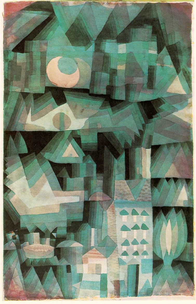
Village among Rocks (Ort in Folsen), Paul Klee (Swiss, 1879 – 1940), 1932. Gouache on canvas, BF 2520.


Blocks have always been one of my favorite toys. Even now, when at a house with small children, I will participate by building something with the often colorful pieces of wood. There’s something particularly satisfying about the fit and finish of a small structure made of wooden blocks, the feeling much like a greenhorn mason might have after finishing his first successful runs of bricks.


Drawing styles often imitate play styles. This makes sense; drawing is the first artistic impulse that most of us had, ham-fisted or not. And the Swiss artist Paul Klee has always been associated with the winsome and playful – though often with the appropriate dash of 20th century angst and satire mixed in (what would one expect of someone so close to fascism’s scowl?)


In the gouache drawing Village among Rocks (Ort in Folsen) the feel of the surface has several affinities with both blocks and rocks, both building materials. The subject matter is straight up against us, almost a sheer face of a cliff; the gouache surface is consistently mottled and weathered, evoking ancient alpine rock faces; and the color scheme is typical of multi-colored but dull rocks, or well-worn wooden blocks. The composition too, looks piled or built up, like a block structure. The shapes are erratic; jutting; all delineated by thin black lines, creating a web which runs to the borders. Here and there a door is suggested; a steeple; a low-sloping roof; a sharp flinty rock. Value in the drawing is highly consistent, though with subtle color shifts. There is blue-greys; dark clay-ochres and greyish-lavenders; teals and rust browns; dull periwinkle-steel and caucasian pinks.


Though the composition is somewhere between a web, a grid and a rockslide, the rusts and ochres (the slightly warmer colors) tend to pull away from the greys and blues (the chillier colors). So upon seeing the picture from a distance, a sense of a group of houses is created, but the effect is still of a village planted precariously on a sheer rock face. Many of Klee’s drawings evoke the sense of a diorama: this one feels like a backdrop to one.


There is a persistent ill-at-ease feeling that permeates this drawing as well. Since one cannot really be sure which shapes are the rocks and which are the houses, a slightly uncomfortable feeling exists, what one might get at dusk in an unfamiliar town. Of course, my mind tries to make sense of what it’s seeing here, but once some guesses are made, and the eyes follow the lines to interpret the space, most depth, scale or even angle is quickly lost among the weird shapes, jutting points and impossible juxtapositions. The edginess persists: this is not a cozy resort village. Doors open into rocks; some of the rocks seem to have roofs; the houses are all piled together.


This is all a bit children’s-spook story though; there is playfulness in this drawing too. Klee has toyed with the shapes in a way similar to one playing around and shuffling blocks: some of the angles were changed, painted over and the colors modulated; some of the black lines have moved and shifted direction; painted out. Play is in large part experimentation and learning, as is all forward-moving art, and that truth is evident in this drawing.


Read more...

Jesus? Is that you?

(from http://waynestead.com/Jesus%20Portraits.html)

Yes, it is I; doing my best to be a faithful imitator of Jesus.
Actually, I'm wearing a wig and beard, marketed at Bible bookstores as a genuine Jesus-getup, by invitation of a great young Brooklyn artist (i.e., my age) named Wayne Adams. We met at the CIVA (Christians in the Visual Arts) conference in June, at Messiah (appropriately enough).
Vicki thought it looks like I'm eating the beard. I certainly was smelling it, and it wasn't great. (It also looks like I might have a raucous belly laugh.)
But this was a lot of fun, and Adams has a bunch of portraits in this series - see his website for the rest, along with some situationals that are FUNNY (and which may leave you feeling slightly, but vaguely guilty, for thinking they are funny).

Read more...

Art Thoughts, Week 2 – Matisse & Material


View of the Sea, Collioure (La Mer vue de Collioure), Henri Matisse (French, 1869 – 1954), 1906, oil on canvas, BF 73.


Matisse, the most famous son of a dingy northern French mining and textile-manufacturing area, was a lover of textiles. In many of his paintings, his handling of paint mimics the basic materials of weaving. A foundation of compositional threads were laid down, and the colors stitched in, around and between the pentimenti. There is not necessarily any loss of perspective or depth in most Matisse paintings; it is just accomplished by color and value rather than DaVincian sfumato, or smokiness. In fact Mattise’s aesthetic is more like a camera: all parts from finger’s distance to infinity is in the same focus. All things remain on the surface, like a tapestry flung across our view.


This beauty of a Fauve painting (shown, this time, above) has a very circular core. The winsome, willowy tree wraps around the canvas from the right to left, and lightly cascades olive-colored leaves near the top, creating a canopy over the village nestled bowl-like on the shore, which, sandwiched by the sea and sky, cuts through the painting’s center.


There is something of Wayne Thiebaud in the Fauve works of Matisse...or rather, there is something of Matisse in Thiebaud. The colors of Fauvism – a moniker that means “wild beasts”, and given, like many memorable names are, in mocking and jest, thus sticking forever – are normally thought of as being acidic, caustic; sardonic even. But here they are merely decadent, perhaps foretelling Matisse’s eventual, more mature bent, and thereby reminding me of the venerable Californian Thiebaud. The colors make the sweet-tooth salivate a bit: cotton candy pinks; watermelon and key lime; mangoes and lemon chiffon; blackberries and strawberries with cream – all these sweets can be found in this painting; an Easter basket for sure.


But there is some seriousness here: as with many Matisse paintings, there is a definite “there-ness”– a sense that this could be nowhere or anywhere else but here at this moment – along with a certain incoherency. That is, it is simultaneously a place – Collioure – but at the same time a thoroughly unique “Matisse-ified” Collioure. Along with the place, another significant presence in the painting is brushes. In every corner, no attempt is made to mask the artifice. It is a painting of Collioure, not Collioure itself – not even a picture of it, really. This is the epitome of abstractness; even more than the work of someone most often associated with modernist abstraction such as Jackson Pollock. Pure abstractness is slight and subtle, a comedic twisting of reality; Pollock is an overt and brutal representation of an icy ideal. Modernism has not, in bucolic Collioure, become tainted yet.


And yet, so much of it comes down to the materiality of the painting. It is a picture, but it is a picture made of materials; of stuff. Matisse treats the painting exactly as what it is painted on: a fabric. In this, he was confident. With the experimental calligraphy of his brights and filberts, he has woven us not only – in retrospect – a diminutive early masterpiece, but also somehow more importantly, a sweet memory of 1906 south France.

Read more...

Eames sidetrack


No, dear readers, I have not (quite) shirked my duties in writing Art Thoughts, entry two. I have an excuse: Vicki and I were up in Rhode Island this weekend, picking up a set of six original orange fiberglass shell side chairs, Eames-designed; Herman Miller-manufactured. (Above you can see on the left what they look like now; on the right is what we will make them look like eventually...with the Eiffel wire base.)

So, patience is due; I'll post the new entry for Art Thoughts tomorrow (Monday) since I have off work. A Matisse painting is up next. 

Read more...

Art Thoughts, Week 1 - Von Kulmbach & Emotion


Meeting of Joachim and Anna at the Golden Gate, circa 1510-1520, Hans Von Kulmbach (German, circa 1485-1522), oil on panel, BF 871

If you are like me, you do not know who Von Kulmbach is; before I did some informal research recently, I only knew him from this one painting at the Barnes Foundation. It turns out however, that I do know his last teacher: Albrecht Durer, the famous Northern Renaissance master. And after Durer stopped taking commissions for altarpieces in his later years – I suppose he’d become well-off enough to have the luxury of avoiding the “moneymakers” – they went to the disciple Von Kulmbach.

The painting I’ll write a few words about (title above) is, according to scholars, most likely from one of those altarpieces. Some think it may have been an altarpiece with the subject of the Birth of the Virgin, since Joachim and Anna (apocryphally) were the parents of Mary, the mother of Jesus. In this scene, Anna has learned that she, much like Sarah the wife of Abraham, has become pregnant in her old age through the Holy Spirit.

And it is a gorgeous little painting – measuring about 15 inches high by 8 inches wide – which shows off what some say are Von Kulmbach’s signatures: jewel-like colors, and sensitive, evocative faces. Joachim is on the left; Anna has come to emotionally embrace him from the right. They are framed by a stone arch, through which is visible the wheat-colored stone walls of the city, and a summer-clear sky – this is presumably the Golden Gate of the title. Yet they are not fully embracing; Anna looks as if she has learned something emotionally taxing, her lower body is almost overcome and ready to collapse under her blue robe. Joachim’s arms mimic hers in a kind of intertwined spiral, and he is leaning towards her, supporting – or expecting to support – her weight. The colors are predominantly luminous cousins of the primary colors.

The arcs of their bodies towards each other; the heart-shape their heads make almost touching each other in their passion under the arch; the yin-yang spiral their arms and hands create; the bent-ness of Joachim’s boot pointing a line directly through the folds of his salmon-scarlet robe, moving towards and wrapping around Anna and her amazing expression, a line which then continues up through the slanted outer city wall, the arch and the azure sky, and back around: all these elements create a taut, centered feeling to the painting. These are two people who are utterly caught up in each other; in the moment of revelation and sharing: it is an intensely personal scene, as if glimpsed fleetingly by a stranger passing them in a city. And yet what pregnant (no pun intended) emotion is caught by that one scant moment! Much of this can be seen in Anna’s expression, and conversely by Joachim’s absorption and reception of it. The stable mutuality of the relationship shown here is strengthened by the presence of the arch: one of architecture’s most stable structures.

I would not be surprised to learn that (unless he leant such amazing expressions to all his subjects – which could certainly be true) Von Kulmbach was in love with this particular model for Anna. All that an artist might unconsciously include in the careful vagaries of the brush is caught here in the formal elements – and the mystery – which make up the numinous beauty and grace in this woman’s face. You must see it in person to fully appreciate it.

Ironically, though this painting is doubly out of its intended context – both the church and its original companion panels – it is, I think, that much stronger for it. It shines in a way which it would never be able to if it was within the larger, more complex context of an ecclesiastical building; or even the entire Apocryphal story. It is now, in its 20th century American collection context, a prime piece in this “jewel box” of an institution.

Read more...

The Best of 1507, maybe...

Picasso's Woman with a Cigarette, Barnes Foundation,
from www.famous-painters.org

You won't find any Best of 2007 lists here, friends. Only a favorite line from probably my favorite album (of the few new albums I listened to) of the past year:

"And if the whole world’s singing your songs/And all of your paintings have been hung/Just remember what was yours is everyone’s from now on..."
–Wilco (Jeff Tweedy) from What Light, on Sky Blue Sky.

I also, spurred on by the decisions made by Rob Matthews, et al, have come to the conclusion I need some more discipline in my blogging career. Along that line, I've decided to write a short weekly essay on an artwork or object (will most often end up being a painting) here at the Barnes Foundation. There are several reasons why this has come to mind: for one, I've always wanted to do this, after hearing about a famous 20th century art critic (Greenberg, I think??) mention visiting the Metropolitan Museum of Art during his lunchtime, sitting in front of and absorbing a single artwork. I admired this as a discipline that could bring many good dividends. Also, the subjects are readily available; they are only upstairs. And thirdly, it will be a challenge: I will not be able to reproduce the images, so I will need to describe them so fully that an illustration should (ostensibly) not be necessary for the reader. This will be a challenge for my writing skills. Another obvious benefit which comes with all study of art history is to my own art-making.

At this point, I'm already a week behind, so I'm going to just begin this week with a painting from the collection, and call last week a break. Stay tuned!

Read more...
Related Posts with Thumbnails