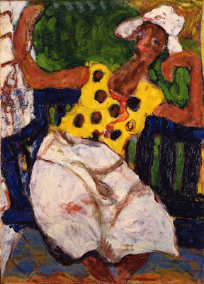
Art Thoughts, Week 25 -- Pascin & Craft


Southern Scene, Jules Pascin, (American and Bulgarian, active in France, 1885—1930), 1915, oil on canvas, BF 194.

Most of us, at one time or another, were taught to draw by breaking what we were seeing down into individual shapes – triangles, squares, circles, cylinders, pyramids, rectangles and so on. This way, we were told, anything could be drawn; we could parse anything intellectually, visually rebuild it, then smooth off the edges: literally 2D sculpture as drawing. But this is not the only way of drawing, by any means. Instead, for example, one could use an unbroken line which caresses and undulates around an object, becoming a spatial, quivering depiction. Or, a drawing could be done completely in shaded patches, overlapping in different directions like so many screens or webs that eventually pile up into a specific shape or space.

Pascin, at least in many of his exterior scenes, used a decidedly drawing-based style of painting, what I’d call line-and-wash, reminiscent of Kandinsky’s painting style. But overall, the particular shape which Pascin preferred using to construct or craft his compositions was the almond, or mandorla, shape. It can be found in the arching trunks of shade trees; the spindly legs of the horse’s and people’s limbs; and the foreshortened wagon wheels. It’s significant here that the almond shape is reminiscent of another iconic shape: the simple leaf. And in some ways, the manner in which Pascin has crafted his picture is akin to a pile of multi-colored leaves; all laying on top of, next to or overlapping one another; influencing and casting color and light between each other. And like leaves, which in a sudden gust of wind could blow away and completely rearrange, so it seems could the repeated elements in this painting.

And, as most artists eventually realize, that is about as concrete as a space – and light within that space – will ever get. Each moment brings change; everything from the most infinitesimal to the grippingly enormous, and they are all interconnected. Those who choose the exquisite torture of trying to depict these changes are constantly on the chase, like a dog after its own tail. (Thus the appeal of making up one’s own environment, with its more controlled set of variables – though this is just as elusive…how many of us have actually been successful in recreating the exact picture we began with in our mind?) There are, of course, significant numbers of these moments that do get successfully wrangled down; otherwise we’d have no artworks to speak of. But still, the space and forms are tenuous in Southern Scene – the feel is similar to a photograph in which shapes are blurred because there was movement during the exposure. Things in this painting fade in and out; there is air and room between elements, largely defined by color changes – much how a Fauvian Matisse feels. The leaf pile thus is able to breathe; to live.

This might be indicative of where and when this painting was made – likely out of doors, and on a sunny, breezy day. The crucial thing to realize though is that Pascin made deliberate choices about how he was going to craft his depiction, and because of those choices – the almonds; the dappled light; the breezy shapes – the painting feels wonderfully fresh. We know intellectually that this is a painting of a scene, not the scene itself. But still, we are somehow startled that it does not suddenly, despite being a resplendent butterfly pinned to a card, flutter its delicate wings and fly off.

Read more...

Summer in the Studio

Not much commentary folks, but here's a few pictures of what I've been working on at the studio this summer so far...

This painting is just about finished; the lighting is really poor, but it's on a light, "strawberry mousse" pink. (There are some filled holes in the panel which have not yet been painted in.) I'm working on starting another panel using these shapes.


And this painting was finished several weeks ago; the title is Pod.


With this one, not quite sure where it's going, but I like the color balance so far.


Additionally, I've really been itching to do some more drawings, so I restarted my protracted series on flattened Chinese takeout boxes (the first one is titled Liberty [ink on gessoed cardboard, drawn with bamboo pen], and the second Witnesses [pencil on gessoed cardboard]).


Read more...

Art Thoughts, Week 24 -- Hals and Mortality

(Dear readers; this essay was to appear Friday afternoon; unfortunately the internet was down all that day, so you're getting it late. This week will supply another installment however.)


Dutch Burgher, Frans Hals, Dutch (c. 1580—1666), 1643, oil on canvas, BF 262.

Eyes are difficult to paint accurately; take it from someone who has tried, and often failed. The eyes (and even more so the eye socket) have so many thin strands of varied strata; such numerous tone and color changes – not to mention being known as “windows to the soul” – that they are likely the hardest thing on a human to paint. Nevertheless, Hals has painted a pair of extremely engaging eyes; dark eyes that are at turn inviting, comforting, imploring.

The eyes are also where the viewer’s eyes are first drawn to in a portrait. Any divergence from this tendency indicates a Herculean effort on the portrait painter’s part – it’s just too natural. Our own primary mode of gathering information is highly magnetized towards portrayals of another’s same portals. Depending on the met gaze’s intensity, focus, aloofness or even intimidation, we may quickly turn away, but the eye is still an enormous draw in art, especially in portraits.

And this is a portrait – but of whom exactly has been lost. Quite possibly, Hals was paid by this Dutch burgher (Dutch citizen) to have his portrait done. Even though we’ve lost his name, there are many more things (and most of them more important) to be learned about him. After the eyes, other features become noticeable: the gently rakish angle of his hat sitting on a slightly tilted head, and how that angle plays with his emerging arm below; the coarse, painterly way Hals has depicted his beard hairs and hands like two little patches of Lucian Freud; the delicate lay of his gauzy collar. All this is interesting, and could command a separate essay. But the most obvious, and what exists as a parallel element to the intensity of his eyes, is his gold pocket watch. These two seem to be sidling up into a joint message. What of the imploring in his eyes and face may be found in the watch? What of the open and obviously-readable watch is related to his eyes?

There is a tradition in the painting of portraits called momento mori, where an object or element in the painting shares the message of sure mortality; of what Franklin called the only sure thing besides taxation. Eventually, the burgher might be saying to us, we all will die, you included; in fact, I’ve gone on before and want you to think seriously about this fact, reforming your life if necessary. Accordingly, in Pennsylvania German culture, the idea takes form in a more emboldening phrase: “O edel Herz, bedenk dein End” (O noble heart, consider your end).

Momento mori usually takes shape in one of several iconic objects: a candle; skull; wilting flower; clock and so on. Here the choice is interesting – a gold watch, such as only the wealthy could have afforded. With the intricacy and skill involved in hand-making such a diminutive timepiece, it’s clear that this burgher was a man of means. This risks clouding our reception of his message. Is he warning us of the deluding snare that riches may become, or is this blatant ostentatiousness clothed in a false morality? In other words, is he really concerned, or just showing off? Perhaps we should give his eyes the benefit of the doubt, and not be tempted to ascribe the gold watch too much persuasive clout. Let’s postulate the burgher had overcome the sirens of wealth in his lifetime, and is now reaching out through the fog with clarity; inviting us to live Socrate’s “considered life”.


Read more...

Art Thoughts, Week 23 -- Settanni & Joy


Negro Figure, Luigi Settanni, American, (1908—1984), c. 1940, oil on canvas, BF 2037.

Sitting on a veranda as I write, surrounded by the ebb and flow of cicada chatter, I remember the distinct pleasure of a break from hot labor on a porch swing. The subdued lilting of that seated pause was a typical summertime feature for me while growing up (and still is when visiting my family’s house.)

“Topsy”, as the Negro Figure is more colorfully known, clearly realizes the pleasure of porch swings as well. Her sprawling, lanky pose in the hefty, navy-blue swing in this Settanni painting makes this clear. There is also an obvious expression of joy and relaxation, not only in her gesture, but also in her face…though it has a bit of the pasted-on doll face to it, sketchily rendered by Settanni as it is. But Settanni was never terribly concerned with facial messages; he was much more interested in a two-part “expressive relationship” if you will – and perhaps this was the native-born Italian in him: (1) the expressiveness of the pictured figure’s bodily movement, and (2) the implied but necessary movement of the artist/depicter in kind, in reaction to what was being painted. This was crucial to his identification with the subject, and indeed helps our, the viewers’ identification as well.

This African-American woman is very expressive in her movement. There is something of the caryatid about her. But she is a domestic caryatid as opposed to Modigliani’s decorative caryatid, which is more concerned with itself than with what it’s supporting. But what is Topsy supporting? She seems to be holding up a writhing, amoebic form of emerald and grass, Atlas-like, but with her happy, ragdoll arms. Now, some may find the following assertion offensive, but it only has a racial cast because of Settanni’s choice to depict an African-American woman in 1940: given the time period and possible location this was painted (southern Florida), along with her work-style clothing, it’s possible Topsy was a domestic laborer, accustomed to hard, sometimes tedious, work. Thinking of her in this way though is useful: it brings us back to the swing as a welcoming pause; part of the simple summer antidote to a hot, workaday existence. By lifting her hands, she is both holding up the drudgeries of the day with her joy, and harking back to that old African-American refrain of “laughing to keep from crying” – continued praise and even levity among adversity – which is actually common to all oppressed peoples still holding on to a shredded hope. Thus, even in her likely dull day, Topsy is able to lift her hands with a joie de vivre which is admirable – and infectious. (The fact that Settanni was able to notice this and desire to depict it is a reminder that the eponymous French phrase has been used to describe his own painting style – and that he was intimately connected to the Barnes Foundation and supported by Dr. Barnes himself for decades.)

As always (and especially in this case) to say these things is hopefully to elicit from the work that which is already there, rather than conjure up non-existent gewgaws, which is so easy (and tempting) for an art writer to do. There is always that danger. However, we can know instinctually that there is a skilled joy evident in this painting; Settanni has conveyed this well. This is the joying in contrast – the cool breeze treasured all the more for dispelling the blast of heat before it. This much at least I must say, having experienced it, is incontrovertible.

Read more...

Art Thoughts, Week 22 -- Avery & Mystery


Nursemaid, Milton Avery, (American, 1893—1965), 1934, oil on canvas, BF 961.

The story goes that Dr. Barnes, upon seeing this painting leaning against a wall in a New York gallery storeroom, was immediately taken with it, and bought it on the spot. I don’t believe he ever owned another Avery; and it is the only one in the collection. And, as is typical in the Barnes Foundation’s small stable of artists represented by a single piece, the signature painting is often atypical of their work. This painting is somewhat an atypical Avery, in that it has a decidedly dark emotion.

It is, as Dr. Barnes noticed straight away, a very arresting picture. Three figures stand, one of them seemingly talking, on a beach which curves around behind them in a hairpin, culminating in a peninsular tuft of trees; there is a cursorily-drawn, buffeted little boat on the navy and ultramarine waters. Moreover, there is a curious darkness which seems to hang over the work; even the palette-knifed off-white of the nursemaid’s great-coat seems shadowy. This darkness also permeates the sky, giving a sense of “impending doom” (which also happens to be my wife’s euphemism for autumn), much like the inky electric storm that develops around the Sta-Puff marshmallow ghost in the movie Ghostbusters II. That is, there seems to be a distinct foreboding; an atmosphere just beginning to ripen towards an intensifying and mysterious conclusion.

But what about these figures who populate (or find themselves) in this darkening landscape? There are three: a sturdy, dark woman wearing a shamrock green swimsuit, talking to a monumental, white-garbed nursemaid, whose charge is a tiny slip of a child, leaning silently by the nursemaid. The figure in green and the pink child seem like visitors; they are not entirely comfortable in the landscape. The nursemaid however seems more integral to the dark emotion of the scene: she is part of the scenery. And one look at her face convinces you of this, and almost prevents you thereafter from looking at anything else in the painting in the same way. It is a face simultaneously piercing and dully masklike; ghostly ephemeral, yet very concrete. This face given by Avery to the nursemaid even inspires a bit of horror in me – it is reminiscent of those ambiguously grinning personifications of the moon phases found sometimes on old-style calendars. Here is the blacked-out new moon staring back at us, confronting us – supposed to be invisible, but somehow still gazing unnervingly; inscrutably.

The moon has for centuries – and by myriad cultures – been endowed with more mystery, deifications and mythology than almost every other heavenly body. It has been revered as both mother and seducer; a maddening force (think of the word “luna-cy”) and a beautiful, reassuring presence. A nursemaid as a mysterious new moon; her coat glowing like a lit pearl, but her face obscured like a fading, mocking mask? Is she protector or harmer? – it’s unsure. We are told in biblical texts that Satan masquerades as an “angel of light” deceiving and devouring the straying believer. Is this nursemaid a guardian angel – as Avery seems to have portrayed her on the surface – or is she a spirit disguised and bringing harm, just now reflected in the ensuing darkness swimming around her presence? Or; is she simply a “mama bear”, whose ire’s been piqued by a nosy beach painter, who himself is unconsciously staring at this odd trio on a normal, storm-threatening afternoon?

Read more...

Art Thoughts, Week 21 -- Corot & Melancholy


(Since I'm so behind anyway, here's another mini-essay for the Independence Day vacation):
Melancholic Italian Woman (Rome), Jean Baptiste Camille Corot, (French 1796—1875), 1826—1827, oil on canvas, BF 964.


Normally, I’d never start my thoughts on a painting or other work of art with a subject suggested by the artist themselves. It would come off as patronizing, and perhaps like short-changing myself and the reader before even handing over my product. But the inclusion of “melancholic” in the title of this piece, the more I thought it over and considered the painting, seemed so necessary and intrinsic, that to ignore it would seem to not only miss the whole point of why Corot painted it in the first place, but also how he laid down his decisions in paint, all along the way.

I tend to prefer – and think to be more accurate – the ancient definition of “melancholia” which acknowledged not only emotional and psychological components of the condition (the modern definition stops here) but physical and physiological manifestations as well. And as Dr. William Glasser makes amply clear in his brilliant psychological manifesto, Choice Theory, all we can do for our whole lives is behave (in the sense of pure action, not morals) and furthermore, all behavior is by nature “total behavior” – the physical response cannot be divorced from the feeling or emotional seed, and vice-versa. And of course, it makes sense, right? How else would Corot have picked up on this Italian woman’s emotional state, except through its physical manifestation? And Corot chose, more specifically as an artist, to portray his response in expressive color.

Corot’s coloring, in my limited experience with his work here at the Foundation and even more limitedly elsewhere, tends to have two distinguishing characteristics: it is usually both dark and complex. That is, his colors are hard to “read”. (In contrast, Matisse’s colors, which use much white and “purer” colors, are easier to pull apart into individual hues). But Corot’s colors are more layered – the adjectives don’t come as readily to describe them. And in this painting in particular, each major color has some of each of the others mixed in. For example, the ruddy chestnut brown of her skirt has some of the rusty lacquer-red of the furniture mixed in; the dark camel where she’s seated has some of the warm, sage grey of the wall mixed in…and so on. So, much like the mixed, conflicted emotions of melancholy, the colors seem, though absolutely accurate, conflicted as well.

Composition also accentuates the melancholy seen on the woman’s face and body. She is essentially painted into a corner. Complex emotions, of which melancholy is the most insidious, tend to back the sufferer into a helpless place, where all feels terribly final, and because of its encompassing nature, inevitable. Thus resigned inaction is a usual part of melancholia (note her sadly folded hands).

Could Corot have misread the woman? Was she perhaps simply tired and resting? In a way, it’s immaterial. Many of us have known spikes of melancholy – a few hours or a day – where all felt futile and pheromones ebbed. And more importantly, whether or not this woman was melancholic by nature, the subject at hand genuinely was, and that is what Corot painted – with more than a handful of seasoned empathy and compassion.


Read more...

Art Thoughts, Week 20 -- Pippin & Salvation


Woman of Samaria, Horace Pippin, (American, 1888—1946), 1940, oil on canvas, BF 986.

Horace Pippin is sometimes called a naïve painter. Naïve painting has many similarities and affinities to outsider, now mostly called visionary, painting, as well as simply self-taught artists. Naïveté in the painting world usually pertains to formal concerns (composition; depiction; color choice) rather than conceptual or otherwise. And certainly in no way can this painting by Pippin in the Barnes Foundation, Woman of Samaria, be considered naïve in any other way than formal – and even that is debatable.

The first impression upon looking at this painting is the incredible sky – an almost apocalyptic pink, emblazoned with grey clouds, sizzles in the background. The foreground is dominated by tarry blacks and deep forest greens; it is an almost inscrutable space, in the manner of Albert Pinkham Ryder. And in the middle of this edgy landscape sits Christ at the well in Samaria, a region near ancient Palestine, conversing calmly with a penitent woman come to draw water. The composition is fairly typical of a genre painting – in fact, Pippin may have drawn this image from a biblical illustration, print or other publication as self-taught artists often do – but the color is anything but typical. Another odd thing: one somehow expects Christ to be beckoning towards the woman, in an invitational manner, or emphasizing towards the well, as in the biblical story. But no; he is motioning towards the darkened woods that they are on the edge of – a foreboding place – and the woman is straining towards him, seemingly hanging on every word. The well, symbolic of offered salvation, floats in a - literally and figuratively -gray area between the distant fiery sky, and the nearer at hand dark forest.

Might this indicate that Jesus is offering the woman escape from an atmosphere of heightening danger? Is this, along with the conflagratory sky, indicating the imperative of accepting salvation – no time to consider; they are at our heels! It almost seems that way.

Another possibility, though, presents itself once one remembers that naïve and visionary art both often deal with internal drive rather than exterior impetus: or at least, the aesthetic drive usually goes that direction. That is, the artist’s reasons for deciding to create something is often not driven by outside influences, such as nature or light or a beautiful face; it is more often rather suggested by some spiritual vision, or persistent internal idea. (In this way, these artists have more affinity with conceptual art than they do with traditional realism.) So, could the bellicose pink sunset, and Jesus’ imperative gesture towards the dangers of the forest, belie not actual danger in the real, but a spiritual and psychological immediacy in the woman’s heart? Could her soul, rather than simply her body, be on the line in this painting; could the burning in the sky indicate the burning in her heart on encountering the incarnate God? Indeed, the apostles of Emmaus in the book of Acts remarked breathlessly to themselves, after realizing the Lord had been there unbeknownst to them, “Were not our hearts burning within us while he talked with us?” (And Pippin was no stranger to the dangers implicit in wartime.) In this way, Pippin’s use of almost toxic, cosmic colors speaks of a spiritual imperative; an immediacy of salvation; a time of decision at hand. And we thus arrive at another prime motive in naïve and visionary art: message. And what more classically Western spiritual message than the imperative of the gospel, as iterated through the woman of Samaria? Pippin has painted his message well.

Read more...
Related Posts with Thumbnails