Dead horse meatball?
 (above, picture from Roberta Fallon)
Sorry to be almost beating a dead horse (meatball?), but here's some more from Artblog on the Meat Ball show at Fleisher-Ollman Gallery, downtown. Roberta Fallon said she held off on writing about it, thinking the Phila. Weekly would allow for space, but not to be...I also included a little aside from her on the current social state in America, spurred on by two of the artists' works in the show, that I think is interesting and thought-provoking.
(My edits and emphases are included, since all the pictures are not shown...see www.fallonandrosof.com/artblog for the full syntax.)
Thursday morning meatballs
Herein a few comments on a great show I saw but couldn't write about for the Weekly but thought I could so held off writing about here. See Libby's post for more.
Oners
Like many things that appear in Fleisher-Ollman Gallery, the works in this show are all "oners." They may be meatballs but they're individual meatballs first, and their ability to cohere as a group is a result of some nice curating by the young threesome in charge, Jina Valentine, William Pym and Brendan Greaves. Of course the glorious big space helps as well, providing ample breathing room for the pieces to exist side by side without beating each other up.If there's a hallmark in the show it's that the art is not particularly loveable. That's not to knock it. Because really how loveable is Guernica...or anything by George Segal, Ed Kleinholz or Marina Abramovicz? Some art doesn't want to be loved. It wants to talk at you or to you and that's what we have here. Yakkety yak, don't talk back.The most nervous talkers, the ones whose urgency seems off the charts, are Frank Vagnone and Jack Sloss. Vagnone, with his anthropomorphosed assemblages that include the kitchen sink and all, read like visionary riffs on Greys Anatomy. And Sloss, with his two-channel video piece of weird, floating imagery like clowns and masked men looming like astronauts in zero gravity traps you in his orbit and won't let you go. Both artists' works are compulsive talkers who won't let you get a word in edgewise. It's after you leave their aura that you can talk back at them, agree or disagree. Vagnone's two pieces, which have a survivalist-art aesthetic, compel you to look and to think about the body's insides and the mind housed in there somewhere. But the affect is so splayed and raw I felt like I was gaping at a roadside accident with myself the accident victim. Sloss's melange of odd imagery, like Vagnone's melange of hardware and stuff, provide a kind of mirroring of the world today. Both artists works seem to swim in our culture of narcissism and self-loathing yet the issues they raise -- about body, disease, technology -- posit a less than rosy future. Unlike "Self" magazine, dedicated to the study of you, all about you, aren't you the best, these two works treat self to a cold water bath. You may be you but you're not great they say. Get over you and let's talk about something bigger, like us, society, social contract, our future.I've become obsessed with the thought that America has broken the social contract and the thought scares me. Gone are ideas about supporting each other with programs that help the less fortunate. We dally with privatizing our future; we sleep through election day not caring whether our vote counts or not. We preen therefore we are. Artists whose work sounds the alarm about the vulnerability of us all in the culture of narcissism -- as I think these works do -- are artists to watch. Like the canary in the coal mine they're bringing in a message. I only hope it's not too late to turn around.Elsewhere in the show lurk many pieces I had brief discussions with in my head.Michael Khaisman's backlit packing tape on plexiglas pieces are as familiar as Bogey and Bergman even though the materials are a surprise. Johanna Inman's digital blow-ups of what look to be discarded and damaged glass slides from some art museum are a better take on empire than Ed Ruscha's large, vacuous paintings at the Whitney. (see post, and sorry to beat a dead horse.) Gone, gone, gone are the days of glass slides and reverence without questioning for, well, for anything at all.
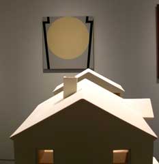
Leah Bailis's little suburban tract houses and P. Timothy Gierschick's symbol paintings conduct a sidebar conversation about restricted horizons, house as pressure cooker and yearning for better. I found the dialog between the works compelling. B. Ever Nalens' scotch tape transfer piece (Gallerist John Ollman had to point the piece out to me -- I completely didn't see it at first.) and Michael Coppage's pop-rivetted cardboard oculuses are great-looking.
Nathaniel Davis's drawings on graph paper and Alex Paik's symbol paintings echo Gierschick and Bailis.
Curator Greaves wrote us a while back to say that he, Valentine and Pym have been working as a curatorial team "for several years, with shows not just at Fleisher/Ollman, but likewise Harvard University, Art 36 Basel, Scope Miami." Keep up the good work, guys!
Unquote.


Can you tell me more about your piece that is third from the left in this picture?
I was wondering myself, and now I see Roberta mentions it in her Flickr description of this photo, if you pull any inspiration from road signs? Or are you just using a generic keystone shape?
First, I'm sorry we didn't get to see these together in person. But a few words about the one I call "Double Cross". When someone else asked about this one, partly because they were curious about relationships between the painting and the title, I initially described it as being more formal than my other paintings...but after I said this twice, I was less convinced, and now think that all my work is more formal than I have admitted - or realized - before. By "formal" I simply mean an overriding interest in relationships in the formal elements of paintings: color, form, space, etc., as opposed to conceptual. That of course doesn't mean that they aren't conceptual; it only means to me that they are more formal than I before realized. So...my impetus in making this painting was initially more formal, in this regard: I was simply using a shape I'd been thinking about and playing with, and having gotten stuck with it in that state, decided to buck my "suprematist" and strident tape-laying self, and slop on some salmon-colored paint, and let it do what it will. And that's how it came about...and it was accepted to the show, without giving me too much time to reconsider my dripping, pink choice. The title I gave it was also very "formal" in the regard that that word means descriptive - a double cross - and I basically threw other allusions to the wind; letting them "fall where they may." That's where I am at with my thinking with this painting...I'd have to live with it for a little longer to say much more.
Oh, about the sign question. Yes, I am inspired by signs; absolutely. And I do think of them as signs, in a way. In fact, a piece I did for advent season 2004, was called "Signs and Wonders", and was done on several old aluminum street signs.
I would definitely not think of the keystone in any general way at all; it's very subjective. Almost as subjective as a self-portrait; or other touchstone of identity. In fact, I've encouraged people to think of it as my self-portrait, or signature. It's a shape in which I find myself.