INROADS: Curator's Statement

         Yvonne Valenza, Jumble, from the exhibit INROADS                        


An ongoing project of mine (I'm heading it up, anyway) is an art exhibit space in my place of worship, Oxford Circle Mennonite Church, called Second Space Arts. The current exhibit (up until the 28th of November) is entitled INROADS, the work of Tegan Brozyna and Yvonne Valenza. Their work in this exhibit deals with both the ins and outs (inward and outward) aspects of journey...and how our individual journeys impact others, as well as our environment. What follows is the curatorial statement I wrote for the show:


Curator’s Statement
Inroads: Brozyna and Valenza

Life’s a journey: we’ve all heard this so many times, it’s nearly a cliché. But like most clichés, it has its origin in dignified truth. In a Western (European/American, generally) cultural sense, this journey is implied as linear – one occurrence after another, lined up like fence-posts or hatch-marks – creating a line which does not return. In the Eastern (Asian/African; again generally) cultural concept, a journey often assumes, rather than linear, a circular progression: occurrences repeat; one’s actions influence how you are acted upon. This is related to the concept of karma: good results in good; bad often results in bad.

Looking at topography (the “lay of the land”) or cartography (maps) should then resonate with our guts – our instincts, so to speak – and visually remind us that extremes are often incorrect: the truth is often somewhere nearer the middle. The meandering lines found in Tegan Brozyna’s paintings and works on paper are a fine synthesis of the linear and the circular versions of journey. In a real sense, rather than life being a journey, life is journeying: the passive becomes active. In Brozyna’s works, we visually walk with her over hill and dale; through the streets and avenues of America, all the while enjoying the view afforded by Brozyna’s joyful re-working of the landscape, and its realignment into a more ambiguous space. Painted on “bird’s-eye view” maps, the lines we actually traipse on morph into a more horizon-based experience: our progression is pleasant, but somewhat mysterious, because of this ambiguity. As the French post-Impressionist painter Paul Gauguin asks in his famous painting title, Where Do We Come From? What Are We? Where Are We Going?

Ambiguity and mystery are part and parcel of all journeys – including that of our psychological interiors. Ever since the early-twentieth century heydays of the ground-breaking psychological theorists Freud and Jung, a cultural fascination with the self’s personality, direction and meaning has been popularized. But of course, regardless of what our time within consists of; all our inner journeys impact all our outer life directions. And this is the line where Yvonne Valenza’s works on paper find their footing. In fact her illustrations and prints confront us with the question of how our direct actions may directly influence others’ lives (and journeys)…a little Western-style karma anyone? The work deftly retains both a sharp (poignant) sense of the interior, as well as one of social and cultural action and questions.

Whereas Brozyna is making work as an invitation to the viewer to join (and enjoy) the journey, Valenza’s work acts most usually as an investigation of journey: how do our individual journeys – both inner and outer – affect our surroundings and fellow pilgrims? 

Timothy Gierschick
Curator


Coming soon...part 3 of Wherefore Painting?


Read more...

Wherefore painting? (part 2)

(Part 2 of an ongoing essay)


 (Matthew Sepielli, Black Book, 2010).


A further question which arises then is why, if the book trope functions to give Sepielli’s works both a physical and psychological skeleton, as well as make it a driver of experience, does not the nearly-as universal trope of a four-sided, rectangular painting surface seem to function as strongly? The history and psychological power of the flat painting surface is even deeper historically and potentially more primeval than even the scribed and bound book. One possible approach to this question is to consider the educational and didactic shift that happened because of (or was occasioned by) the printing press. Before the book’s more universal availability and affordability, production was highly laborious, and the finished products were rare and expensive, therefore only available to the elite (i.e. church; ruling class; etc.) The average citizen could not read. Previous to this, didactics were based on pictures: one of the primary reasons churches were adorned with all the beautiful and lavish painting was for educational means – to instruct the laity in scriptural stories, beliefs and credos. Then came the printing press: Gutenberg’s innovation made the book more affordable, more lightweight and more ubiquitous. From this point on, the heretofore prime didactic tool – the painting (or more correctly picture) – was gradually replaced by the book; at least for the masses. In the six centuries since, the concept and logic of a book (put forward here earlier) became linked directly to not only our sense of narrative and progression, but also education, knowledge and propaganda. Therefore the trope of a book is rooted in the subconscious, in its power to sway, direct and limit one’s absorption of anything related to or reminiscent of that particular group of logic. And of course, Sepielli’s paintings are our pertinent example of that dynamic.

In Black Book, Sepielli takes this idea a step further, and appeals to that by-now ingrained logic more directly. In Black Book, we have a characteristically Sepiellian surface: nearly tar-bound with a protean, rubbery consistency, this painting reads fairly simply, until one reaches (incidentally, by “reading” left to right, Western-style) a shape suggestive of a backwards capital letter B. Now, Sepielli has been utilizing text in various ways in much of his recent work, on both book and non-book pieces, but not normally in quite so direct a way as this; which recalls one of Ed Ruscha’s iconic letter paintings. No longer is it something to be “read” and “interpreted”; here it is more symbolic (as all letters are) and decipherable. B relates to perhaps the title, Black Book, or the original Greek beta, second in command to the alpha – a commentary on a book’s subservience to the author; a painting’s subservience to the artist? The sense of cipher, symbol and icon is heightened by its being filled in (no “gesture” to speak of, such as script has, which would imply human hand, and less autonomy) and its highly-variable and expressive application of palette. It is literally a shape which suggests a letter, rather than vice versa. 


(Ed Ruscha, F-house, 1987)


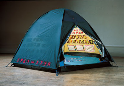
There is one other feature of Black Book which distinguishes it from the other book paintings: it is permanently opened – sealed to this particular spread. This creates an instant ambiguity: we are (book-wise) in the center, yet simultaneously at the end determined by Sepielli. The iconic B then, is afforded even more power, because it becomes a pointer (as it does even by virtue of its shape) to the previous narrative (the alpha) – leaving us to guess at the rest of the narrative, or alphabet, if you will. It is therefore ironically even more of a mystery than the closed books are: having been afforded the sense of “readability” by an ostensibly open book, the conversation and narrative are more titillating than a book of which we are given only the cover/surface. There we are given a surface with the informing logic of a book (trope); here we are made to attempt to read it – that is, approach it as a book rather than a painting – to ultimately little avail. Does Black Book intimate the infamous bachelor’s “little black book”, akin to a Tracey Emin embroidered confessional tent – and leave us wanting and wondering? We cannot be positive; and thus this is a work in control of itself; drawing strength from its limiting (and limits); both revealing and withholding. 


(Tracey Emin, Everyone I Have Ever Slept With, 1963--1995, 1994).


Read more...

Wherefore painting? (part 1)


(Some thoughts garnered from a few hours at Matthew Sepielli's new show at Tiger Strikes Asteroid...)


 What is central to a painting? What is at its core; both physically and philosophically, and most fundamentally, how are these related – or are they?

The reason Matthew Sepielli’s paintings are a good case study for these sticky – and dangerously unanswerable – questions, is that they are overwhelmingly corporeal; meaty and unavoidable. These are objects for which titling seems nearly unnecessary – their presence alone speaks with a certain enough voice to eliminate any overt need for textual specificity. And yet, Sepielli does title them; attaching small rudders to these already careering vehicles. Some of these paintings are indistinct color studies; each color morphing into another, Kosoff-like; line being a near non- entity. In others, the matrix itself is delineated literally, with connect-the-dot-style mapping nets, elbowing and hinging their way across the soupy surface: and in this case, color is sublimated. This seems to offer the beginnings of a thesis: no one formal concern is paramount; indeed as is intimated in Sepielli's press release, the organic exploration informs directly which element or elements the piece moves within and towards – and what materials are intuitively grabbed  and incorporated. Is it then the experiment itself which forms the core of these works? Perhaps…but to posit a more succinct theory, I believe the choice and features of the painted-on form/surface most closely directs the path of the paintings, in a roughly-centralized manner. That is, rather than line in this one, color in that, and surface in yet another, the actual depth, perimeter, dimension and sheer thing-ness of the painted-on form/surface (or object, as the case may be) most universally drives Sepielli’s paintings’ direction and eventual conclusion. 

The series (and this term is used as loosely as I believe Sepielli might use it) of books as surfaces/objects focus in even more closely on this core driver of Sepielli’s work. As with the other paintings, the compositions on the books are centrally organized, but depending on the piece and the choice of incorporated collage that is appliqued to the surface, the perimeter is occasionally pierced slightly by those added elements (or literally pierced, as in State Fair). (The frequency of this does not work against the surface as prime-driver argument; rather it is fairly consistently utilized; enough to consider its absence as the “exception which makes the rule”).  A book, in the beginning as that alone, is an understood and fully-logicized entity, physically: it is read as being complete in its form. In this way, even before becoming subsequently a surface, it exerts a strong influence even on the final parameters of the piece. In other words, the logic of the book, even before paint is applied, reaches ahead of the artist and places certain defining limits and stops on the process. This is a highly organic comingling of mind and matter; past, present and future; meta- and micro-reality – becoming not unlike one of Karl Jung’s famous anthropomorphic Archetypes.

But why these particular limits from the very concept of a book – and why does this feature prominently in these particular works? Put simply, the strongest component of a book’s overall logic is its narrative (meant in the largest sense possible); that is, we logicize and assume, through long and absorbed experience, that a book has a distinct beginning and distinct end, with a center of some length between. And not only is this a theoretical and psychological dimension, it is wrought physically in a form, for us to know tactilely. Therefore this narrative logic is multi-leveled, and that much more pervasive and persistent, placing a particularly strong defining logic on anything added to it, even if that addition, for all intents and purposes, is primarily physical in nature. Thus, Sepielli’s paintings rely heavily on, firstly, the force of surface and form; and secondly, the book “series” even more so because of the forth-going, extrapolating narrative logic. 

 (All images, Matthew Sepiellli, 2010. Titles, top to bottom: Pig Meat; State Fair; In a Fine Net)


(Part 2, next week...)

Read more...
Related Posts with Thumbnails