Showing posts with label paintings. Show all posts

New Year; New Maxims

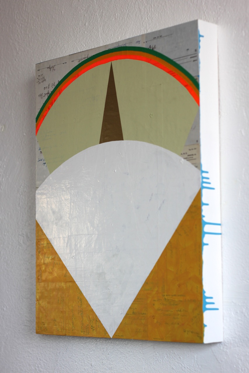
The impromptu color combinations on my stirring sticks often suggest color combinations that might work in the paintings.

2.11.13

Every year, I try to encapsulate some lessons I feel I'm learning, or need to begin learning, for my artistic practice. This year, they emerged while frenetically preparing the paintings for my latest show, and were fine-tuned while talking with both friends and strangers at the show's opening and First Friday receptions. They are as follows (with some explanation): 

Loosen Up

My tendency is to be very tight with my paint application, relying heavily on taping, masking, stencils, tracing, compassing, and so on. One visitor, a stranger to me, but a fellow painter in his sixties, complimented my work at the exhibit, but then said, "these lines (pointing to a work with harshly taped yellow lines) make me say, why the hell doesn't he just paint it?" And then he laughed and reminded me that he liked my work, and that he felt he had the right to speak with me this way, since he had been painting for fifty years or so. I was fine with this, and thanked him for his candor, and realized he had touched on something that I'd been feeling tapping me on the back, but hadn't taken the time to mentally articulate. Thus, the first maxim: not a hard rule, by any means - I'm not going to give up the tape, the stencils, or the masking, since these are my tools - but I'm also going to keep a reminder near that I should also rely on those other, even simpler tools at my disposal: steady hands; quality brushes that make a good edge - a human edge - all by themselves; and an ease of application which comes from knowing these tools well. 


Mix it Up

This one is loosely based on a maxim from a previous year, where I saw the need to begin adding more diverse paint application styles to my repertoire: not just straight, flat paint, but scumbling; spraying, with spray paint or stiff brush; thin paint layers, and layers bleeding through each other. In other words, allow the paint and other materials to be all that they can be; get them to do as much as is possible. Make the paint itself the most versatile tool it can be. So, in a way, this maxim is a reminder that this needs to continue. I thank the work of Corey Antis, which I sat with for hours at a time while monitoring Tiger Strikes Asteroid, for originally pushing me to this realization.


Keep it Up

Ultimately, the most simple and the most challenging one of the three: consistency. At my new location, I've resolved to eek out as much time from my week as possible, without unduly stealing from other important parts of my life, to spend in the studio. Keep plowing forward, expecting a good crop to result. An old adage, but a good one. This is tempered, of course, by my feeling that I need to squeeze out of every element in a picture the most it can provide. In other words, work with less elements, but make each element work as hard as it possibly can for the overall benefit of the picture. This is not easy, but very satisfying when it is working well.


I plan on making a sign of these to hang in the studio this year. Let's see how they look at the end of the year, what they might lead to pictorially, and which maxims might emerge as I move on.

Read more...

CO Flag: now in Indiana

CO Flag, enamel on found door panel, 2004. Collection of Mennonite Church USA.

 Hi friends. An older painting of mine has been accepted into the (brand new) collection of artwork in the (also brand new) building of the Mennonite Church USA headquarters in Elkhart, IN. Below is the short blurb to help viewers engage with the (admittedly) minimal image. I'd be interested in your feedback, as well.


Several years ago, I was working my way through a book by Perry Bush, entitled Two Kingdoms, Two Loyalties: Mennonite Pacifism in Modern America, a study of the gradual transition of Mennonites from quietism to active pacifism, and happened upon a passage which piqued my interest on the psychological impact of color. During World War II, when there was a heightened animosity against conscientious objectors, an Ohio Mennonite place of business had, overnight, been splashed with a can of yellow paint. Yellow has long been associated with cowardice, and this is likely what the perpetrator was intending to convey. Being from the (at least outwardly) more politically-tolerant east coast, I was unfamiliar with this discriminatory practice, and it struck me as an opportunity for artistic experimentation.

My artistic approach has become fairly minimal, that is using a minimum of materials and components to convey a maximum of expression, so that connections often need to be sussed out by the viewer. This piece, CO Flag, was made easier by the fact that a friend of mine, knowing that I enjoyed painting on and engaging with found objects in my work, had given me an aluminum screen door panel, stamped with an iconic "barn-door" pattern. I decided to use it to experiment with the possibilities of yellow. The thought process was something like this: if one assumes that the perpetrator of the yellow-paint vandalism was doing that action because of perceived patriotism, and if one also assumes that the Mennonite victim of this crime also was, in their own way, trying to be a good citizen, what might be an expressive icon or symbol of that unusual common ground? In other words, what kind of flag (a calling-card of patriotism) would a conscientious objector (CO) have, or choose to have? And of course a little artistic tongue-in-cheek approach doesn't hurt.

Re-appropriating the cowardly color yellow, I made it the primary color of this flag, and squeezed it into a very basic representation of the American flag, and painted it on a door panel: another re-appropriation. One piece of advice to discriminated people is to take back something that was taken away, and make it new. This is also a part of the Gospel: old things have passed away; the new is here! My hope is that some of these connections were successful in this painting, and that it goes on as an encouragement to creative discussion -- and creation.

March 31, 2012.

Read more...

Essay: Karla Siegel Paintings at Artspace Liberti

 
Untitled, 2011, Karla Siegel


Below is an essay I was commissioned to write for friend and fellow studio mate, Karla Siegel. The show just opened up this past Friday; please go see it and support not only her work but Artspace Liberti in Fishtown. I think this is some of the best stuff I've written recently...


It's a matter of belief then. Do you believe that what this picture is showing you is true; that it truly exists or once existed? Do you believe that the artist is being sincere in their motive, approach, and depiction? When light, which is a major problem (in the sense of an experiment or challenge) in Karla Siegel's work is invited, even encouraged, to have its way, the question must be asked: what do you believe? It's probably too philosophical a beginning for most of us, but nevertheless underlying all vision lies the question of belief. And when an artist such as Siegel, doubly a painter, invites light into the mix as powerfully as she has, the questions crop up.
    Light makes painting not only beautiful, but also confusing; it imparts order as well as chaos. Take an example from art history; say, Impressionism. This movement was brief as far as movements go, but at its heart it was interested in the same thing painting has been interested in all along: the capturing of an essence. Impressionist painters went about it by, as some critics spit at the time, "flinging” their paint-pots at canvas. Despite the ironclad acceptance now of Impressionism, these critics were not far from the truth. These painters – Monet, Pissarro, et al – were often working so ardently to capture and encapsulate the play of light creating and destroying form, they nearly were flinging paint in their zeal to stop light and time in their tracks. (Of course flinging with intent, and without, makes all the difference here). Monet, for example, was so doggedly after the enigma of light, that he did several scenes – one of the most haunting and well-known being the haystacks – over and over, in this light and that, one day after the other. Siegel's painting is rooted directly in the traditions of painting: she says as much herself. Portraiture and still-life are the two expressions of painting that are most obvious here. But, as mentioned before, she is most deeply rooted in the more primal – more human, you might even say – painterly instinct, that of pursuing and subduing the essential element of light. But how exactly – and how does Siegel call us to belief through her paint?
    One method is layering. Time and light have been companions throughout the history of art – one example has been mentioned already. In some cases, the artist attempts to stop time, or at least express the effect of a set time period of light upon paint. In other cases, time is less linear and more layered, something like the difference between a cupcake and a layer cake. The former is heat, time and materials all running parallel in one take; the latter is again the product of heat, time and materials running the same way, but then separated and stacked to create an entirely different result – and reaction. Siegel's portraits are the layer cake: we see different time + light creations piled or layered upon each other. And the technique and perspective reiterate this: in several paintings the face comes up close, very close to the painting surface, becoming muddled and thick in its execution; in others the outlines of shoulder, neck, and head are recognizable, but they are cut from the up-close detail of another face, like a small profile snipped out of a larger image from a magazine. Another of the portraits has a pulled effect, not unlike taffy, that moves the figure up into the blocks of light suggesting a large studio window. The figure, though owing a bit to Bacon, is more calm than his tortured, drawn figures. Even here though, one intuitively picks up on the layers of reaction to light that Siegel has percieved, and subsequently sandwiched into the picture.    
    A second tactic of Siegel's to subduing the enigma of light can be seen in her still-life-inspired abstracts, which suggest not only fountains, bouquets and blooms; but also driveway fireworks and bright, smoky explosions. Earlier mention was made of the action of light through paint at times creating confusion or chaos. In the still-lifes, Siegel is not actually trying to confuse or unsettle the viewer; rather she, like any good artist or scientist, is attempting to solve a problem – and here one problem is fresh depiction. And the approach chosen is to de-clarify; to make indistinct; to obfuscate. But why? One cannot really know; often even the artist can't articulate their own reasoning. Here's a shot, however: consider the full-on, noonday sun. It is blazing; crippling; impossible to look upon fully without pain and damage. If one made an attempt to do so, it would literally blind you – just as omniscience would implode our understanding. In other words, humans are incapable of the full absorption of light's power; of full absorption of worldly knowledge – we are too corporeal. But...what of those hazy and foggy days when the sun is obscured; covered by a scrim of moisture, smoke or steam? Now, the sun – the full sun – can be gazed upon with no damage! Its spherical contour can be made out through the haze – one element of the sun's existence does not escape us. In the case of Siegel's still-lifes, the full knowledge of the scene or source would not actually be physically injurious to us – from human to human, pure knowledge and vision do not function that way. However, without Siegel's haze of paint; scrim of manipulation; we would be stymied by too much – too much information; too much direct representation – we'd not be asked to do any work. As with the full-on sun, we'd be blinded by our own visual callousness. But through obfuscation and haziness, Siegel tells us less, and the painting teaches us more. And as with the hazy sun, one element at least does not escape us. This is the part of the basic paradox of art that Siegel so adeptly and consistently dips into.
    Finally, Siegel captures light by doing exactly that: collecting it, largely in the impasto of her portraits, but also more subtly in the delicate washes and glazes in the still-life abstracts. This occurrence came while looking at them closely: the impasto, lain horizontally, vertically, diagonally this way and that, captures, gathers, and intensifies the cast light from sources both natural and artificial, much like a screen or colander captures grit or grains on its grid, creating independent patterns and intensifying the light's power in particular areas, as well as modulating the surrounding and underlying colors. This uncovers an approach to the original question of belief: this collecting and emitting of light –as nearly physical as is possible without a filament or diode – underlines emphatically the base materiality of the work. Thus an utterly material attribute of the painting – the impasto paint with its furrows, hills and dales – is capturing and enlarging the effect of a highly immaterial entity: light. Here is where the enigmas might clash. But because of this sudden kiss of the material and immaterial, we find ourselves able to answer to a point, perhaps timorously, perhaps boldly: "I believe – but help me with my unbelief!"

Timothy Gierschick
January, 2012

Read more...

Artists' little helpers: thoughts on apprenticeship


 Matisse, La Danse mural


Donald Judd, Untitled (for Susan Buckwalter), galvanized and aluminum.


(I'd be very interested in any comments on these thoughts...)

It has been a tradition of artists for centuries now, particularly Western artists, to have numerous assistants (in earlier parlance, apprentices). In exchange for experience, remuneration and perhaps some cachet, they work for these well-established artists, doing menial and preparatory tasks: canvas preparation, paint mixing, layout drawing or painting, fabrication, and so on. In the modern era (1890s until about 1990s), this relationship morphed more into the assistant category than apprentice: though many of the assistants undoubtedly went on (and still do) to further their own careers through connections they made, or references found through their “masters”, it wasn’t necessarily as much a given as it would have been under the earlier definition of “apprentice”. There the younger artists were part of a more rigid and established pattern of master and trainee, not unlike the trade guilds of medieval Europe, and likely were more subject to the system’s parameters, not to their own desires or whims as to when hanging out their own shingle was finally possible: following the system was mandatory to be accepted as a serious artist in the market (then largely ecclesiastical).

Here are two interesting aberrations of the general modernist model, which might be worth investigating in light of the older model of apprentice: Henri Matisse and Donald Judd.
Matisse, in La Danse, his canvas-cum-mural commissioned in the early 1920s by Dr. Barnes of Pennsylvania, was already laying the groundwork for his famous, late-career cut-paper works. The nearly forty-foot long mural incorporates large areas of color, depicting frolicking grey female figures against a backdrop of pink, blue and black. Spending time with the mural it becomes obvious that, along each edge of the positive shapes, there seems to be a painted, undulating band or border, in a slightly different value and sheen than that of the larger field of color, that visually readjusts, balances and cleans up the edges of those shapes. There are also similar bands along the inside of the negative shapes. This toys with one’s perception of the negatives and positives: they seemingly float upon each other, like paper on a puddle, soaking in water at intervals, creating a set of complex, nuanced and mutable planes. Beyond simple description, however, this quality points to one of the many interesting anecdotes about this work: that Matisse hired a house-painter, presumably in Nice, where the studio for painting La Danse was situated, to paint in the very large areas of solid color. Matisse afterwards then likely applied those aforementioned “bands” which tidy-up – and edit compositional balance, as can be seen by the many line and edge adjustments – the areas the house painter covered. Was this done by Matisse as a time-saver; was he perhaps running past schedule? Or did he simply not feel the need to individually and directly apply every drop of paint onto a mural which would carry his name? This is not a very Modernist concept; modern expression at its height was so much about the individual’s expression, created by that very same individual; it wasn’t until more postmodern times when the direct creation of work and manipulation of material as an unbroken line from the individual’s idea was questioned, and became somewhat unnecessary, immaterial or even pejorative (such as in Donald Judd, who we’ll discuss next). Could this gesture of using a workman’s hand in a fine art application be of the same seminal token as much of Matisse’s artistic decisions? Or was it simply out of necessity…or both? And more importantly, could that humble (station; we don’t know his personality) house painter be considered the missing link between the ancient idea of “apprentice”, and the postmodern idea of the “hired tradesperson”, such as Judd and others used?

Donald Judd was a postmodernist artist of what is sometimes called the Minimalist school, and that title has much to do with our questions of “individuality” and “authorship” of an artwork. Minimalists became known for actively and deliberately divorcing the material creation of their work from the concept or idea. This would often take the form of farming out the fabrication of their sculpture and materials to workmen and craftspeople of the common variety: for Judd, this sometimes meant HVAC contractors, metalworkers and carpenters, who would fabricate his work for him according to his specifications and drawings. Artists have been doing this, of a sort, for generations, in the form of having other more specifically-trained artisans, such as bronze casters or lithographers, carry part of a project to completion that the author/artist was not well-versed in (or not interested in). That is not exactly what we speak of here: this is different in that it is (a) using skilled workers, but from outside the art “world”, and (b) using labor which is not personally invested in finding their own way, and making a name in the same milieu as the hiring or “master” artist. This is the major reason why Matisse’s use of a house painter to apply the actual paint surface of a painting is so interesting; a completely ancient and a completely postmodern gesture, all at once.

A good example of a Judd work that was fabricated by skilled tradesmen is one of his wall pieces of galvanized steel: not surprisingly, the same material used to make HVAC ductwork (the one I know personally is in a private collection in Philadelphia). The piece is expertly made – more expertly than perhaps Judd himself could have accomplished – but has its aberrations as any handmade object does. Was Judd revolutionizing the idea of an “assistant” for the postmodern era (that of an aesthetically disinterested tradesperson), or was he simply riffing off an idea begun quietly by Matisse?

Read more...

Fairmount Arts Crawl, 2011

A few weeks ago, the Church Studios at Olivet Covenant Presbyterian Church participated in the Fairmount Arts Crawl...here are some scenes from that event, centered around my studio...
(Thanks to Vicki Liantonio/Piccolo Takes All for the photos!)


More in depth posts are in the works...stay tuned...

Read more...

Experiment: new paintings via iTouch

A little experiment here; seeing what kind of quality I get with photos from my iTouch. Either way, you get to see some progress happening in my studio (which I haven't shared for a long time).


Okay...now that I know this works, I'll a) take better pictures, and b) more!

Read more...

Seeing Faces at the Barnes Foundation

(above, Gallery 6, south wall)
(picture source)


It's amazing how sometimes it takes years for a thing or a concept, to soak in and become more clear. For the past six years, as art handler and collections assistant at the Barnes Foundation, I've been (casually) puzzling over the placement of the candlesticks and vessels (mostly meant for potables - coffeepots, teapots, tankards, pitchers and the like) that dominate the tables, desks and chest-tops at the Barnes Foundation. Now, Dr. Barnes arranged symmetrically - stridently so - thus these furniture pieces are normally anchoring the wall arrangement or "ensemble"; they are essentially rooted to the floor by these furniture pieces, the furniture acting as a kind of grounding mechanism (root system, if you will) for the more esoteric interplay taking place in the branching arrangement above. But the items on the furniture pieces are symbolically important as well, I realized recently. And it seemed like so much of a trope for so long, that I'd (nearly) taken it for granted. Almost always, the two candlesticks are at or near the two back corners of the piece's top, and then the vessel is centered on the top, but - and here's the detail which confused me at first - placed towards the front. I dutifully maintained this arrangement (according to the original, 1951 postmortem  installation photographs which function as our standard), but without really understanding what Barnes was after (if anything at all).

And here is what I believe Barnes may have been after: a visage; a physiognomy made from symbolic decorative arts items, suggestively arranged to resemble a face. Normally this consists of candlesticks for eyes, and vessels for a mouth (and occasionally a nose and mouth). Thus, the concept of the omnipresence of art at the Barnes Foundation (or a pervasive mirror, if you will). Essentially, Barnes was creating the suggestion of a face on the very surface which a centralized viewer would be standing in front of. And the items vary according to which direction the symbolic connection is to go. For example, in Gallery 6 on the south wall, (see image above) a teapot is placed: it both formally references the reflection on the lake in the Gauguin painting above it, as well as symbolizes a carrying and possible pouring out (or divvying out) of of knowledge, wisdom -- or potency. Conversely, in Gallery 2, east wall, the central vessel (mouth, if you will) is a host box for holding the symbol of Christ's body for communion...of course, it references the painting above, a depiction of a vision of the Holy Virgin, by El Greco. But it also symbolizes the emptiness (which it is) of a soul waiting and imploring for the holiness of God to fill them - it is a vessel in waiting; in limbo; in anticipation, along with the saint seen in prayer receiving a vision.

One of the most blatant examples, and the one which initially precipitated this idea, is in Gallery 23, west wall, under the Unpleasant Surprise masterpiece by Henri Rousseau. There is a bear attacking a maiden in the painting, and on the blanket chest below it, is an ursine face scaring us; confronting us with a similar danger (and possibility, in the form of a saving rifleman). The arrangement formula is slightly different here: two ears are created by candlesticks; two eyes by tankards, their handles angling towards the back corners, implying furrowed brow and menacing face. The nose, septum and slightly grinning mouth is created by a particularly unusual item, used in the production of wax-covered rush lights, called a "grisset".

Considered as a persuasive phenomenon, or a general component of the collection's arrangement, there is certainly a sense of omnipresence of art. Students are instructed to be "centralized" and focused on the ensembles as didactic "chalkboards", thus by virtue of these assembled visages, the dedicated gaze is immediately met with an artificial face; an oracle of sorts, which imparts a symbolic direction to those seekers who face down the occasionally intimidating walls. They also function as a mirror, in which different aspects of ourselves can be seen - not unlike the assumed human presence in landscapes (picturing ourselves as being there). This is, if it is true, meant as both comforting and confrontational, two aspects of the best of art collections. But mysteriously oracular? That is all Barnes Foundation.

Read more...

Wherefore painting? (part 2)

(Part 2 of an ongoing essay)


 (Matthew Sepielli, Black Book, 2010).


A further question which arises then is why, if the book trope functions to give Sepielli’s works both a physical and psychological skeleton, as well as make it a driver of experience, does not the nearly-as universal trope of a four-sided, rectangular painting surface seem to function as strongly? The history and psychological power of the flat painting surface is even deeper historically and potentially more primeval than even the scribed and bound book. One possible approach to this question is to consider the educational and didactic shift that happened because of (or was occasioned by) the printing press. Before the book’s more universal availability and affordability, production was highly laborious, and the finished products were rare and expensive, therefore only available to the elite (i.e. church; ruling class; etc.) The average citizen could not read. Previous to this, didactics were based on pictures: one of the primary reasons churches were adorned with all the beautiful and lavish painting was for educational means – to instruct the laity in scriptural stories, beliefs and credos. Then came the printing press: Gutenberg’s innovation made the book more affordable, more lightweight and more ubiquitous. From this point on, the heretofore prime didactic tool – the painting (or more correctly picture) – was gradually replaced by the book; at least for the masses. In the six centuries since, the concept and logic of a book (put forward here earlier) became linked directly to not only our sense of narrative and progression, but also education, knowledge and propaganda. Therefore the trope of a book is rooted in the subconscious, in its power to sway, direct and limit one’s absorption of anything related to or reminiscent of that particular group of logic. And of course, Sepielli’s paintings are our pertinent example of that dynamic.

In Black Book, Sepielli takes this idea a step further, and appeals to that by-now ingrained logic more directly. In Black Book, we have a characteristically Sepiellian surface: nearly tar-bound with a protean, rubbery consistency, this painting reads fairly simply, until one reaches (incidentally, by “reading” left to right, Western-style) a shape suggestive of a backwards capital letter B. Now, Sepielli has been utilizing text in various ways in much of his recent work, on both book and non-book pieces, but not normally in quite so direct a way as this; which recalls one of Ed Ruscha’s iconic letter paintings. No longer is it something to be “read” and “interpreted”; here it is more symbolic (as all letters are) and decipherable. B relates to perhaps the title, Black Book, or the original Greek beta, second in command to the alpha – a commentary on a book’s subservience to the author; a painting’s subservience to the artist? The sense of cipher, symbol and icon is heightened by its being filled in (no “gesture” to speak of, such as script has, which would imply human hand, and less autonomy) and its highly-variable and expressive application of palette. It is literally a shape which suggests a letter, rather than vice versa. 


(Ed Ruscha, F-house, 1987)


There is one other feature of Black Book which distinguishes it from the other book paintings: it is permanently opened – sealed to this particular spread. This creates an instant ambiguity: we are (book-wise) in the center, yet simultaneously at the end determined by Sepielli. The iconic B then, is afforded even more power, because it becomes a pointer (as it does even by virtue of its shape) to the previous narrative (the alpha) – leaving us to guess at the rest of the narrative, or alphabet, if you will. It is therefore ironically even more of a mystery than the closed books are: having been afforded the sense of “readability” by an ostensibly open book, the conversation and narrative are more titillating than a book of which we are given only the cover/surface. There we are given a surface with the informing logic of a book (trope); here we are made to attempt to read it – that is, approach it as a book rather than a painting – to ultimately little avail. Does Black Book intimate the infamous bachelor’s “little black book”, akin to a Tracey Emin embroidered confessional tent – and leave us wanting and wondering? We cannot be positive; and thus this is a work in control of itself; drawing strength from its limiting (and limits); both revealing and withholding. 


(Tracey Emin, Everyone I Have Ever Slept With, 1963--1995, 1994).


Read more...

Wherefore painting? (part 1)


(Some thoughts garnered from a few hours at Matthew Sepielli's new show at Tiger Strikes Asteroid...)


 What is central to a painting? What is at its core; both physically and philosophically, and most fundamentally, how are these related – or are they?

The reason Matthew Sepielli’s paintings are a good case study for these sticky – and dangerously unanswerable – questions, is that they are overwhelmingly corporeal; meaty and unavoidable. These are objects for which titling seems nearly unnecessary – their presence alone speaks with a certain enough voice to eliminate any overt need for textual specificity. And yet, Sepielli does title them; attaching small rudders to these already careering vehicles. Some of these paintings are indistinct color studies; each color morphing into another, Kosoff-like; line being a near non- entity. In others, the matrix itself is delineated literally, with connect-the-dot-style mapping nets, elbowing and hinging their way across the soupy surface: and in this case, color is sublimated. This seems to offer the beginnings of a thesis: no one formal concern is paramount; indeed as is intimated in Sepielli's press release, the organic exploration informs directly which element or elements the piece moves within and towards – and what materials are intuitively grabbed  and incorporated. Is it then the experiment itself which forms the core of these works? Perhaps…but to posit a more succinct theory, I believe the choice and features of the painted-on form/surface most closely directs the path of the paintings, in a roughly-centralized manner. That is, rather than line in this one, color in that, and surface in yet another, the actual depth, perimeter, dimension and sheer thing-ness of the painted-on form/surface (or object, as the case may be) most universally drives Sepielli’s paintings’ direction and eventual conclusion. 

The series (and this term is used as loosely as I believe Sepielli might use it) of books as surfaces/objects focus in even more closely on this core driver of Sepielli’s work. As with the other paintings, the compositions on the books are centrally organized, but depending on the piece and the choice of incorporated collage that is appliqued to the surface, the perimeter is occasionally pierced slightly by those added elements (or literally pierced, as in State Fair). (The frequency of this does not work against the surface as prime-driver argument; rather it is fairly consistently utilized; enough to consider its absence as the “exception which makes the rule”).  A book, in the beginning as that alone, is an understood and fully-logicized entity, physically: it is read as being complete in its form. In this way, even before becoming subsequently a surface, it exerts a strong influence even on the final parameters of the piece. In other words, the logic of the book, even before paint is applied, reaches ahead of the artist and places certain defining limits and stops on the process. This is a highly organic comingling of mind and matter; past, present and future; meta- and micro-reality – becoming not unlike one of Karl Jung’s famous anthropomorphic Archetypes.

But why these particular limits from the very concept of a book – and why does this feature prominently in these particular works? Put simply, the strongest component of a book’s overall logic is its narrative (meant in the largest sense possible); that is, we logicize and assume, through long and absorbed experience, that a book has a distinct beginning and distinct end, with a center of some length between. And not only is this a theoretical and psychological dimension, it is wrought physically in a form, for us to know tactilely. Therefore this narrative logic is multi-leveled, and that much more pervasive and persistent, placing a particularly strong defining logic on anything added to it, even if that addition, for all intents and purposes, is primarily physical in nature. Thus, Sepielli’s paintings rely heavily on, firstly, the force of surface and form; and secondly, the book “series” even more so because of the forth-going, extrapolating narrative logic. 

 (All images, Matthew Sepiellli, 2010. Titles, top to bottom: Pig Meat; State Fair; In a Fine Net)


(Part 2, next week...)

Read more...

In3s: two paintings

Here are two of the three paintings that will be in In3s at Artspace Liberti, Fishtown, opening this Friday evening the 3rd:


Pique, latex, enamel, collage, found object on panel, 2010.


Parade Rain, latex, enamel, collage on panel, 2010.

The opening reception runs from 7 - 10 PM. See you there?

Read more...

March of the Romantic -- Jaya Howey at Marginal Utility


The In Acts Out: Jaya Howey at Marginal Utility.
Mr. Howey, I’m confident, does create a “humorous contrast” between the highly-considered surfaces, and the flippant, banal titles of his paintings – but there was no way I could really know. Marginal Utility decided to hang the paintings – runic slabs of  mostly wet-clay, warm-gray, over various brightly-colored underlayers – without any text or explanation, save a cryptic newsprint scrap such as Marginal Utility is fond of. Only the ebb and flow of Howey’s thicket of marks were there to guide the viewer – and I’m entirely fine with this. Though it may turn off the casual visitor, or the “post-painting” painting neophyte, those who are already very interested in both the materiality of painting and the nascent ideas of painting, will feel themselves drawn in regardless. (A risky hang tends to divide the art-adults from the art-children, anyhow).
As I discussed afterward with a friend along for the visit, my frame of references includes many artists whom I, upon meeting new work, will almost unconsciously associate and categorize them with. It’s a mental sorting which helps with both looking and articulating. Upon viewing Howey for the first time (and it must be said, that I only know this Howey body of work well; his practice is widely divergent in style) within a minute I was thinking of Warren Rohrer. Rohrer is one of the local painting scene’s best hidden secrets (unfortunately); he was at the height of his powers during the eighties, dying in 1995. He utilized a similar push-and-pull exercise as Howey with the materials of paint, and with the possibilities of surface as a repository of ideas and belief. Brightly-colored, heavily influenced by drawing, calligraphy and the agricultural landscape (a kind of Updikian painter), Rohrer’s work is decidedly painting; there is little credence given to the possibility of post-painting – he is still feeding fundamentally off the abstract expressionist’s tap. Whereas Rohrer created an internal language of marks within each piece – only incidentally connected to the whole, his personality really being the consistent touchstone – Howey’s works are strongly reliant on the whole. The sparseness of stimuli almost requires this, so it does not collapse under its own weightlessness.  Indeed, as the press release states, Howey’s pictorial surfaces are pushed just shy of “compositional stability”. But again, whereas in Rohrer this is accomplished by an overwhelming flood of color, strata and mark-upon-mark, we’re given the most economical of means by Howey – but to the same end essentially: co-identification. Howey wants us to find a way in as much as Rohrer, but because each of them is drawing off quite different tributaries, their flow is divergent. But the same wide river of painting is nonetheless fed.
This paucity of “compositional stability” is what really appeals to me the most – that is of course, after the pleasingly moist-clay gray oil; the subtleties of brightness under the murk, and the beauty of the scratching – put simply, the gorgeous formality of it all. In fact, compositional stability increases, as the implication of painting being legion tells us, the more one takes in (or is taken in by) the entire show. Rather than being given a collection of short stories (there’s Updike again; how modernist!) we are seeing the chapters of a novel. In German, “novel” is Roman (pronounced roe-monn) – and the role of neo-romanticism is evident. The romance in Howey’s paintings though, is not of the hero, the hapless sidekick or the wooed woman – it is rather the story of painting itself. Each scratch into the paint, creating the buzz of moist burrs, tries to accomplish what all romantics are after – a direct line from the body to the heart…not a cord to be twanged at whim, but to function as a real tap for real emotion. In the current environment of high irony as craftsmanship, and winking, humorless humor, this is a tall order. But I believe this neo-romanticism will continue to march in, even if on matchstick legs such as Howey’s. Bravo to him for realizing it, and bravo to Marginal Utility for verifying it by making us rely on the old-fashioned gaze for information. How romantic is that?


(top, Jaya Howey; from www.marginalutility.com)
(below, Warren Rohrer, from www.locksgallery.com)


Read more...

Art Thoughts, Week 46: David & Conflict


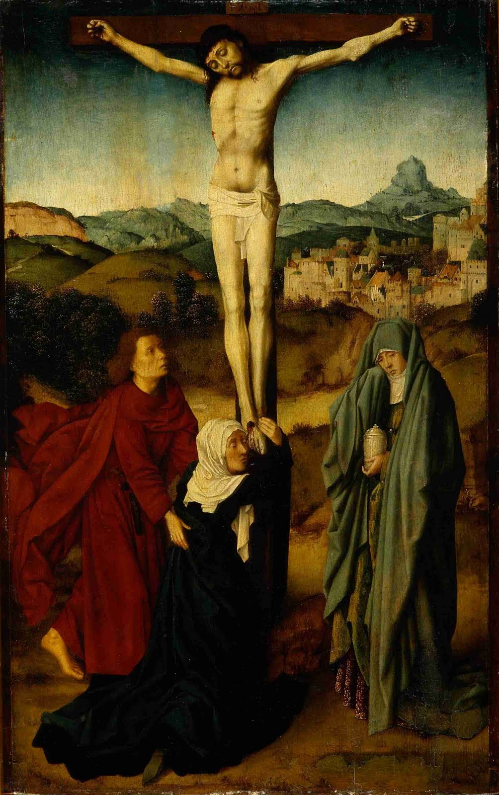
Crucifixion Scene with the Virgin, St. John and the Magdalene, Gerard David, Netherlandish (1460—1523), oil on panel, BF123.

Even when writing about paintings, auto-pilot can attempt to take over. Whether through routine, boredom, distraction or stereotypes, occasionally the same words, the same thoughts, the same associations float to the top. For this particular painting, Crucifixion by David (pronounced Dah-veed), that particular temptation to be rote came from genre. This is firstly a religious painting, and secondly a crucifixion: a genre so ubiquitous as to elicit a whole corral of pre-programmed expectations. Ironically, my sculpture professor used to say the hardest thing to depict seriously in art is the cross: it’s just been done too many times, and too often poorly. But even though this happens, one must keep looking, and keep writing. 

The important question which finally emerges is what is there about this painting’s unique voice which helps it rise above the babble? By what aspect does this piece distinguish itself? Though an academician, and subject to the whims of his patrons, David was nonetheless his own person, and most importantly his own painter. Otherwise (to grow momentarily snarky) how would one know if it was a Van der Weyden, Tintoretto or Gaugin crucifixion that we were looking at? You get the point: aesthetic signature is important; primary, even.

But what else – any particular emotional undercurrent which pulls or pushes the painting in one direction or another? There is such within this painting, animating it…and there is a companion set of color choices by David (supported by convention) which set up both a support and a denial of that emotional portrayal. In other words, the painting’s components take sides. Another professor of mine, this time in literature, stated that all fiction, at its core, has a driving force of conflict behind it. It is a raw touchstone for humanness. And really, what more conflicted scene could one imagine for a 15th century Christian? They, along with the figures here, are stuck between a promise and a reality. That is, the promise of resurrection and renewal, and the harsh reality of an expiring fleshly form.

To illustrate the basic conflict, look at two of the figures. The emotional conflict is primarily represented in the central figure, Mary the mother of Jesus. (Mary Magdalene, the third in the group, is sometimes shown at the foot of the cross, but the scriptural reference supports this being the Virgin, since John is comforting her). Not only is her entire gesture and weight attempting to hold Jesus down, but also the darkest colors in the painting are found in her cloak, causing the greatest balance of weight – compositionally and emotionally – to be on her side. And this makes sense: it is before the resurrection, when reality holds sway. Her emotional response of wrapping around the cross and Jesus’ feet and holding on for dear life, accentuates the necessity of Christ’s eventual ascent – here signified iconically by his outstretched arms, seeming like not so much a crucifixion as an attempt to fly up into the air, right then and there.

John the disciple, the figure on the left, is opposed to Mary emotionally and by color. He rushes in (by evidence of his flying, flaming cloak) and comforts Mary with the promise aspect of the equation –while likely being unconvinced of its verity. With his shocking crimson coat, he represents the passion with which he takes up the duty of looking after Jesus’ mother Mary…despite the doubt; he shows why he is the “disciple whom Jesus loved”: he is devoted despite overt emotion.

Mary Magdalene represents, I believe, the place where most viewers will (and should) find themselves (knowing, after all, how the story ends): at the place of sorrowful readiness. She has a vessel which most likely holds the embalming spices for the burial. That is, she is neither pinioning the promise like Mary, nor bemoaning the reality like John…she is rather, prepared to move on and step into the future, regardless of what the details may determine. She remains, after everything, that belittled – but far from little – giant of faith.

Read more...

Amphibious Painter's Tape


On many of my paintings, as you can make out if you look carefully, I use techniques and tools such as templates; stencils; compasses; scribing, etc. Another technique and material I use frequently is taping-off edges, borders, grids and lines. Much of this penchant comes from my interest in finding a balance between the effort towards "perfection", and the human errors (or "happy accidents") that result from pushing the painterly envelope. I'm also interested in traditional Pennsylvania German, and other folk-expression's techniques for decorative painting, but I'll let that topic for another post...


For years, I used a brown paper-based tape, with a low-tack adhesive on half the tape...this created, in my non-rigorous testings, the best edge. Unfortunately, I have only been able to find it at one local store, and that is in my old neighborhood. Your run-of-the-mill blue painter's tape had too much tack -- even the low-tack tape -- and it required sticking it to your sweater or jeans a few times, so as not to pull off layers of paint. That being said, I often used blue tape, since it was the easiest thing to find.


And then came along Frog Tape. I receive a weekly email on DIY home repair...and the writer often mentions products that he finds to be useful and superior...one week he mentioned Frog Tape, and I was intrigued. Up to that point, I'd not seen it in stores yet. Soon thereafter, though, Lowe's began carrying it, and I was tempted...despite the higher price. Well, I have to say, it's worth the extra price, now that I've tried it. It utilizes a "paint-blocking" technology which essentially soaks up excess water found in latex paint (my usual material of choice) and prevents it from seeping through, which is when it carries suspended pigment through, and makes an annoying feathered edge.


This morning at the studio I used it over a well-cured latex coat, over which a spray-painted grid had been applied...I taped off the lines I wanted, and scuff-sanded the spray paint to aid in adhesion. The green paint I used was fairly low-viscosity (I often up the water content in my latex paints to aid in flow). So, I applied the tape, painted the shapes, let it dry, pulled it off about an hour later, and voila! Nary a seep...except where I'd not pushed the tape down hard enough against an edge; that was all me. Happiness!


So...I would normally never endorse a product unless (like good ol' Paul Harvey) I used it myself. Well, I'm here to say, it's a fine product, and I will keep using it. Try it out; I'd be curious to hear if anyone else has experience with Frog Tape.


(By the way; the name? I'm guessing they are referencing how a frog drinks (takes in water): through its skin.)

Read more...

Brief: Douglas Witmer at Blank Space, NYC


    (Images below; top, A Trace of Something I Want to Feel Again; bottom, We'll Get Away With It.)


Douglas Witmer at Blank Space, NY
A pair of paintings in Ring the Bells Anew arrested my attention quickly upon turning the corner: A Trace of Something I Want to Feel Again and We’ll get Away with It. It was an impulse for which I couldn’t find a reason (not that it was completely necessary to)…until I spoke briefly with Douglas Witmer about them, and found out that they had two related common denominators. They were the same size canvas, and that particular ratio was a new one for Witmer. That said, they fit nicely into my resonation with the show’s title: Witmer is ringing a very old bell, but the tintinnabulum never grows old: in fact, the results feel as fresh as does every toll from a bell tower greeting a new day. The possibilities continue.
The delicately strong voice of A Trace… pulled at me first – a large, soft monolith the hue of a Japanese anemone…or who knows; perhaps the evanescence of peonies in May. Regardless, it was flowery in the best sense; an exquisite waterfall of delicately scented orchid that one keeps near so as to prolong its effect. Which brings me to the second of several strong (and strengthening) components of Witmer’s work: the activity occurring “behind” those soft monoliths – dripping; spreading; fading in and out – playing with the memories we are beginning to fall into within the frontal colors. It keeps us engaged; on our toes; keeps us from losing ourselves in our personal, nostalgic response to the dominant colored blocks.

A third strength is the vastly differing movements of the brushstrokes in the frontal colors – up; down; back and forth – all with their own particular evocations of emotion or memorial. Cascades – green, orange, red, light yellow – or strata lain like bricks. All this is really only noticeable upon long perusal – but that is crucial anyway, to really absorbing these pieces. That said, the intelligent and harmonious hang did remind me that Witmer’s work rewards varying levels of looks. Like a bold landscape, they can be enjoyed both very quickly – like a drive-by from a window (a quality I associate with Blinky Palermo – a promenade of flags), or painstakingly slow, pulled apart as a 
portraitist might separate his sitter into individual components, and then reassemble them according to a new system. Regardless, Ring the Bells Anew will remind you of something which you treasure, and still shower with an affection long fostered. 


Blank Space Art

Read more...

New Paintings in Progress, March 2010


new painting inspired by a Cezanne still life in the Barnes Foundation collection:


new painting in series of works incorporating old prescription slips:


Read more...

Art Thoughts, Week 45: Seurat & Stability

Anyone who’s stood at the edge of a skyscraper, dam or cliff and peered down, feeling that queer liquidity occur between their ears, knows firsthand of the connectedness between the physical and the psychological. As a youngster at the shore with my family, I often felt that same fear from a pier’s edge, accentuated by the mysterious, murky bay water, where one could see more of their reflection, than the bottom. The instinct was, as it usually is, to step back, and if even that is difficult, to find something to hold on to; something rooted and stable which will impart some anchoring. 

In Seurat’s Port of Honfleur, he plays with this tendency to search for stability, and also questions the actual effectiveness of that ostensible security. A first look at this painting might raise the question, what is this form in the front of the sublime harbor scene, seemingly muddling the view? At least this was among my initial reactions, and until recently, this vaguely humanoid pier post consistently puzzled me, both as a form, and as a tactic by Seurat: why this, and why there? 

One possible explanation might be related to that very human tendency to seek out stability in the face of an unfamiliar situation. At first glance, Seurat is giving us something to “hold onto” while approaching the obviously beautiful scene, with its simultaneously threatening depths. This post’s weirdly humanoid shape gives us a point of identification as we look into this scene from a vantage point outside it; it’s the liaison between us and the painted scene. And indeed, an anchoring hold is what we need, because at the same time Seurat is helping us identify with the scene, he is “clarifying” the diffusion of actual space. 

We must remember the radical newness that this technique of pointillism represented: even a dedicated nineteenth-century viewer might be forgiven for confusion, distaste or vertigo. But the beauty of the scene assisted them, as it does us: Seurat, even while fiddling with the microscope lens as he did, does not sacrifice beauty to the god of novelty. He has entered into a severe irony, clarifying the reality of confusion. That is, we are really at the heart of it a collection of molecules – small, individual components – which maintain viability and structure through elaborate, mysterious chemical and physical attractions. Seurat is presenting to us our innate instability; including the very device he’s given us to hold onto while gazing out onto the water.

Of course, at the same time that pointillism was emerging as a new artistic technique, scientific discoveries were confirming those very things which pointillism reveals. This is typical of a brilliant artistic mind: when science bounds ahead, art is often not far behind and occasionally pushing. Vice versa, art pushing science is often also the case. Not only were color experiments being propounded, such as the interrelationship of adjacent colors, but also molecular discovery was burgeoning. And at the same time doubt began increasing about our long-held beliefs about human souls; the spirit: all simply a deus ex machina? If we really are just a collection of smaller pieces, albeit highly logical, where does this supposed wellspring reside? And so the familiar platonic division of spirit versus body reached another level. Yet…the beauty of even such a persistently questioning artwork points back to an even more original question. From whence does our attraction to the numinous arise, if not somewhere between these tiny components we are made from? Is it simply electrical impulses, arcing from one grain to the next? The calm of the boats on the water; the hazy glow of the colors; the highly intelligent composition of shapes: all this seems to suggest that, whether in the gap between parts, or the parcel, there is something which needs both a law of beauty, and the resulting stability possible from a strategic discomfort.

Read more...

Investigating Art and the Spiritual, Week 11: Student Presentations


(above, some images of artists/works referenced by the presenters; top to bottom: Georges Seurat; M.K. Guth; Pam Taggart).


This week, three students presented to the rest of the class; two shared a presentation on a spiritual aspect related to the collection, and a third shared about the paper she is writing on a similar subject. Thanks to all three; you did an excellent job.
Next week: A visit and presentation from artist Zoe Cohen. http://zoecohen.com/home.html

Read more...

Art Thoughts, Week 44 -- De Chirico and Collecting

Charles Willson Peale, The Artist in his Museum, 1822.


Giorgio de Chirico, Sophocles and Euripides, 1925 (BF575).

NB: Since the class is winding down, my thoughts have returned to my unfinished project, 52 weeks of Art Thoughts; begun (believe it or not) January of 2008. SO, I wrote number 44/52 this week, not realizing until I'd written most of it, that I'd already done a piece on De Chirico. Ah well, "no hahm, no fow-el." Enjoy, and look for more of these throughout the rest of December and January.

Sophocles and Euripides, Giorgio de Chirico (Italian, 1888—1978), 1925, oil on canvas, BF575.

Collecting things – almost anything – seems to be an impulse common to the majority of humans. Amassing like things, according to particular definitions, criteria or guidelines, somehow finds constant purchase in the ridges of our brains, and tickles our fingertips. Charles Willson Peale, being a late-18th century artist of the highest order, as well as a thoroughly late 18th century man, had a bit of the nascent Wunderkammer bug about him. It wasn’t merely exoticism which drew him, though – a wealth of skeletons, artifacts and natural specimens was simultaneously a trove of painting and study props. Therefore not only was it zeitgeist, it was utilitarian – and undoubtedly a function of his delight. Consider The Artist in his Museum, a self-portrait of 1822 – with obvious pride and flourishing of demure delight, he offers us entrance. It is that held curtain, the pulling back of an obstacle to entrance (a symbol of imparted revelation), which connected me to Peale from de Chirico’s Sophocles and Euripides

Here too, there is an implied slip of dark curtain on the right-hand side – though hardly enough to impede. Yet, there it is. De Chirico is thus inviting us into a strange and confused space – but unlike Peale’s space, this one by its nature is un-categorical. The figures, named after two ancient Greek thinkers, dominate centrally. And like many philosopher’s arguments, as well as many de Chirico figures, one is not sure whether the figure and concept is meant to seem solidified, or still animated – or somewhere in between? At the figures’ hearts, there is a sudden colorful blossoming of thought-form: inspiration that is fleeting; bright; and slippery. Tools are here to grapple with it – yet we wonder whether the hemlock has yet reached their hearts. De Chirico’s brush strokes seem to accentuate this psychological tentativeness: each stroke is a word in this narrative; compiled, they construct an illustrative picture. The assembled formal aspects create a narrative; though, like the brightly-colored shapes in the chests and backs of the figures, we are far more unsure of their purpose than we are of their form. What we might notice, though, is that the area of “thought-forms” is the most vibrant, free-form thing about this space. The buildings and space around them, even the figures, are as bright and vacuous as the common person’s stereotype of heaven. Additionally, the part of the body most often associated with this vivid flowering of thought, the head, is a dressmaker’s dummy head: a form only, stuffed with dumb filler, used only to imply a basic sense of humanness. The Greeks believed the bowels to be the seat of human emotion; perhaps the center of human thought for them was the heart?

Collecting thoughts rather than artifacts, these philosophers calmly gesture on in their evanescent and rarified scene – the most tentative and sketchy area of the already-tentatively painted surface. But how colorful and eye-catching their mental constructions are – there is obviously more thought spent on the interior collecting of thoughts, than on the world around them. Perhaps this really is their true purpose – but how much truth there is in this: the more appealing and grandiose our interiors become, the more hardened our external efforts may grow. Dostoevsky gave form to this idea when his Underground Man excoriated the current philosophers by “quoting” them as saying, “Everything is beautiful and lofty,” at the same moment their feet tread squalor.

Read more...
Related Posts with Thumbnails