Weening your work

From Bookforum, Sept/Oct/Nov 2006; review of Writings on Art by Mark Rothko, by Harry Cooper:

"This urge to control meaning and reception drove Rothko almost to distraction: Rebuffing the Whitney's desire to purchase his work in 1952, he proclaimed his 'deep sense of responsibility for the life my pictures will lead out in the world.'

As far as my work goes, I tend to follow more the sentiment of St. Francis Xavier when he said, Give me a child until they are the age of seven, and then they may be put in the hands of anyone.

That is to say; raise up your painting in the way that it should go, and in the end it will not depart from it.

Invest heavily in the nurturing and quality of your work while it is in your hands, and it should not disappoint you when it reaches the world wider than our studios.

Loose an immature painting upon the world, however, and you may regret it, wishing for just a bit more time to refine your aesthetic progeny.

Read more...

Name droppin', Round 2

Alright, a few more names and then that's enough of this:

John Chamberlain
DeKooning
Wilhelm Schimmel
Alice Neel
Emily Brown
Jean Jaffe
Adolph Gottlieb
Ron Mueck
Richard Tuttle
Margaret Kilgallen
Dove Bradshaw
David Goerk

Read more...

Name droppin', Round 1

Yesterday, I was sitting and eating my lunch in the Lower Merion Township Park, and for whatever reason, began thinking of all the artists whose work I'd "worked with": a long list of art works that I've moved; packed; hung; dusted; took out of the frame; put back in the frame, etc. The list was quite extensive, and was kind of interesting to think about.

I know that some may accuse me of name dropping, but that's okay...on one level, it's just like the grocer listing off the brands of canned vegetables she stocks; or the plumber mentioning all the famous peoples' drains he's unclogged. They are just as invested in their line as I; I am interested personally in learning from what I work with, as well as them.

So, here goes; a list which will bore some and madden the rest...I'll begin with the more "close-to-home" artists, so to speak, and move from there...I've just put them in the form they came to mind. (The names in purple were/are Philadelphia-area based artists; the ones in rust have/had other Pennsylvania connections):

Picasso (just today, in fact)
Matisse
Renoir
Soutine
Cezanne
Monet
Manet
Seurat
Van Gogh
Warhol
Rauschenburg
Anselm Kiefer
di Chirico
Brice Marden
Judith Schaechter
Harry Bertoia
Corot
Chardin
Maurice Prendergast
William Glackens
Thomas Sulley
Mary Cassatt
Thomas Eakins
Robert Venturi
Ellsworth Kelly
Robert Ryman
Donald Judd
Richard Long
Jacopo (?) Tintoretto
Edward Hicks
Church
Andre Serrano
Sol Lewitt
Warren Rohrer
Richard Artschwager
Rembrandt
Goya
Martha Madigan
Karen Kilimnik
Miro
Agnes Martin
Marsden Hartley
Horace Pippin
Pascin

Okay, enough for now; I'll think of more later! There are several in my head, whose names escape me now.

Read more...

Ryman and Barnes

(above, untitled, 1965)


(above, from Series #34, 2005)

Images from www.artnet.com

Yesterday at work (Barnes Foundation) I met a scion of art of the last century, Robert Ryman. He was in town for a lecture, and the opening of an exhibit at PAFA (Pennsylvania Academy of the Fine Arts) in Philly, featuring his work from 2002, Philadelphia Prototype. That work had been previously been commissioned by Larry Becker Contemporary Art, North Second Street in Philadelphia. Mr. Ryman was accompanied at the Barnes by Larry and Heidi, the proprietors.

I exchanged a hello with Mr. Ryman in room XIX, telling him I was a great admirer of his work...he seemed genuinely surprised that I knew of his work, but our conversation was quickly usurped by the presence of all the fine Matisses in the room, whom I found out Mr. Ryman adores. So, that was that. I've had more interaction, however, with many of his works; ranging from 1960's to 1980's work, in various Philadelphia private collections.

Robert Ryman is someone I admire for even more than just his seminal work (which alone would be enough): as well for the fact he never had any "formal" training in art-making. As I heard it, he picked up brushes in the 1960's, and hasn't stopped since, hoeing new rows ever since. This lends a freshness to all his, especially early, work.

Speaking of rows, for those of you who are unfamiliar with his work, the paintings (and he also makes prints, and some works which might more accurately be called works on paper), range from earlier pieces which are like a delicate, snow-covered plowed field (ala Warren Rohrer); to more deconstructivist (as far as painting goes, anyway) works from the 1980's which are concerned with how a piece interacts with the wall and its own hardware. Pieces such as the Philadelphia Prototype examine how painting might look, by using simply the hardened paint or medium as the film which holds paper or mylar to the wall. Essentially, though, all manner of whites reign supreme.

I've included (above) two works to give you an idea of what it looks like. But (duhh) you need to see it in person. The DIA:Beacon center has a great collection, and of course he occasionally can be seen in Philly at Larry Becker - and of course now at PAFA.

http://www.artnet.com/gallery/135/larry-becker-contemporary-art.html

Read more...

Care and caprice...and morbid pictures

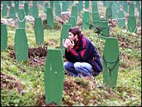
(a graveyard in Bosnia...love the shape and color of the grave markers!)

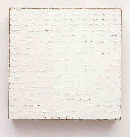
This morning I was in the beginning stages of laying out the composition of a new painting, the surface being a found one; a shellaced wooden door with random splashes of brushed white paint on one side, which seem to be simply from the door painter cleaning his or her brush on the inside of the door. My compositional elements were two stencils; one a circle with a dimple in one side, much like the top part of a heart shape, and the second a fat tear drop shape. My plan was (and is; I'm not finished yet) to lay out a plethora of these, each successive step a reaction to the previous element.

The first shape I laid down was the tear drop; with this element I reacted against the weight of the brushy white shapes, which are just left of the center of the panel (being a door set "sideways"). OK. The next step was to take the second shape, the dimpled circle, and react now to TWO other things (not counting the colors, which have not been considered yet). OK; that wasn't too difficult. Again, I picked up the tear drop; not TOO much thought needed; still largely an intuited step, but became more difficult to consider. By the time the next application came around, I was slowing down. It was becoming very difficult to intuitively place a shape based on all the other elements around it.

So, I decided to stop there, and make it even harder for myself...add COLOR! In some ways, this may provide clarity, but will most likely slow down the decision process...which is largely connected to my way of working. This brings to light an important balance, which should play a large part in each of the multitudes of individual decisions of which an art work consists, up to its ostensible conclusion: one must balance care with caprice.

Simply put, do I err on the side of agonizing every minutia of the process? No; this usually produces a particularly anal type of work. On the other hand, do I, in a cavalier fashion, proceed blindly, and "let God sort out the dead"? No; this alternate swing in the other direction often produces adolescent, slap-dash works. Thus, for me, a balance is important. Granted, some work by certain artists, depending on their skills, may look one way, but was produced with the opposite mindset. Cy Twombly is one who comes to mind.

Intentionality...and experience plays a large part in this. It brings to mind a story I heard once about a Chinese artist who was asked by a rich man to paint him a picture of a rooster. After waiting patiently for several years, the rich person frustratedly asked the artist when he would ever get around to giving him the painting he'd requested. The artist, then and there, simply pulled out some paper, a brush and ink, and in a few minutes did a beautiful, virtuosic painting of a rooster. The rich man became very angry, and asked why, if he did it so quickly just now, he had taken so long in getting him his requested painting. The artist did not respond, but waved him into his studio: the rich man was astounded to see all the walls covered with thousands of paintings of roosters. Only after all those paintings, could he fulfill the patron's request skillfully.

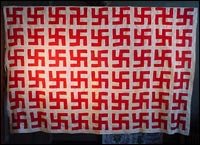
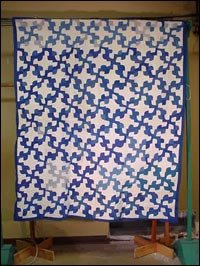
In the spirit of thoughts on composition, I've included some interesting (and morbid) pictures that I've had for a long time, but haven't used for anything...most of them use the compositional concepts of repetition and pattern.

(a swastika quilt...)

(another quilt, this one made from Klan hoods...sweet dreams!)

Read more...

Sign Ministry


Spotted these on our trip out to Huntingdon, PA...I believe they were put up by a Mennonite community in south-central PA. There was, and still is in some areas, an odd movement in some conservative Mennonite circles, to paint and put up these signs as a sort of public testimony to drivers-by. They are usually quoting scripture; oftentimes with a message imploring righteous living or a call to salvation. Vicki remarked that they are a stereotypically Mennonite witness: mostly passive; a belief statement not requiring a personal response; an invitation, or a handing-over of responsibility to the spoken-to. I denied it vehemently, of course. I thought the colors and scalloping were great.

Read more...
Related Posts with Thumbnails