The unseen sculptor

Been thinking about unseen forces: air and wind; sound...plumbing.

"...At no other time of year is the movement of the invisible air so apparent as in the white months of winter. We see it recorded in blowing clouds of surface flakes, in solidified ripples and waves, in sweeping lines and in the streamlining of the drifted snow...in the dawn after such a storm everywhere we look there are new forms of plastic beauty glowing and glistening in the early morning light."

-Edwin Way Teale, A Naturalist Buys an Old Farm

Read more...

Mei-ling Hom

(above, Mei-ling Hom's wire cloud forms at Fleisher/Ollman gallery, Philadelphia)

On Tuesday's Magazine section in the Philadelphia Inquirer, there was a great photo spread of Mei-ling Hom, a South Philly artist, working on her installation at the Smithsonian's Sackler Gallery.

http://www.philly.com/mld/inquirer/12509509.htm

Also, in last week's Philadelphia Weekly, Roberta Fallon had a friendly studio-visit of an article on her work. She is an area artist to know. I also think she will be featured at some time in the future, by Smithsonian magazine. So, keep your eyes open...she's producing some really well-crafted, rich stuff. (Clouds signify good fortune in Chinese culture.)

http://www.asia.si.edu/exhibitions/current/MeilingHom.htm

She also has an installation coming up at the Philadelphia Airport...unfortunately, you can't see it unless you have a ticket. But they do have pictures on their website:

http://www.phl.org/art_current.html

Enjoy!

Read more...

Shayna Bubele...


My little niece, arrived August 18th. Another August bird. Wilkommen, Emmaline Joy Gierschick. Looks like you've got spirit.

Read more...

Gridlock

I received a comment/question recently from Ben Volta on layering and grids, and thought it was a good direction, so I've decided to put it here, and then respond to it and expound further, so that a better comparison can be made, and so our dialogue isn't stuck in the comments section. Ben said:

Why do you think that the grid is so appealing for artists? Is it because it gives us a system to explore within? . A general appeal towards layering for me harkens back to that first time I learned how to use the layer feature on adobe photoshop. I was amazed at that feature. Wouldn’t it be nice if the physical world had features like photoshop, where you could hide, delete and lock physical layers. Oh well…I see the paint that you place on your “found” surface as a sort of layering process. Do you consciously think about this as you plan your paintings?

I don't have a conclusive answer on the grid, of course, but I considered it in a few ways:
A putting-down (application) of texture without being too committed?
A way of working "all-over" the surface, rather than piecemeal? (Insta-composition?)
Unity?
Continuity?
Groundedness without over-permanence?
Or...is it a crutch, as Ben alluded...I love the grid also, sometimes too much. If not at first, it could become such. As can any compositional method, or any technique could, I suppose.
Additionally, a grid can help bring together a composition that otherwise may have only a tenuous balance.
The grid also has many emotional possibilities, besides formalities...quietness? I allude to this by using the word grounded, etc. What do you think?

More thoughts on layering:
Layering: includes laying down paint on my found surfaces/objects?
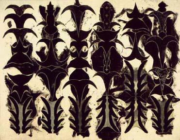
YES...I do think of this in terms of layering...and dealing with the "visual vocabulary" I often talk about in reference to my work; those pre-existing parts of the found object/surface that I'm using. A layering of voices, in a way, similar to how one lays down - usually - complementing tracks on a song recording.
In the same way, I need to find the right inflections (borders/edges); words (shapes/symbols/icons); or notes that work with the object/surface and previous layers. And each one that comes along need to work with (or effectively - kind of the same thing - work against) the preceding layers. Including the attuned attitude to the realization of when I need to stop - when the conversation or "song" is at an appropriate stage to let it stay, and move on to another work or piece. It's more mystical than you might realize by looking at my work...I don't often know the hows or whys.
In this way, a series of paintings correlates to a group of songs on a well-crafted album. Variations of elements, but no loss of uniqueness.

In fact, some comments by Douglas Witmer on my recent series of Prayer File paintings, done on old file folders, may shed some more light on this discussion about the dilemmas and challenges when working with found objects (as the first "layer" to respond to):

You ask for more commentary on your "prayer files" and I have been wanting to oblige you. I want to re-iterate that I really find the b/w imagery with the changing-colored borders really bold. I like them
on the support of the file. I think it's tough to try to use found objects in conjunction with geometry that is handled in a way that seems to call for a certain austerity. The found object can really
be a distraction (to me). It's funny...I just saw that piece by Gabriel Orozco? at the PMA that is a human skull covered with a sort of diamond checkerboard pattern. I'm so much more interested in the
pattern than having to deal with the conceptual implications of the skull. Sometimes when I look at your footboard piece we have I wonder what it would be like without the casters. With that piece, I
guess it works for me with its reference to handpainted "decorative arts" like furniture. So the challenge of course is how do you incorporate the ideas implied by the found object and have them add
to what you are doing with the imagery? With the prayer files, I like the ideas of filing, storage, rememberance, categorization...I think it works. My distraction (nitpicky) was (and is) seeing the
letter on the tabs, because then it seems the classification is more specific and I want to know why this design with this letter. You have a knack for and an interest in combining found objects with your
imagery which I think works really well, and it's pretty unique. I think the draft card is a really strong piece. With my work I don't think this way at all and I think I tend to get caught up in particulars when I might be better off just taking it all in. Also, I think lately I have developed such a tendency in my mind toward a "conceptless" or "silent" visual purity that anything (like a letter) suggesting a text gives me problems.


What do you all think? This discussion has been enlightening.
Pertinent comments welcome as always.


Read more...

Layers, revisited

Some more random thoughts on layering, etc., from my studio journal:

"Layers - subliminal tension of three-dimensional against two-dimensional? Because when we see 'stacked' things it reads 'space' but we know that (physically) it's 'flat.' Illusion in abstraction? Is my layering abstract, in the 'traditional' sense? Or is it fully representational of keystones, hearts, etc.? Think more about the appeal of layering (J. Johns, et al)."

(The appeal could be related to the appeal of the grid to many artists [including myself]: another way of working, by degrees, with a "ready-made" matrix or pattern that vibrates across and through your image area).

Indeed. Oh, and read the Matisse essay by Peter Schejldahl in this week's New Yorker magazine. (Aug. 29) It's good. I'll be posting some poignant quotes from it later on.

Read more...

Sublimity

(above, Barry Goldberg, Chesapeake, 2003)

"To acknowledge the sublime is to admit that there is something, God or nature, that defines and transcends human culture and what it means to be human. If some definition of the sublime endures, it will depend on whether humans write future dictionaries. It will also rely on a sense of the human self in all its variety, however transformed, and at least a begrudging acknowledgement that there are more things in heaven and earth, than are dreamt of in our philosophy."
-Bill Beckley in Sticky Sublime

Read more...

Comments

Here's a few kind comments regarding my blog material from a long-time friend of mine, Jonathan Bean. He is a recent graduate from New York School of the Visual Arts, and a book illustrator working in Manhattan at the present time...but he and I grew up spending time together in the Berks County woods . His website is www.jonathanbean.com - see samples of his illustration work, sketches etc.


"I was moved by your poem “New Jeruselem”. If I am assuming wrongly that it is about the New Jeruselem in Rockland township than forgive me. But I often used to go drawing on the hill up above the town - the hill the the power lines climb over. I thought about the town, its position, the way people used the name so easily, fluidly in conversation, who might have given the town its name. I did a drawing titled “New Jeruselem” but it wasn’t acutally of the town. It was of the hills past it and was filled with some imaginary structures or shapes. Im not sure I would like it any more if I looked at it again.Have you finished the poem or worked on it more? I would be interested in reading it when you have."

Read more...

Becker/Hafif/Ryman


above: Marcia Hafif, Glaze Painting: Phthalocyanine Blue / Green Lake [Laguna Beach] 2002, 2002

Had an unexpected walk-round in the latest exhibit at Larry Becker Contemporary Art on Saturday; a lovely show with currents of summery feeling. http://www.artnet.com/gallery/135/larry-becker-contemporary-art.html
Talked a bit with Heidi Nivling of the gallery about Marcia Hafif's work; and they gave me an article to read, where she is defending Robert Ryman's work, in 1979. Here is an interesting excerpt:

"Ryman's work is not cool, it is contemplative and human. 'Reductionism' isn't right either because that suggests a process of reducing to an inevitable end, while Ryman's work does not do that, but rather uses a limited selection of elements in any given work for the purpose of clarity. And the range of elements he uses is large and expanding. One sees homogeneity, repression, narrow control and a closed system of art only if one is unable to see what is there and concomitantly expects bright colors and confusion, titillation for the bored, and blatant expressions of narcissism - if not political statements - to be the only worthy components of art. Ryman's painting has a great deal to say to the viewer willing to engage it."
Art in America, September 1979.

Read more...

Heart/Boat - 2005

Read more...

10 x 10 x 10

First, the caveats: I don't normally endorse exhibits that require you to pay a fee for submitting. And the Cheltenham Art Center is a bit main-stream, although they have had some interesting new work occasionally.
However, a new exhibit they're putting together, 10 x 10 x 10, has a fascinating and simple premise, with many possibilities - both to be really horrid, or astoundingly wonderful, depending on how it's pulled off. And they promise to hang everything that comes in that meets the restrictions and whose maker is holding a $10 bill (or $20.) So, it's both opportunist and egalitarian! What a nice combo.If anything, it will be fun to see. Anyway, here's the information; I'm planning on submitting at least one piece - I NEED TO GET MY STUFF OUT OF THE STUDIO! Sorry:


10 x 10 x 10 Homage to the Square

September 25 - October 22, 2005 Meet the Artist Reception: Sunday, September 25, 2005, 2- 4pm
Call for Entries Hand Delivery: Monday, September 19, 9-5pm and Tuesday, September 20, 9am-7pm2-D Entries: Work must be 10 inches by 10 inches, including the frame, and must be ready for hanging.3-D Entries: Work must be 10 inches in at least one direction, including the base, and no more than 10 inches in any other direction, including the base, and must be stable and ready for placing in the exhibition space. Each artist may enter up to 2 works, with an entry fee of $10 each. Please call 215.379.4660 for a prospectus.

And here's the direct website link, which gives you the same info. as above:

http://www.cheltenhamarts.org/ExhibitEvent.html#top

See you there? I'm hoping they hang it salon-style. And, by the way, if you are part of the Olivet Covenant PC Artists-in-Residence program... http://www.olivetcovenant.com/Artist_In_Residence.html ...come find me, I have hard copies of the prospectus.

Read more...

Tim (the other one) in L.A.

Tim Hawkinson in L.A. - check it out. Above is Pentecost, 1999.
Link to NPR spot: http://www.npr.org/templates/story/story.php?storyId=4802237

Read more...

The Swallow's Advice - 2003


From Philadelphia Weekly, February 2003

Read more...

I'm on a roll.

Here's a question/answer session my friend Douglas Witmer joined recently...I found there are some helpful, thought-provoking and tantalizing ideas posited here...as well as some things almost every conscientous artmaker thinks and wonders about occasionally...check it out:

http://thinkingaboutart.blogs.com/art/2005/08/artists_intervi_1.html

And here is Douglas's web blog: www.douglaswitmer.com/blog


Read more...

Look here:

Here, folks, is a Taaffe painting from 1990 - Desert Flowers - for you to admire until I figure out exactly how to upload MY work...stay tuned.

Read more...

Layers


I've been thinking about my use of layers and layering of images in recent work. Perhaps they are an attempt to artificially superimpose/relate shapes that are otherwise unrelated? An attempt to create a shared history? A forced visual semiotics?

Or am I just trying to make sense of all my disparate inspirations? Important life-icons? There is something appealing to discovering their actual physical interaction when succumbing to the same borders and parameters...indeed, there is also something appealing in imposing shared meanings on these symbols - and in a way, they do already have shared meanings, in that they are all important/meaningful to me.

Sorry, still working on figuring out this uploading of pictures.

Read more...

All mortal flesh...

Hello friends:
I just wanted to share with you a good friend's website and blog:
www.benvolta.com - click on FLESH BLOG at the top of the page.
He has been compiling and fine-tuning it for the last few months, and if you are at all interested in contemporary art-making and all that is involved in it, conceptually, emotionally etc., it would be a worthwhile visit. It's definitely from his personal perspective, but it's quite wide-ranging and rich.
Hopefully this weekend will find me uploading a few images for all of you to peruse.

Read more...

New Jerusalem

A new poem-in-progress for you to consider:


New Jerusalem

Ah, New Jerusalem; you
diminutive, green, three-cornered
town, with the name the
size of eternity –
you carry the word of the
kingdom in your little
mouth; a picture of the jewel
made fleshly in your pocket
edged with meadow.
Your denizens, a group of
souls – compiled for naught except
that they are whole and part of you;
Babylon’s red-cheeked
antithesis with broken teeth; old
silage wagons; oily feet.
How many pass through
you and miss the fame – your
foot is small, but the
print extends into the wildest
borders of this earth.
Bless you, New Jerusalem: shine
your lights like tractor
headlights of your farmers,
plowing late.


(c) P. Timothy Gierschick II

Read more...

Iconic/Anecdotal

Following is a passage from the New Yorker, Aug. 8 & 15; Peter Schjeldahl:

"But I was perversely clenched against enjoying the key aspect of Homer's talent, which is based in his early discipline as an illustrator: a prehensile feel for the iconic - the identification of a subject with its representation, such that, in memory, one becomes inseparable from the other."

This, to me, is also descriptive of what I am after in much of my work. It also somewhat answers a question posed to Douglas Witmer on his blog (
www.douglaswitmer.com/blog ) where someone inquired about the anecdotal inspirations for his work, and whether any of that/those were to be captured/experienced by the viewer.

Read more...
Related Posts with Thumbnails